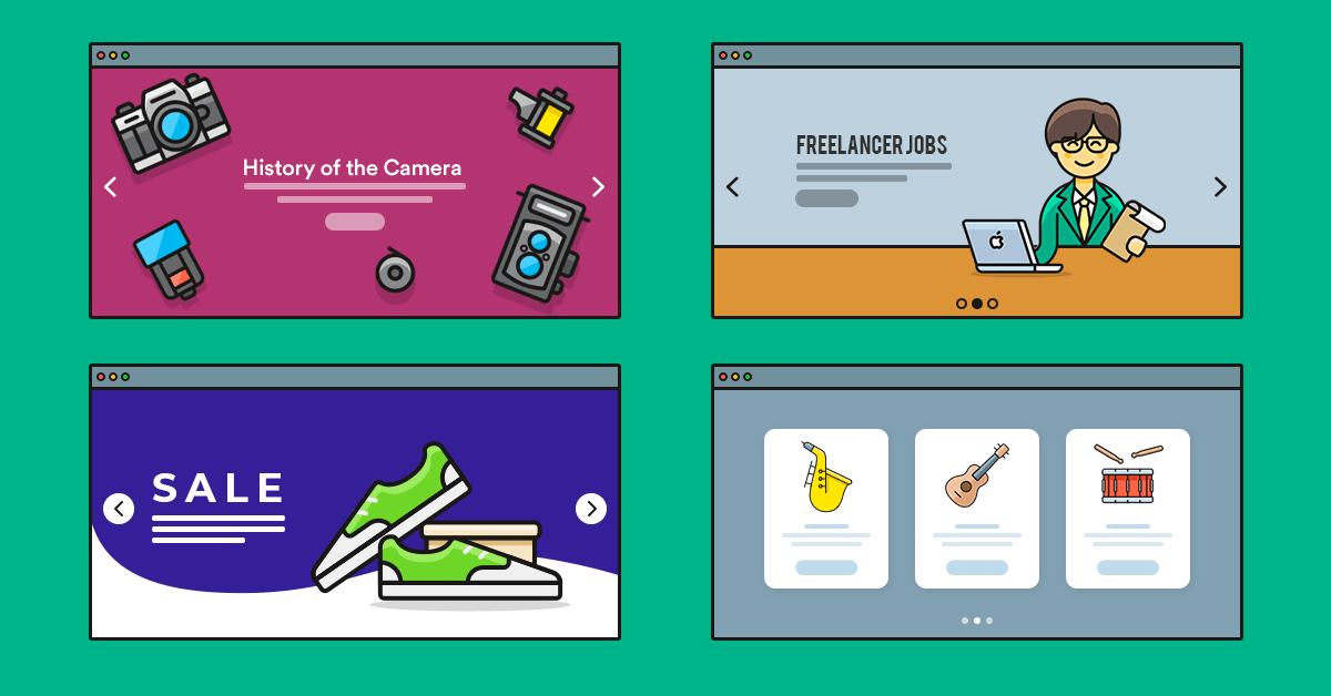
The first website went live on August 6, 1991. It was a basic site, on white background, using black text and blue links. As the years have passed the technology has evolved. As a result, people could create more interesting websites. For example, they could add different colors, images, various effects and animations. Thanks to these new technologies we can create gorgeous modern website templates.
What makes a template feel modern?
Designing a template in 2023 doesn’t mean it will be a modern template. In fact, lots of websites are still created in a non-modern style. This can raise the question: what makes a template feel modern? Well, I’ve collected some of the signs to help you recognize a modern template.
Minimalism
Modern templates tend to be minimalist. Minimalist design prioritizes the essential elements. So, a minimalist website doesn’t have anything that’s unnecessary. In fact, it follows the saying “less is more” using the design around the content.
Micro animations
Micro animations are small animations that enrich your website. In fact, they give visual feedback to the visitor while they go through the website. Additionally, they help create a better experience with various parts of the site. For example, if you have a hamburger menu you can use a micro animation to make it appear. This animation will help clarify the action of what’s happened.
Full page Headers
The header is probably the most important part of the website. It’s the first thing the visitor sees when they arrive on your site. So your header needs to catch their attention fast and make them scroll down. A full page header offers plenty of space to display a captivating headline and nice visuals.
Bright colors
We’re not living in 1991 anymore. While the first website’s design was acceptable back then, people have changed since then. They expect pleasant looking sites. They want colors, to make the pages more interesting. Designers of modern templates like to use bright colors to stand out.
3D effects
According to modern template design, adding depth to the site makes it more appealing. So, modern designers use various tools to achieve the feel of depth and create 3D effects. For example, they might use box shadows on images or boxes. Or, they might use the Parallax effect to make the page more attractive.
Illustrations
Illustrations are custom made designs that make the website look more interesting. Additionally, they can strengthen the message because they give a visual clue.
10 modern template examples for inspiration
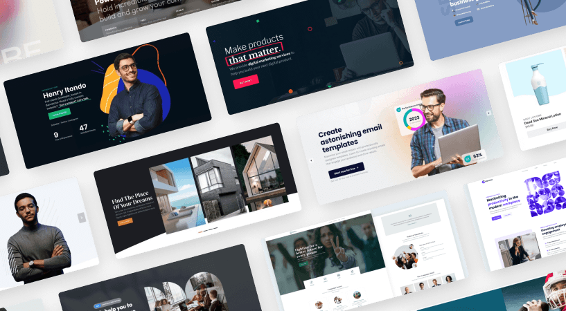
Do you want to create a modern website template, but don’t know where to start? We’ve gathered 10 amazing modern template examples for you. They can be your inspiration to create something amazing. In fact, you can import them to Smart Slider 3 Pro and fine-tune them for your site.
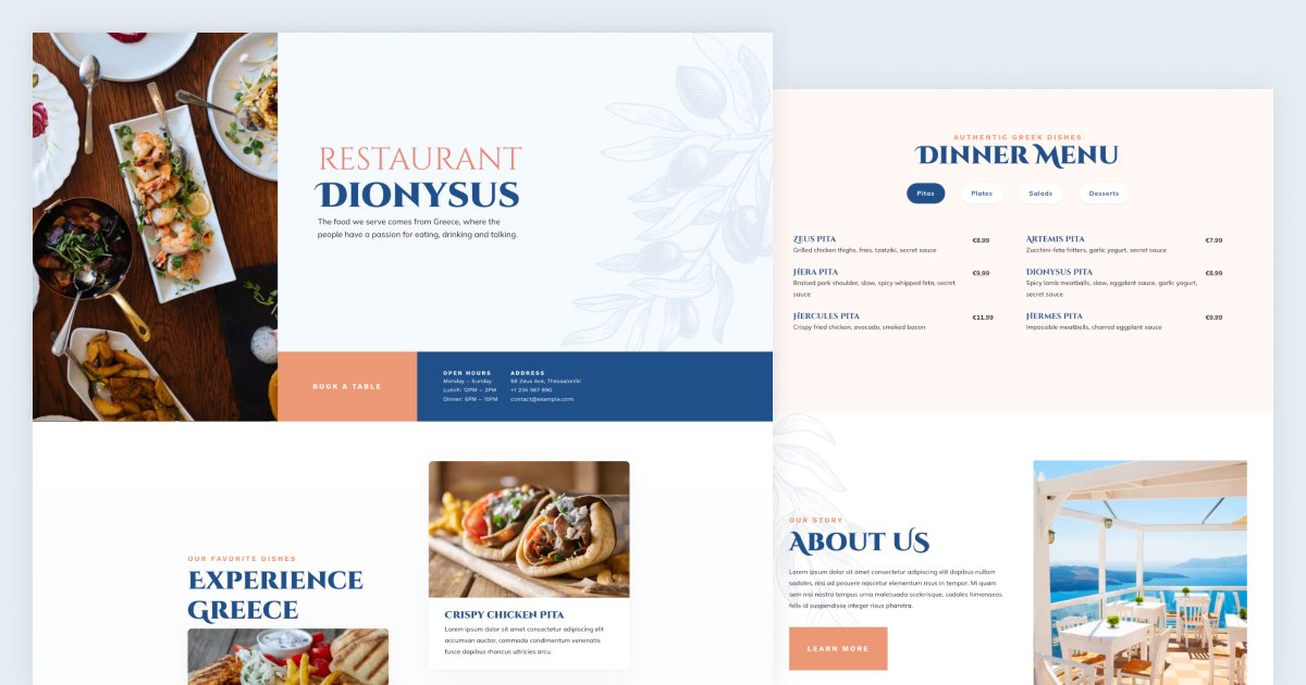
1. Greek Restaurant
The first example showcases a colorful full page header. Also, many of its sections have the parallax effect. Additionally, it has layer animations. Some are basic animations: they move and fade. However, some others are more special, as they’re colorful reveal animations.
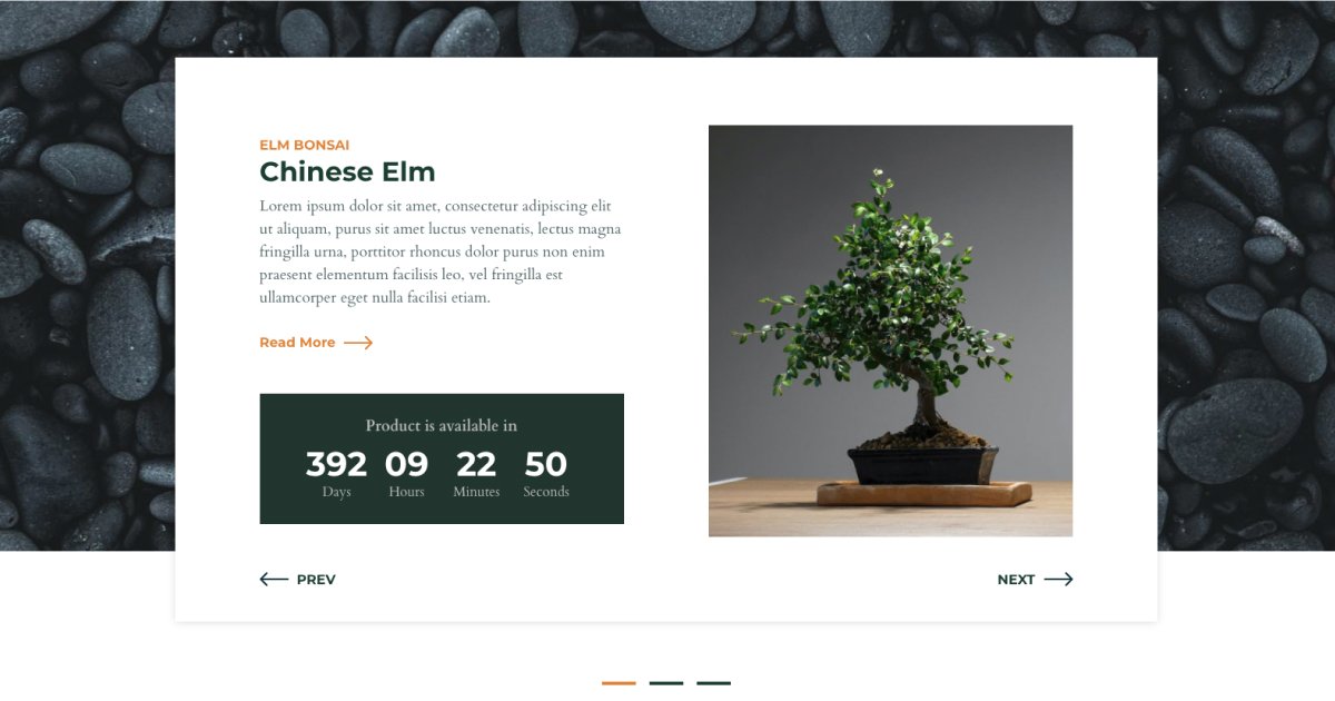
2. Bonsai
The Bonsai is a modern template that uses a minimalist approach. It has large white spaces and solid colors. It also has a Shape Divider at the bottom.
3. 404 Illustration
Illustrations are one of the coolest trends of modern web design. They help to enrich the website with shapes and figures. As a result, it will be interesting and personal. So, it’s worth using illustrations in a modern template.
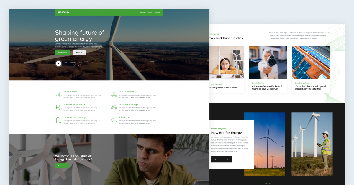
4. Green Energy
The Green Energy is a modern template that features several awesome animations. They make the page load more interesting and bring some interactivity to the page.
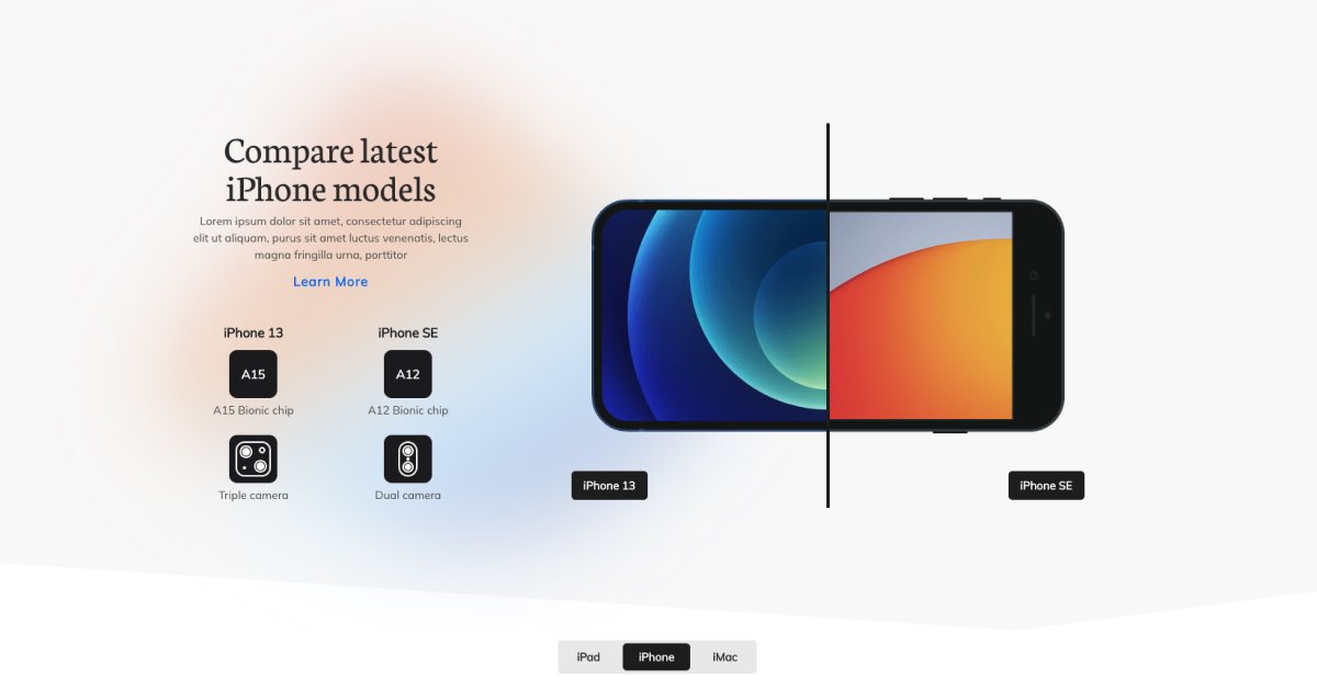
5. Product Compare
A modern template doesn’t have to be minimalistic, but it’s a great addition. The Product Compare example is a clean and minimalist template. It displays a blurred color background and colorful images. Additionally, it has an animated Shape Divider.
6. Cosmetics
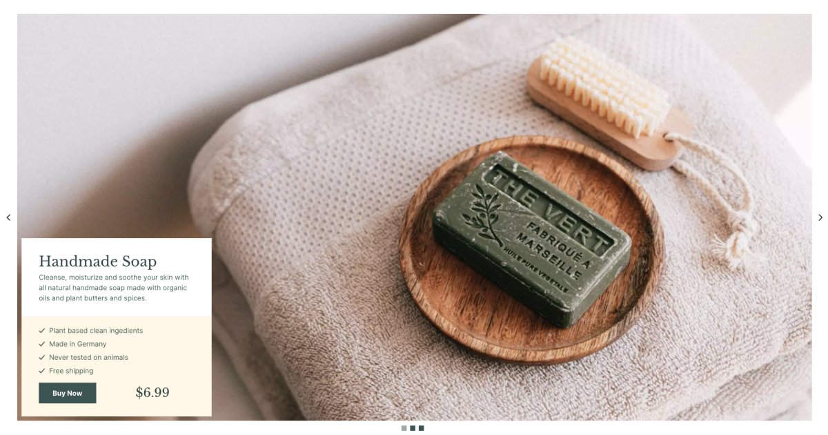
This modern template example focuses on the main picture. In fact, it has very little content that’s placed to the bottom left corner. There’s also a frame around it, which provides space for the navigation arrows and bullets. When your slider focuses on images, it’s worth giving them a nice animation. In this case, the Morph animation appears on the images during slide switching.
7. Security Block
Bold colors and the illustrations are the first things you’ll notice on this modern template. The final result is spectacular and outstanding.
8. Showcase Portfolio
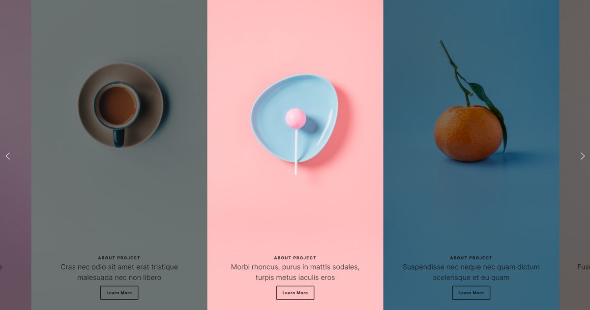
This template is a bit different than the others. Of course, the most obvious difference is that it displays more slides at a time. However, this is not what makes the Showcase Portfolio a modern template. Actually, the way it was built makes it modern. Each slide uses a different bright or pastel color that just shines on the page.
9. Feature Card
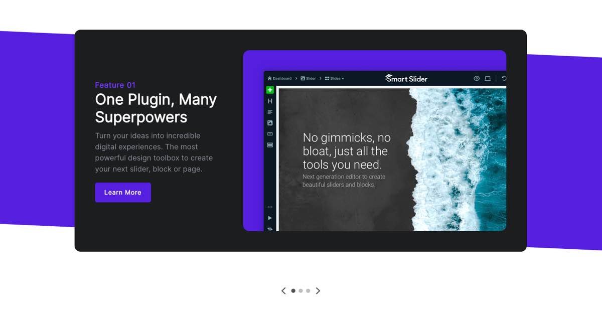
You can find beautiful bright purple, orange and green colors on this template. Additionally, there is a top and bottom Shape Divider and 3D animation. Just three of the many amazing things this modern template can offer you. It’s a versatile template, so you can easily make it fit into your website.
10. Smart Bank
The Smart Bank example’s most interesting feature is the gradient on the headline and button. The effect uses bright colors, which immediately catch the visitor’s attention. Additionally, it has the Particle effect that moves behind the main content.

