


💡 Best features in this slider
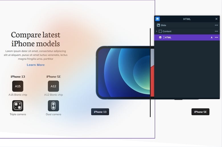
- HTML layer with the blurred shape
- Before after layer
- Shape Divider
- Text bullet
Slider Settings
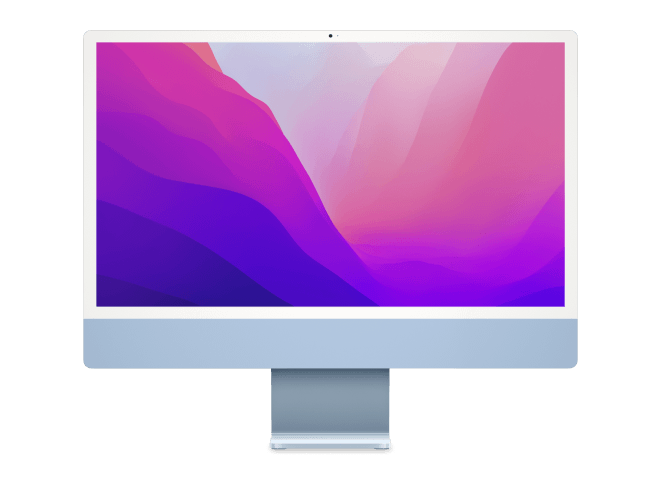
The Product Compare slider looks like the element people think of when you mention the “sliders” to them. It displays a single slide at a time, which helps visitors focus on the message you want them to get. Additionally, it fills the screen horizontally, which is trendy and looks good on today’s large screens.
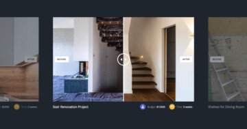
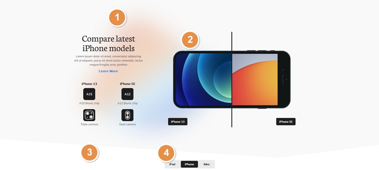
The slider has a total of three slides. For convenient navigation visitors can use the Text bullets at the bottom of the slider. This text bullet displays the title of the slide, which helps giving an idea to the visitor about the slide.
Apart from bullets it’s also possible to browse the slides by dragging the mouse or by swiping. This navigation is super convenient for touch screen users.
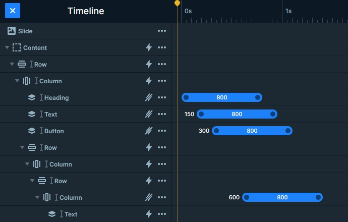
Layers
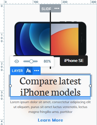
The most important layer on the Product Compare slider is the Before After layer. This layers helps you create cool looking before after sliders. Choose a before and an after image and type a caption for them. Write a short caption to describe the images for your visitors. Finally, choose the color and shape of the divider. The Before After slider is ready to amaze the visitors!
Other notable layers on the slide are the heading, text, image and button layers. The button layer on this template is the “Learn more” text, and it’s very minimalistic. There’s also an HTML layer below the other layers, which displays this cool blurred shape in the background. The easiest way to locate this layer is to use the Layer List.
Animations
There are many animations on this template. The layer animations are easiest to notice, as they appear on large elements. Additionally, there’s a layer animation on every layer. These basic layer animations make the layers move upwards to their place.
The other animation on the slider is slightly less noticeable. It’s the animation of the Shape Divider, which makes the two inclines appear from the bottom. The result is spectacular and your visitors will love it.
Layout
The base layout of the Product Compare slider is a row that has two columns. The first column has the textual layers, and the second contains the before after layer. By default when you add a row, it’s columns are 50% wide. In this case the first column is only 32%, which allows the before after layer to take up the remaining 68%.
Another cool layouting solution is the 2×2 box that shows the product’s features. The main element here is a two column row where each column contains another row with two columns. But the columns of this inner row appear vertically below each other. In other words, the “iPhone 13” and “iPhone SE” layers are in a different row. This kind of layout helps keeping the details of the product together in every responsive scenario.
Responsive
Smart Slider is a responsive slider for WordPress, and it offers tons of cool options to fine-tune how your sliders look on mobile. The option you’ll want to use the most is the ability to change the text size for different devices. As a matter of fact, it’s very rare to have a text that’s font size is perfect for desktop, tablet and mobile as well.
If you check the template on mobile, you’ll notice that the two columns appear in a separate line below each other. Although all rows break automatically this way, you can change their Wrap After option anytime if your layout needs the row to break differently.
Related Post: Introducing Before After Layer
Related Post: Do you Need a Product Slider for your Webshop? Yes, you do!