
💡 Best features in this slider
- Shape divider – top
- Row
- Image layer with 3D mouse parallax
- Slide background color
- Shape divider – bottom
- Bullets and arrows in Advanced position
Settings
People typically use full width sliders because they look great on today’s large monitors.
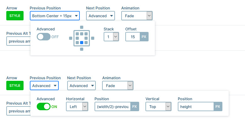
The controls look very special on this slider. That’s because the arrows surround the bullets. When you enable a control, by default you can select from predefined places at its position setting. In the Pro version of Smart Slider, there’s an Advanced position setting, what you can use to place the controls basically anywhere within, or around the slider.
Layers
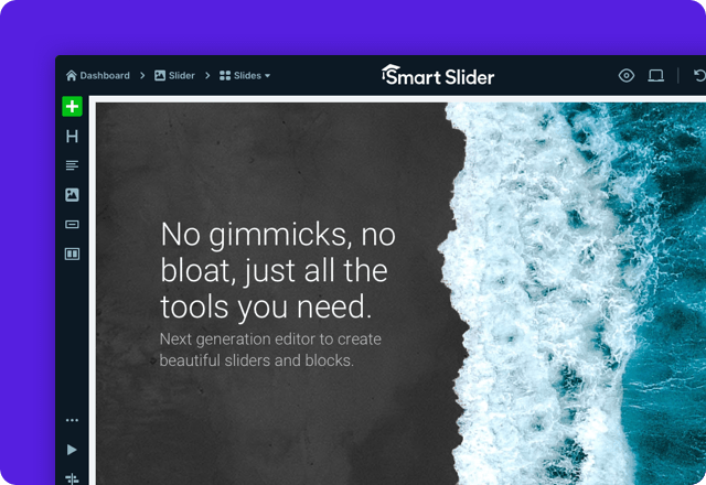
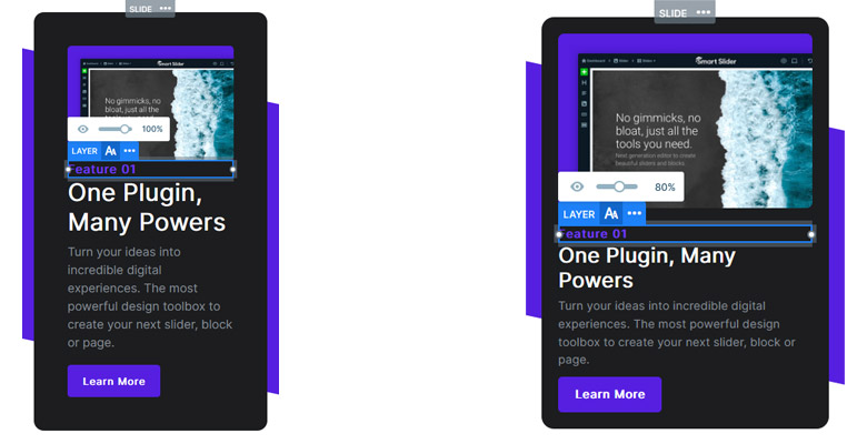
You can find the most popular layers on the Feature Card slider. There are two headings, a text, a button and an image layer, inside a two column row. Using the button layer, you can create a cool CTA for your slide.
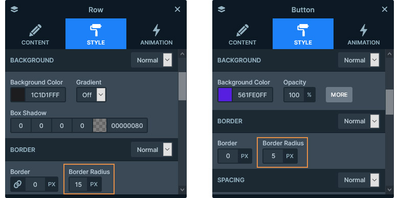
If you check the layout, you’ll also see that it’s full of rounded corners. The image inside the image layer is a png, so here the rounded corners are coming from the image. However, in the row and button layer’s case, the rounded corners are coming from their settings. At the Style tab of the layer window, you can find a Border radius option, what you can use for creating rounded corners.
Animations
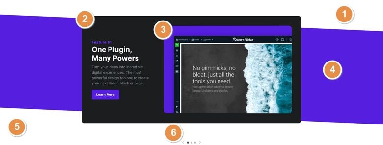
The most noticeable effect you’ll immediately see on this slider is the Shape divider. This feature creates the white shapes at the top and bottom of the slider. When you first load the slider, the shapes appear with a nice animation. The Shape divider is above the background of the slide, but below the layers. This helps creating the Feature Card slider’s unique look.
There’s another fun effect on the Feature Card slider. When you move the cursor above the slider, the image reacts to its movement, and turns towards the mouse. This effect is the 3D mouse parallax, what you can enable on any layer.
Layout
The base of the Feature Card slider is a row, that has two columns and a dark background color. When you add a row layer, it always contains two columns, and both columns are 50% wide. In this case, we changed the column width. The first column is 30% and the second column is 70% wide. This allows the image to display in a bigger size, but the 30% width is still enough for the text to show.
Responsive
Rows help creating mobile friendly layouts by breaking the columns into more lines. The Wrap After option of the row defines amount of columns that can fit into a line. By default every row has its Wrap After setting on 1 on mobile devices.
When a row breaks its columns, it always keeps the original column order. In other words, the column that’s the first from the left is going to be on the top. The column, which is the last from the left side will end up on the bottom. If you don’t like this behavior, you can change the column order device specifically at the row.
There are many other options that you can change for tablet and mobile devices, without affecting the desktop layout. For example, the padding, which was greatly reduced to make the slide look better on mobile. We also reduced the font sizes using the Text Scale option.
Related Documentation: How to place bullets below the slider, with the arrows around them?
Related Post: Add Beautiful Section for your Website with Shape Dividers