


💡 Best features in this slider
Settings
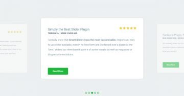
This colorful Smart Bank slider template can be a great testimonial slider with great CTA buttons. You can display the best reviews about your product or company, and can call your visitors to an interaction to check your pricing, or navigate to a try site, or another page.
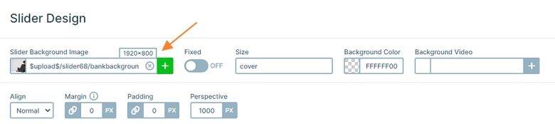
The main image of the slider is a slider background image which can be found at the Slider settings → General → Slider Design. This image will always be in the background even when you switch the slides.
The slider is autoplaying every 5000ms, but you can switch slides with dragging your mouse or using the bullet control on the bottom. The active slide is marked with an orange bullet, which you can change at the Controls tab → Bullet → Dot Style. Here a popup will open, and you can select the Active state at the top right corner where the orange color can be changed.
Layers
When you check this slider, the first thing you will notice the gradient heading and the gradient bullet. These colorful layers cheer up the slider, and also look good. How to change the colors? There isn’t a basic setting for that, we have used custom CSS to make this gradient effect.
You can find this custom CSS at the heading layer if you click on it, and go to the Style tab of the Layer window. Here you can press on the More button to see the advanced settings, like custom CSS. The starting color is #F71285, and the ending is #FFA000. If you want to change them, just override the hexa color codes. Also you can change the angle if you want, now it is 90 deg.
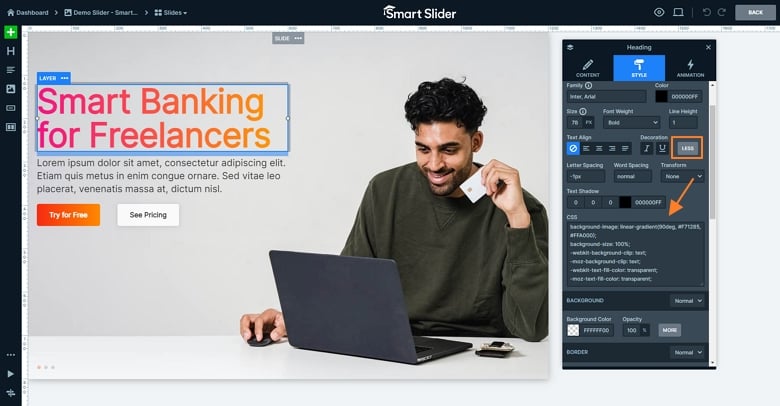
The button also uses custom CSS for their background. You can change or customize it at the Layer window → Style tab → Background → More → CSS.

Animations
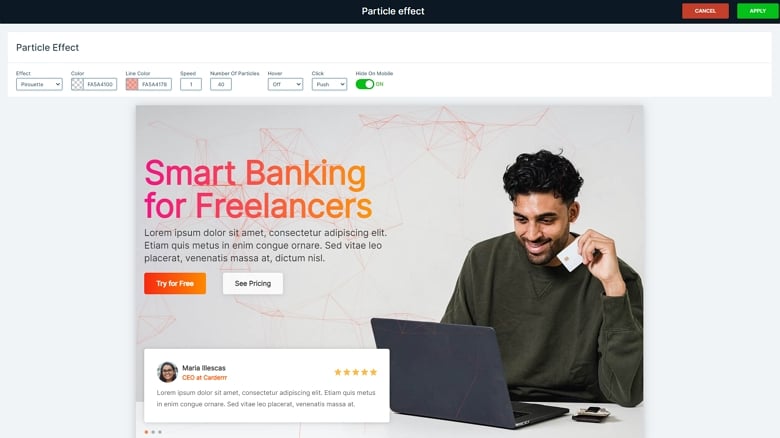
When you check the slider, you can notice there are small particles in the background. This is a cool design effect which helps your site stand out of the crowd. You can customize it at the Particle editor which can be reached from the Slider settings → Animations tab. Here you can change for example the number of the particles, the speed, and the interactions.
Layout
The base of this slide template is the slide background image and the static overlay where the static content is. The content on the static slide won’t change when you switch to another slide. The changeable slides are reviews, each review is a different slide but with the same layout. If you want to display more, you can easily duplicate a slide, then change the content.

Responsive
This slider is also fully responsive as the other templates. The main responsive settings at this slide is the wrap after and the font scale. By default the buttons are under each other in mobile, because it’s row wraps after 1 column. But at this layout it will wrap after 2 columns. Also the texts are smaller thanks to the Text scale option which is device specific, so doesn’t change the sizes on other devices.
Related Documentation: Slider background
Related Post: What is a Particle Effect and Why Should You Use It?
Related Post: Best Testimonial Slider Examples for WordPress