

💡 Best features in this slider
- Slider background image
- Slide content
- Countdown layer
- Shape divider
- Bullet control
Slider Settings
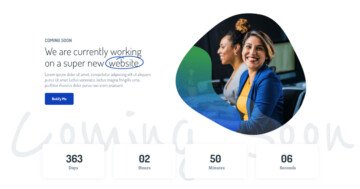
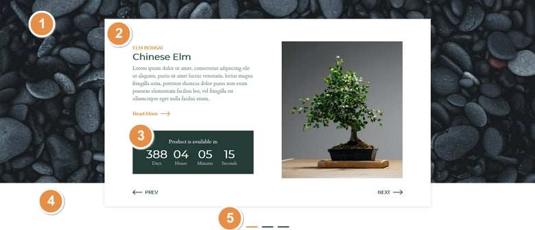
The Bonsai slider uses the Simple slider type, which is the most common way to display a slider on your website. Simple sliders display one slide at a time, which helps the visitor focus exactly on one message. Additionally, it’s a full width slider, which means the slider fills the screen horizontally. Full width sliders look great on today’s wide monitors, and they’re super popular design elements nowadays.
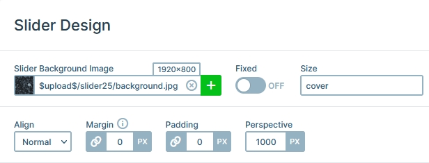
The image in the background is the a background of the whole slider. It’s not added to the slides individually, but to the slider itself. As a result, the image stays in place when the slides move, which gives a stunning look to the slider.
For navigation your visitors can use the custom Prev and Next buttons on the slides. Additionally, on touch screen devices they can swipe the slider to the direction they want to switch to. If the device doesn’t support touch, a mouse drag can also change slides. There’s also a bullet at the bottom middle part of the slider, which is both for navigation and to indicate how many slides are available.
Layers
The most important layer on the Bonsai slider is the Countdown layer. This layer is available in the Pro version of Smart Slider and helps you count down to any date you want to. It’s good to create a product slider or a coming soon page.
Other notable layers are the heading and text layer, which display the textual content of the slide. There’s also an image layer on each slide that shows the product picture.
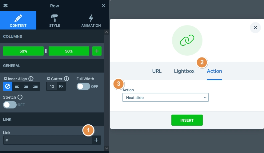
Every slide of the slider has a CTA button that prompts the visitor to read more about the product. There are also custom buttons to switch slides. Creating such a button is super simple using Smart Slider, as you can set it up in a few clicks. Go to the layer where you want such a custom link, click on the + icon at the Link, go to the Action tab and select Next slide. Once you’re done, press Insert and the button will switch to the next slide when clicked.
Animations
Although it does not animate, the Bonsai slider has a Shape Divider in its bottom. This Shape divider creates the white line at the bottom of the slider.
Apart from the Shape divider, the only animation on the slider is the Main Animation. The Main animation is the simplest animation, and it moves the slide with a nice horizontal movement.
Layout
The base layout of each slide is a one column row that has white background color. Inside this row’s column there are two other rows. Both have two columns: one for the main content and another for the navigation.
Responsive
Smart Slider is a responsive slider, and is full of options you can use to fine tune the look of your sliders on small screens. When you optimize your slider for mobile, it’s recommended that you keep the height below 600px. As a result, your slider will fit nicely to the smallest mobile screens.
To ensure a good mobile fit, we hid the large text layer. Additionally, we reduced the font size of some of the texts. As a result, the slider looks better on mobile.
Related Post: Introducing Countdown Layer
Related Post: Do you Need a Product Slider for your Webshop? Yes, you do!