Colors are important to help people recognize you but they also play an important role in their experience with your site. For example, visitors often leave a website because they find its content hard to read. Light templates are usually good choices to avoid this, as they allow creating high contrast with the text. Let’s learn together why you should consider creating a light template for your site.
Meaning and psychology of white
The color white has different meanings in Western and Eastern culture. In Western culture it’s associated with innocence, goodness, cleanliness. However, in many Eastern cultures white is linked to death and sadness. They often use this color in funerals as opposed to westerners using it on weddings.
White resembles a blank state, which symbolizes a new beginning, such as a fresh start. Interior designers like using it to make the room look more spacious. While completely white rooms can seem spacious they can also look empty and unfriendly. Of course, this isn’t the reason why white is a commonly used room color in hospitals. In fact, hospitals often use white because it creates a sense of sterility.
Why should I use light colors on the web?
Web designers use light colors in collective terms of white and light shades of other colors, such as gray or blue. It helps create the feeling of purity, freshness, cleanliness and create contrast. Additionally, designers often use it to create a neutral background and let other colors take the spotlight.
Light templates are popular choices to create minimalistic designs. In short, minimalistic design is the technique of stripping everything down to its basic form. And there’s nothing more basic than white and other light color shades.
Light colors also have high contrast with black text on website templates. In fact, a white-ish background and a dark text is the best color combination for readability.
13 light template examples
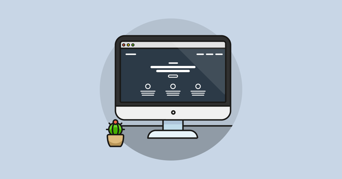
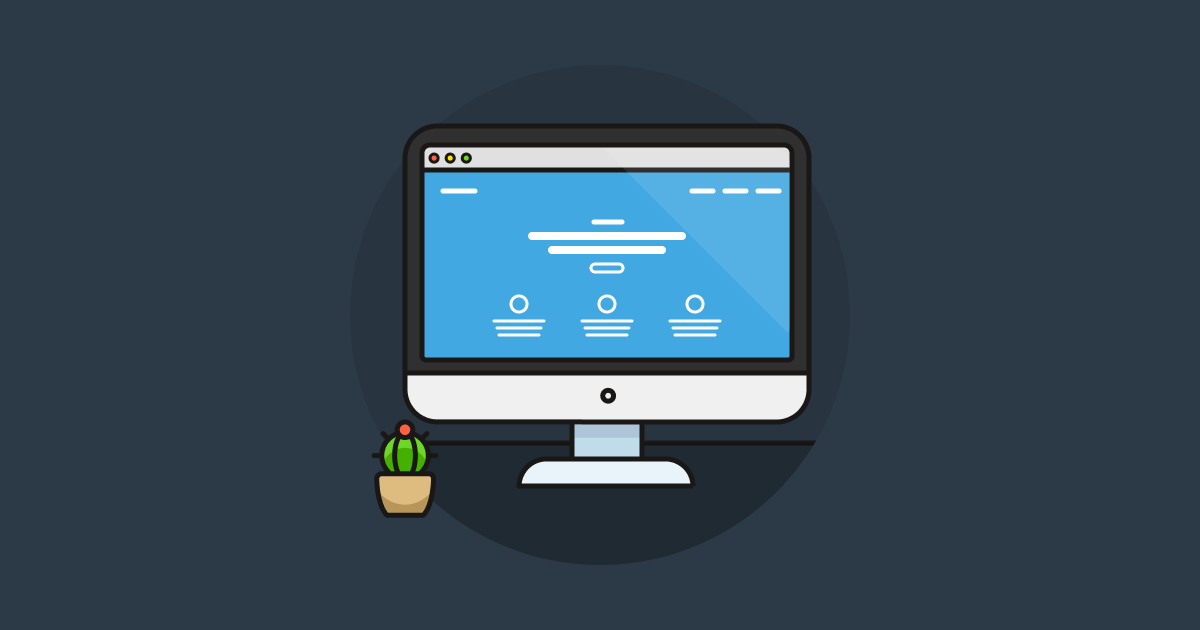
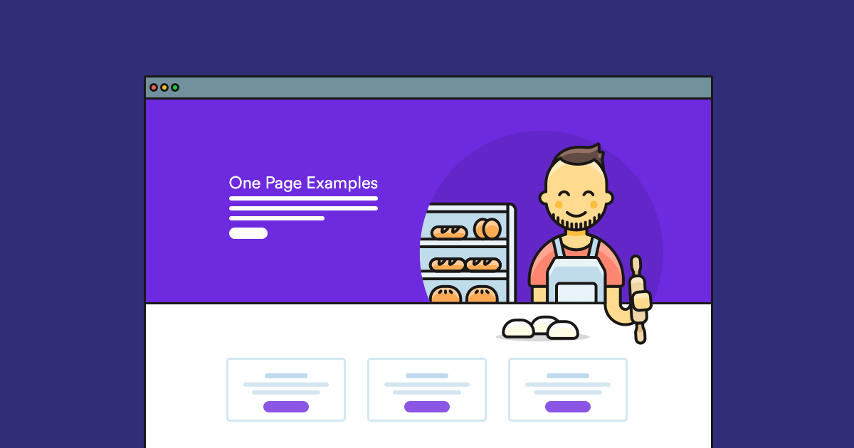
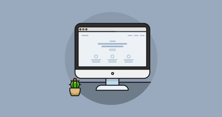
Light templates help create a minimalistic (in other words: modern-looking) design. So, it’s worth considering light colors for your website. Below I’ve collected 13 light template examples for inspiration. If you like any of them, you can import them into Smart Slider with a click of a button.
1. NextChat Block
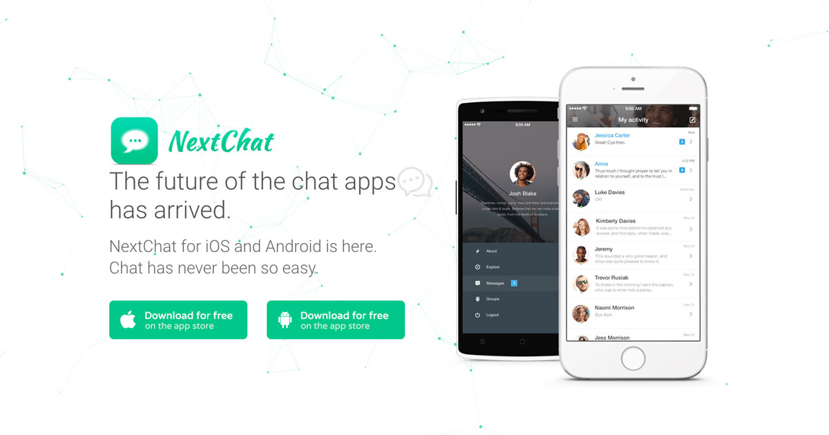
NextChat block is the classic example of using a light template to help other colors shine. In this case, the white background and the darker gray text help highlight the green buttons.
2. Boxed Product Slider
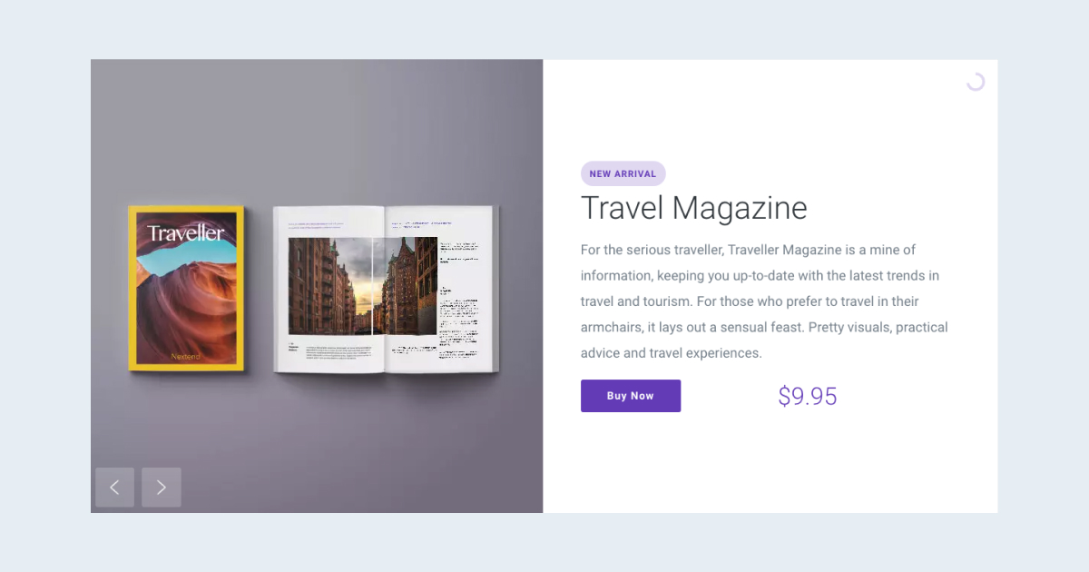
In this light template you can see gray texts on a white background. These color choices help make the blue CTA button stand out.
3. Healthcare
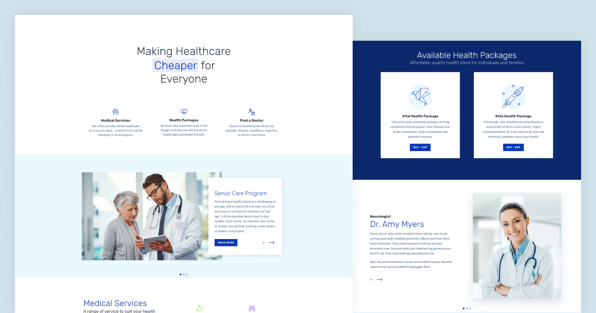
Hospitals often have white colored rooms and doctors wear white clothes for the sense of sterility. Blue promotes trust and dependability. As a result, blue and white color combinations are great for healthcare websites.
4. Post Carousel
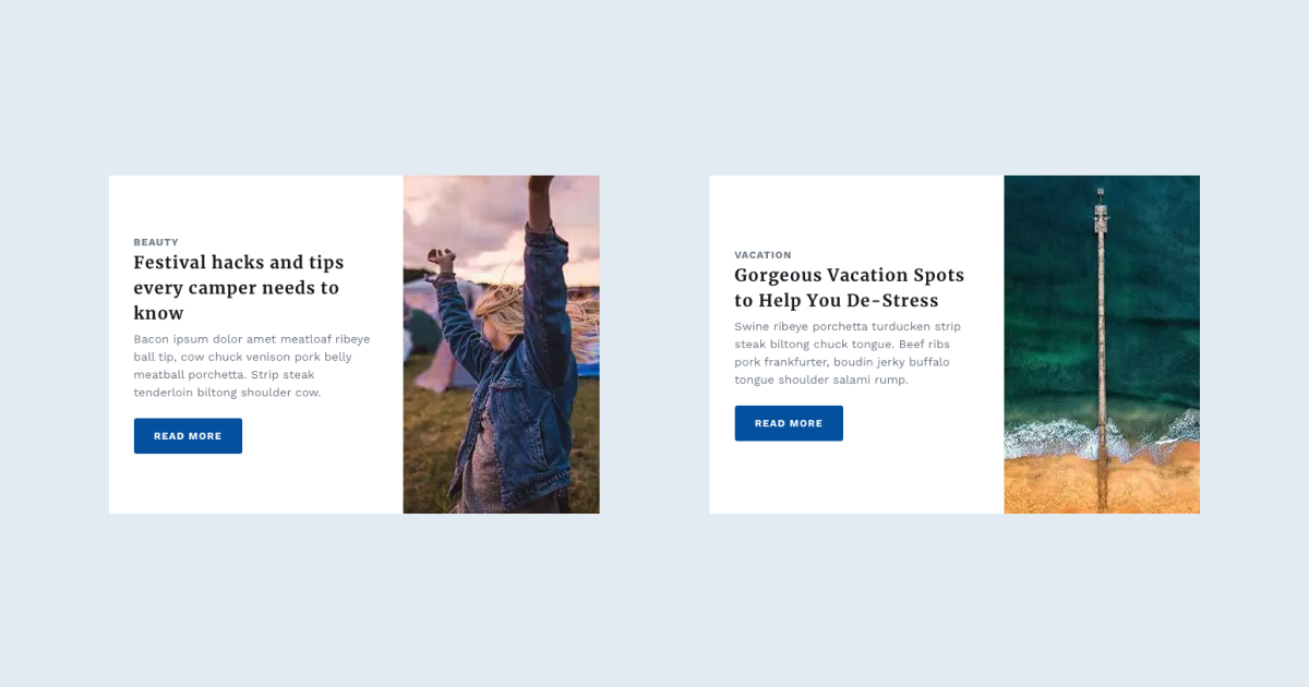
What makes this template stand out is that it uses a light gray background for its content and a white background for the texts. This practice increases legibility and white also highlights the content area.
5. Career
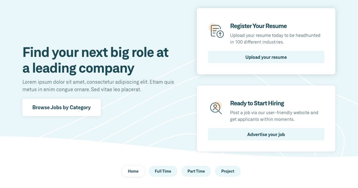
The base of this light template is a light blue color. It uses the white color for a few different purposes. First, to create high contrast between text and their background. Second, it’s a highlight color for the button and bullets. Additionally, the animated Shape Divider is also white.
6. Coming Soon
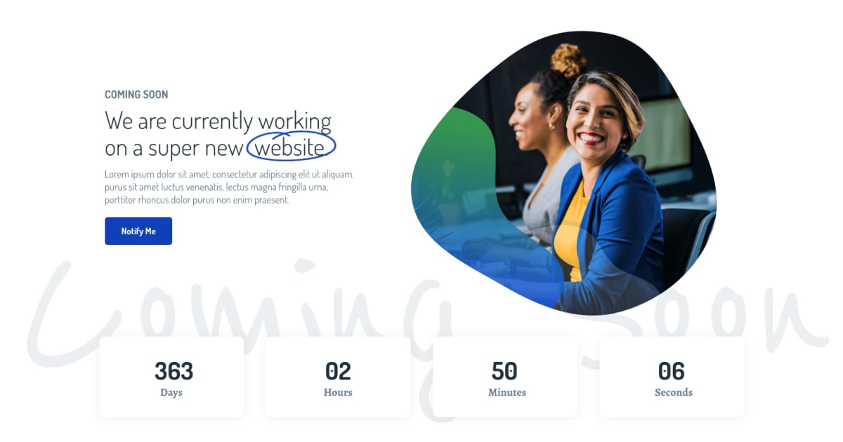
This template has excellent contrast between its background and textual content. The background is white, and the texts are darker shades of gray. As a result, there’s enough contrast and the content is easy to read, making this a great light template example. The blue colors also work great to highlight content.
7. Product Compare
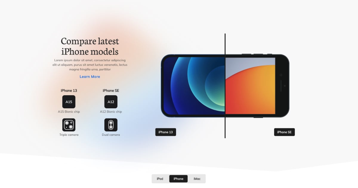
This template uses blurred light colors in its background and high contrast dark colors for its texts. It also has a white Shape Divider to make it look even lighter.
8. Post Slider Showcase
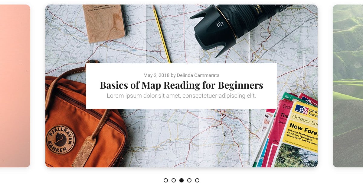
This light template is a great looking black and white template. The only colors are coming from the images. In fact, the images on the sides are semi transparent, so they look even lighter. The backgrounds are white, the texts are gray so they have great contrast.
9. 404 Illustration
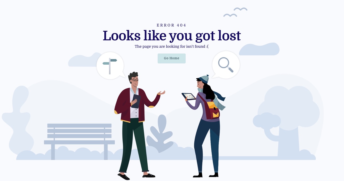
The base of this great light template has a light gray background with bluish-gray objects on it. The texts are dark blue so they have high contrast with the background.
10. Barber
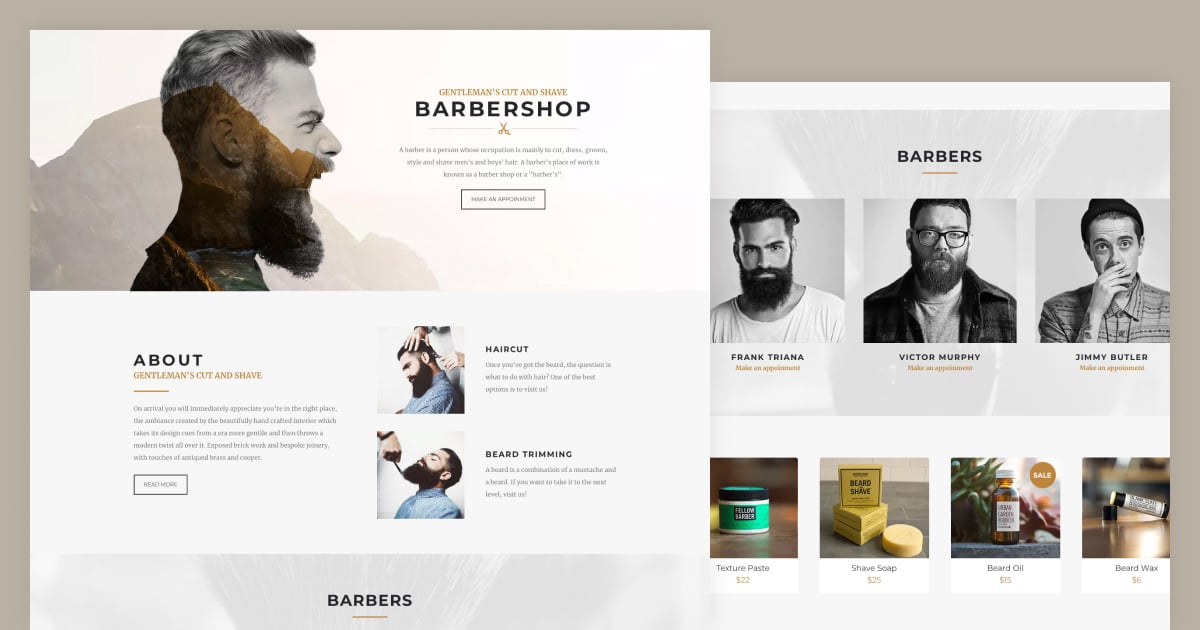
What makes this example a great light template is that it uses dark color texts on a light background. Additionally, it uses a gold highlight color to make some elements stand out.
11. Interior
This template uses a light blue background color. Its texts are darker bluish-gray shades which is nice for contrast. It also uses white color to create more contrast between the background and text.
12. Testimonial Showcase
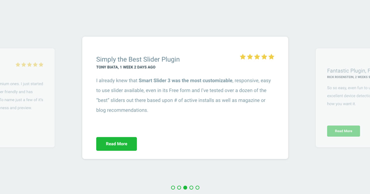
Gray and white are popular color combinations to create a light template. In this example the gray color is the main background. However, the textual content is on a white background which helps to increase the readability. Then there’s a green color to highlight the CTA button and navigation. So the neutral gray color and the blank white let the green take the spotlight.
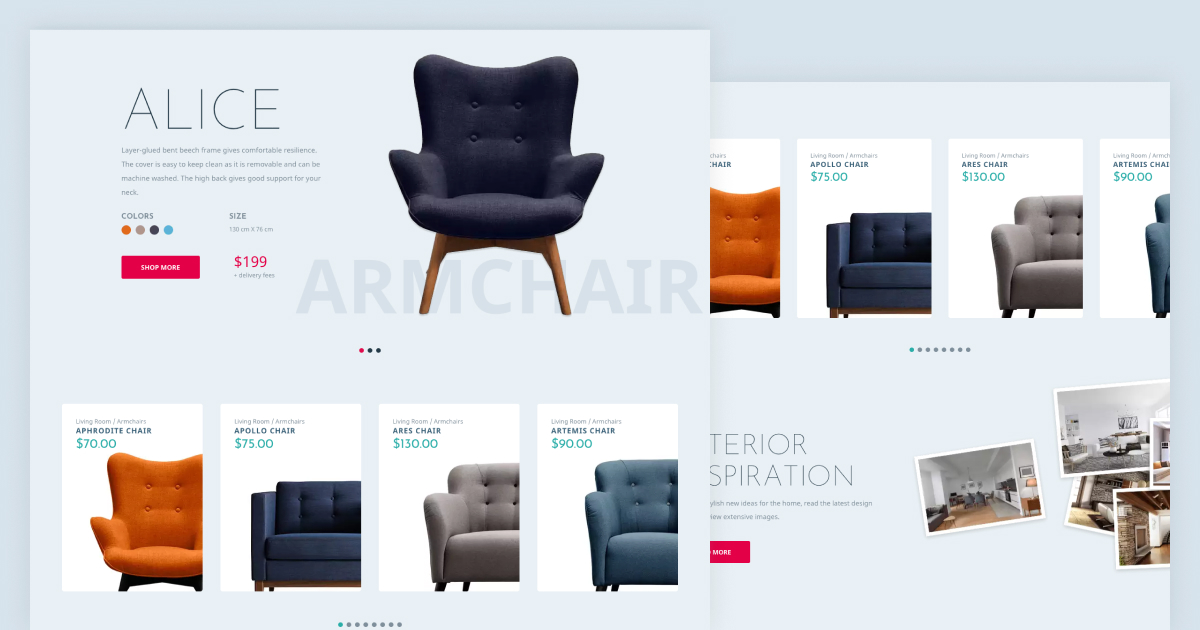
13. Full Width Product Carousel
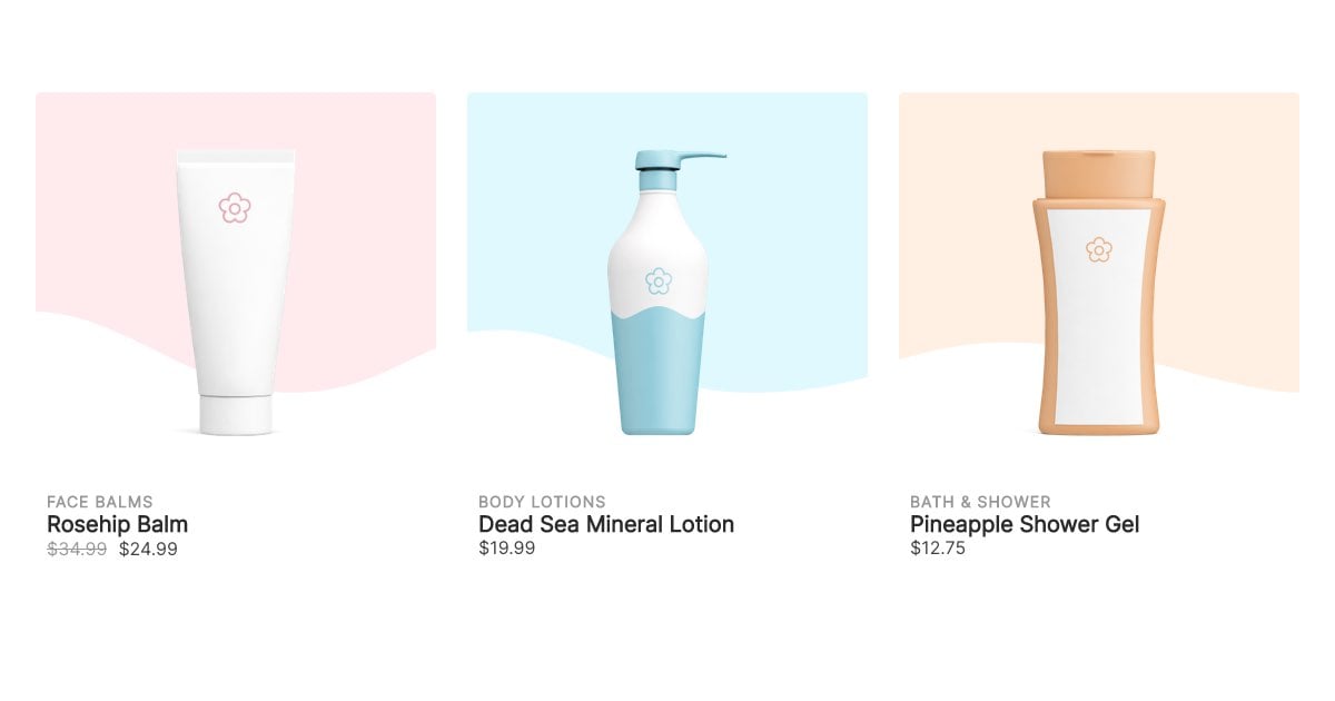
White and black (or dark gray) create great contrast. As a result, dark texts are easy to read on a light template. To make the products look more interesting, we highlighted each product image with a pastel color. These light color shades make the template look more interesting. Additionally, they keep the minimalistic look.
Conclusion
White background and black text make the text easy to read. It’s a simple and easy color combination that helps increase the readability of your site’s texts. Light templates often look minimalistic, and more importantly, modern. Visitors always like to see modern looking web pages, so it’s worth considering a light template for your site.