Black Friday Super Sale! 🔥 Enjoy a jaw-dropping discount of up to 50% OFF on all Smart Slider plans. Hurry, before the offer ends on November 29th!

Buy Now

Full Width Product Carousel

💻 Settings | 🎓 Layers | 🎉 Animations | 🏗️ Layout | 📱 Responsive | Speed

Description: The Full Width Product Carousel brings cool ideas to slider creation. Apart from displaying only products in your slider, you can enrich it with cool slides and offer discount, or showcase the product brand(s).

Premium: Gain access to all slider templates with a single purchase.

Minimum version: 3.5.1.3

Tags:

Slider Settings

The Full Width Product Carousel template is a full width slider which uses the Carousel slider type. Carousel sliders can display more slides next to each other which makes them perfect for creating product sliders. Each slide can display information about one product, so it’s easy to compare their details. Additionally, the full width layout allows many slides to fit next to each other on today’s large monitors, saving both space and clicks.

Visitors have three ways to browse the available slides. First, they can use the arrows on the sides of the slider. The arrows provide a convenient and easy to understand way to go through the slides one by one. Second, visitors can use the bullet points on the bottom of the slide to view whichever they like. Additionally, bullets are great way to show how many slides there are to see. The third navigation way is the drag navigation, which excels on touch screen devices. In this case visitors can switch slides by swiping.

Layers

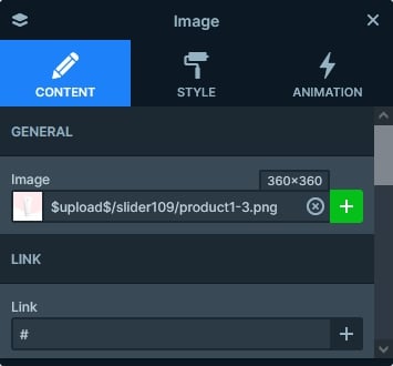
The base of each product slide is an image layer, which contains the picture of the product. Each image has the same size, which gives a consistent look to the slider.

The size of the image displays in the Layer Window

Apart from the image layer, there are heading layers on the product slides. These layers display the category, name and price of the product. There’s a CTA button on every slide, which prompts the visitor to buy the product.

Animations

The only animation on the Full Width Product Carousel template is the Main Animation that’s responsible for moving the slides during slide switching. It’s a horizontal kind of animation, which means it moves the slides on the x axis.

When you use the Horizontal animation, you can choose to switch slides one by one, as opposed to switching all visible slides together. Using the Single Switch option you can ensure that there won’t be lose slides, and the visitors will always see the same amount of slides. That is, if you have enough slides to create a full carousel.

Using the Single Switch option also introduces the possibility of using the Justify slides option, which decides how the slides are positioned inside the slider pane. There are three options to choose here: space between, space around and center. The Space between pushes the first slide to the left side of the pane, and the right slide to the right. The Space around creates an even amount of space on each side of the slides. The Center puts the slides in the middle, and their distance will be the set Minimum slide distance.

Justify slides: Space between (left), Space around (middle) and Center (right)

Layout

If you’re looking to create a product slider, you’re likely already have a webshop where your products are. The Pro version of Smart Slider allows you to dynamically create slides from your WooCommerce products. What does this mean? Simply, you won’t need to add the product details to the slides manually, and maintain them in two places. Instead, the slider will automatically pull the data for you. What’s more, you can create a dynamic product slide based on any of our template sliders.

What makes the slider interesting is that the layout of certain slides varies. Smart Slider allows you to give each slide a different layout within the same slider. So you can bring your creative ideas to your carousel with ease. For example, at this slider the second slide contains a newsletter subscription card. The fourth slide is a testimonial slide, which can help convincing your visitors to buy from your store. The 8th slide contains a discount offer, which is another great way to make your full width product carousel more interesting.

Responsive

The Carousel slider type’s responsive behavior is rather simple. It displays as many slides as can fit into the current slider size. The slides are not resized until the last slide can’t fit anymore. For example, if your slides have 400px width, then they’ll always have this 400px width until the screen gets smaller than 400px.

Spacing on mobile made by the Side Spacing

If you check the Full Width Product Carousel on mobile, you’ll notice that it has equal spacing on each sides. That happens because of the Side Spacing option, where you can set the space between the slide and slider on each device.


Related Post: Do you Need a Product Slider for your Webshop? Yes, you do!

Related Post: All You Need To Know About Carousel Slider Type