Colors can play an important role in how people recognize your brand (or website). Colors can help invoke many types of feelings and emotions in your visitors. If you use the correct colors you can boost your conversion as well. In this article we’ll see what kind of feelings and emotions are linked to a dark template.
Meaning and psychology of black
Color psychology studies the colors in relation to human behavior. It focuses on determining how different colors affect our decisions. For example, to see whether a color of an icon makes it more likely for people to click on it. Each color has a different meaning which explains why we prefer certain colors over others.
The new way to build a Slider
Next generation visual editor, customizable animations & effects, and access to hundreads of premade templates.
Black color symbolizes mystery, power, elegance and sophistication. This makes black a popular color choice in retail. For example, some popular brands like Nike or Chanel have black logos. Additionally, black is an easy to read color which makes it a popular text color on the web.
However, black is often associated with negative emotions. Throughout history, this color has been tied to death. As a result, it tends to invoke negative feelings, such as fear and sadness.
Why do people use dark color schemes on the web?
When it comes to web design, designers use the black color in a huge variety of dark shades. Often designers don’t use a “full” black color, but rather a dark gray or dark blue shade. Dark templates help reduce the intensity of light made by the device screens. As a result, it can be more comfortable to browse dark websites.
Dark templates help improve visual ergonomics as they reduce eye strain. Additionally, it makes browsing in a darker room more comfortable. That’s because the brightness of the screen is closer to the current lightning conditions.
When you create a dark website template, it’s worth it to decrease the brightness of the images a bit. As a result, visitors will be able to look more comfortably at the pictures when they’re on a dark background. In fact, a bright image on a dark background can cause heavy contrast. Therefore, it’s less comfortable to look at these images.
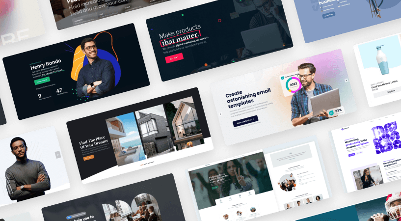
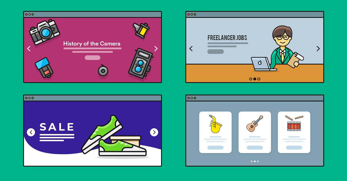
8 dark templates for your website
Creating a good dark website is not an easy task. I’ve collected 8 dark templates for you to get inspired. Download Smart Slider Pro today and get access to all these templates immediately.
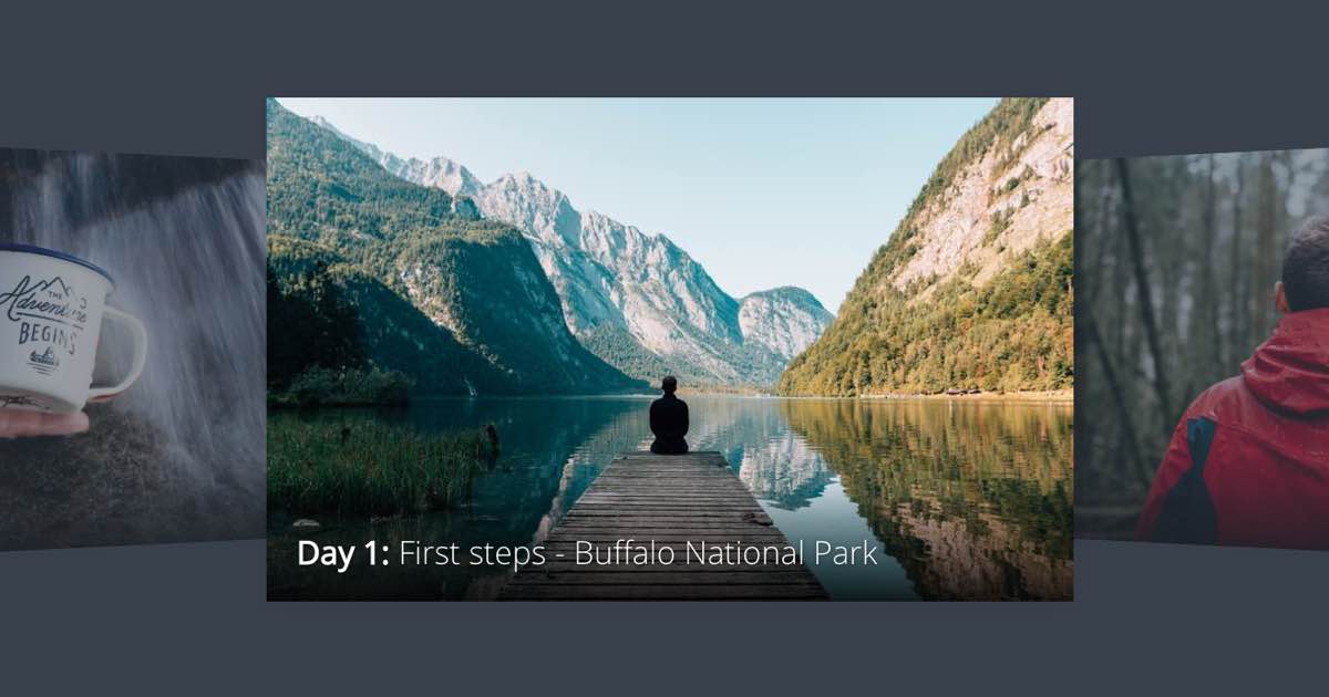
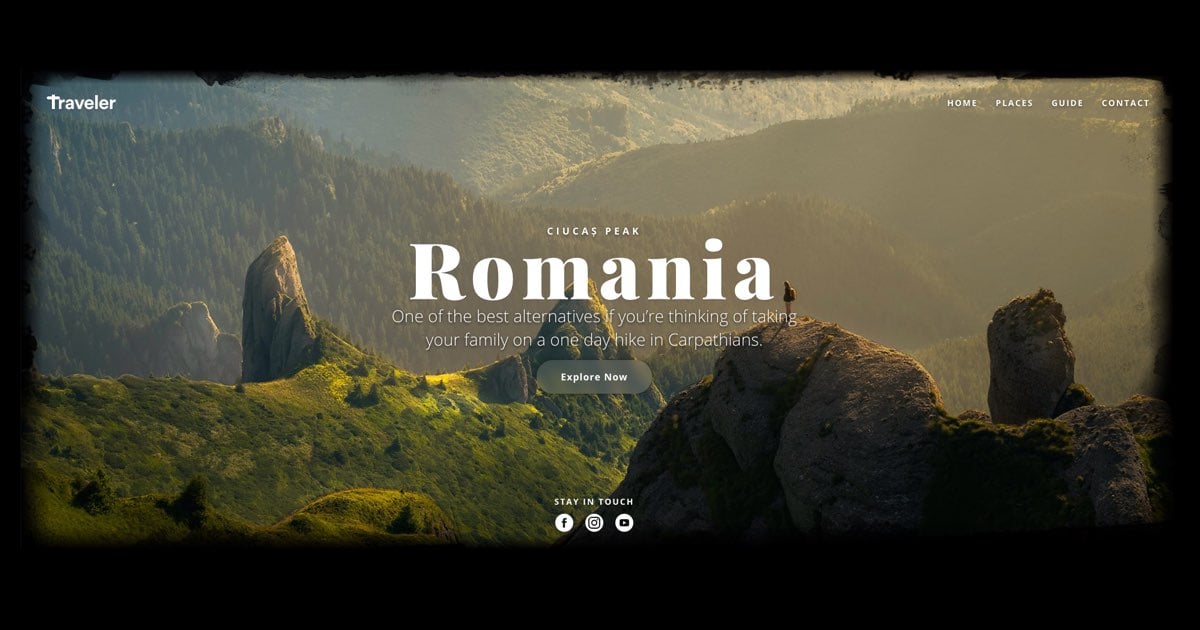
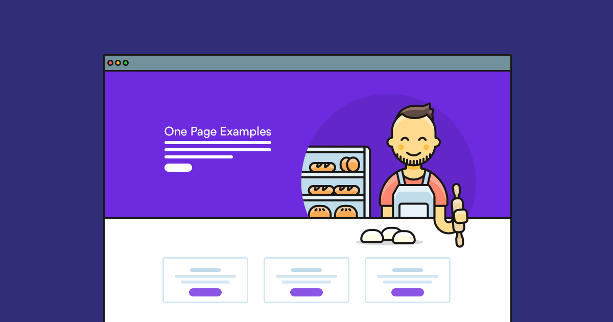
This template uses a darker shade of green as its main color. Its featured image, which you can see in the middle, remains light. But the other images are slightly faded into the background. What makes Coverflow a great dark template example is that it has a nice contrast between the background and text.
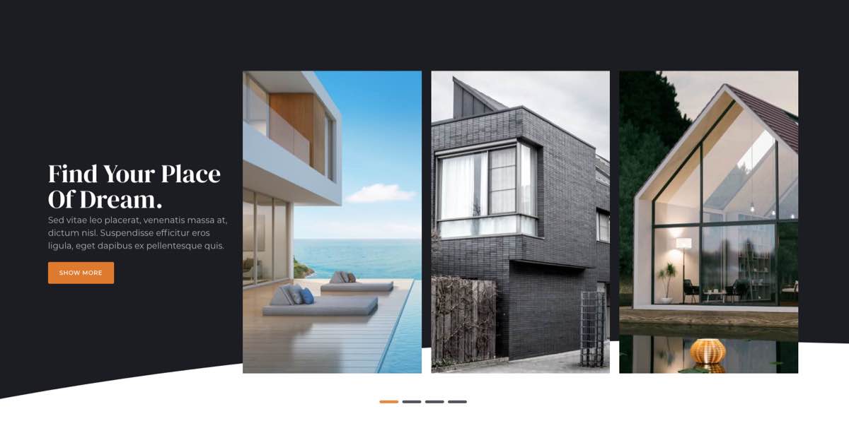
This slider makes a good dark template because of a dark-blue overlay on its background image. This makes the image lose its light colors and create a good contrast with the text.
One of the best practices of creating a dark template is using white color for headings, but using a shade of gray for longer texts. White color tends to create too high contrast with dark backgrounds. As a result, long white colored texts are more tiring to read on a dark background. This template shows this practice in an excellent way. It also introduces a lighter shade of green as an accent color.
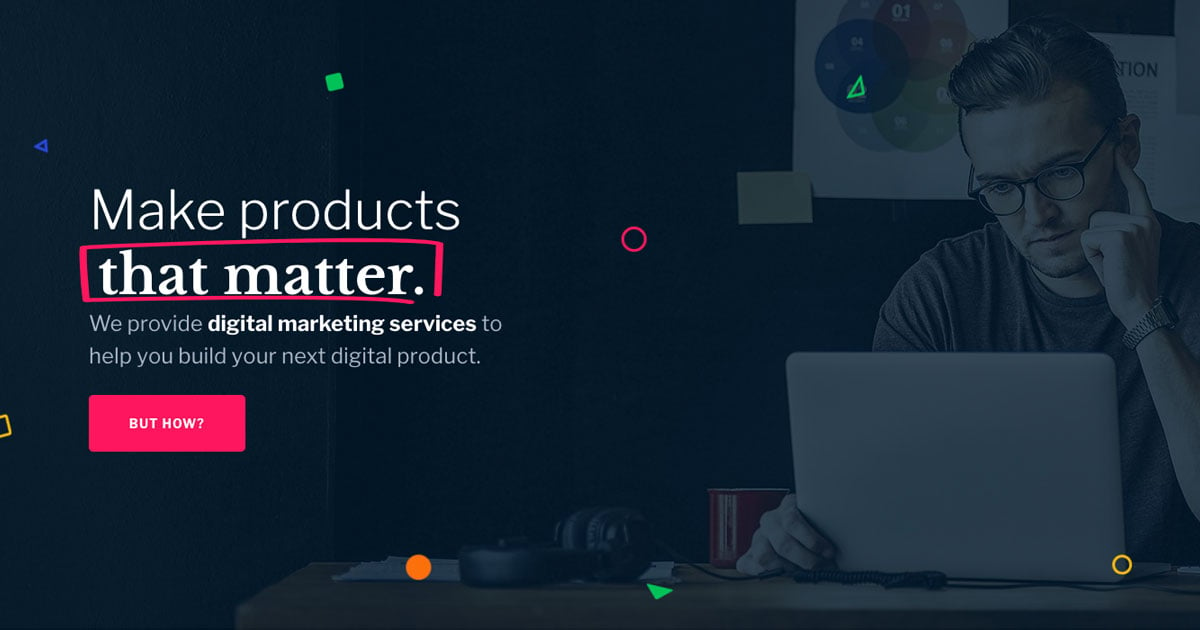
This template uses a dark blue shade to create high contrast between its light texts. So, it’s super useful for dark websites. Apart from the light text colors, it uses a bright pink accent color to get more attention.
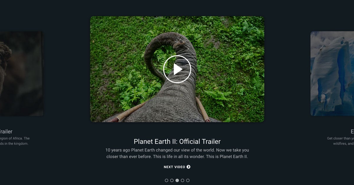
This template has a black background and a special image that looks as if it faded into it. Although the image is not darkened, it still allows lots of contrast with the white text colors.
Another great template that uses a dark shade of blue. This shade provides high contrast between the text and background. Additionally, a dark gray shade appears on the side, where the thumbnails are.
This dark template slightly sticks out from the others. While it uses a dark gray shade as its background, it also has a white Shape Divider at its bottom. This gives the template a large white shade which might be unwanted for a dark website. Great news, though: you can remove the Shape Divider with one click.
Another slider that uses a very dark blue shade as its background. It keeps the image light, creating high contrast between the back and foreground. At the same time, it fades the images on the slides into the background, lowering their light color.
Get on board! Join our 142,416 subscribers!
Get our latest news, tutorials, guides, tips & deals delivered to your inbox.
No spam. No charge. Just curated emails.
Conclusion
Dark templates help make the web a more eye-safe place. They make pages more comfortable to the eyes especially when the light conditions are not that ideal. So, it’s worth creating a dark website template. Just make sure you provide enough contrast between the background and foreground.
Hi, I’m Ramona and I’m a member of Nextend‘s awesome support team. You’ve probably chat with me if you’ve submit a support ticket. When I’m not answering support emails I read a book or go cycling. I enjoy writing as well, both for our blog and for my private projects.