Settings
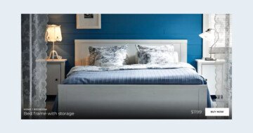
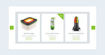
Top 5 Products slider is a modern slider for your website to highlight your products or services. It uses just the right amount of effects to make it interesting for the visitor.
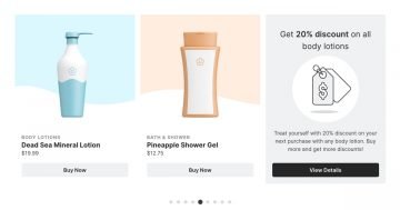
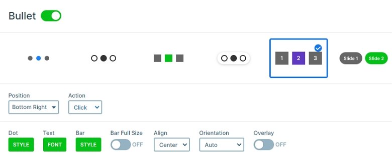
There are more ways which you can navigate between the slides. You can click on the arrow image on the bottom which goes to the next slide with a link action. You can drag and you can use the number type bullets on the bottom right corner. These bullets are fully customized for this layout, but you can also customize it at the style and font settings by clicking on the green buttons at the Slider settings → Controls.
Layers
There are more kinds of layers visible on this slider: there is a button on the top, then heading and text layers come, and under that you can see 2 button layers. Probably the most noticeable part of the Top 5 Products slider is the gray CTA at the bottom. This large CTA stands out of the other content of the slide. Additionally, it also gives an idea about the upcoming slide content. People are more likely to click on a button, when they are fairly certain what to expect afterwards. So this CTA helps to increase your click through rate.

Animations
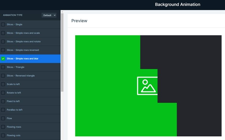
Top 5 Products slider uses a couple of trendy effects which are available in Smart Slider 3. A really cool effect is the “slice” background animation. This effect looks like the reveal layer animations, but it affects the slide background images instead of the layers.
Layout
The Top 5 Products slider showcases many amazing features of Smart Slider 3 Pro. The slides themselves were built using default positioning, Smart Slider 3’s unique way of editing. In default position you can build your content using structures, such as rows and columns. The building is fast and easy, and the responsive result is amazing.
Using a full page slider is a popular design choice amongst website designers. A full page slider fills the whole browser viewport both vertically and horizontally, and the result is amazing. Full page sliders are really versatile. You can actually use them to fulfill any purpose, such being a hero header, or part of a landing page. The Top 5 Products slider you can see above is just as versatile as any other full page slider.
Responsive
The slider has lots of content on the desktop, but if you display all of these on smaller views, then the slider will be too tall, and crowded. To avoid this you can hide layers which content isn’t too important, like the content of the next slide, instead of that the arrow is bigger, and more touchable.
Related Post: What is a Full Page Slider and How to Use it?
Related Post: Do you Need a Product Slider for your Webshop? Yes, you do!


