

Settings
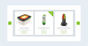
The Product Slider is a boxed slider, so it fits well in your posts or pages, because the slider can be as big as the container it’s in. You can use it as a static slider, so you can display your products, but with Smart Slider you can create a dynamic product slider as well.
Layers
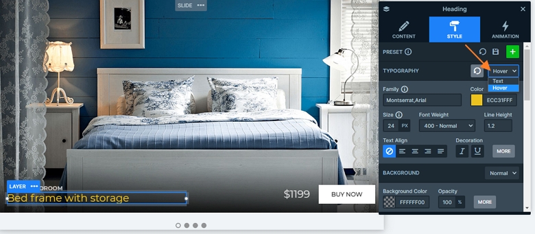
The slider has layers on the bottom of the slides. You can find basic layers on the slider: headings and a button. If you check the big heading, you can see it has a yellow hover color. You can change this color in the Style tab of the layer window at the typography.
Animations
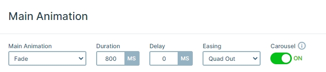
When you switch a slide, you can see the next or previous slide fades in. This animation is the main animation of the slider which you can change to horizontal or vertical in the Animations tab of the Slider settings.
Layout
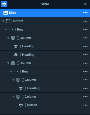
Each slide has the same layout. There is a row with 2 columns. The first row contains 2 heading layers, and the second column has another row on it. This row also has 2 columns, the first has a heading, and the second a button layer.
Responsive
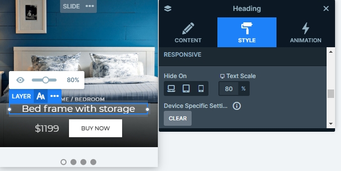
If you check the slider in tablet or mobile, you can see it is fully responsive. The main row wraps after 1 column on mobile, so the content has enough space, and the texts are legible. The texts are also smaller, which you can customize with the text scale option.
Related Post: Do you Need a Product Slider for your Webshop? Yes, you do!