Settings
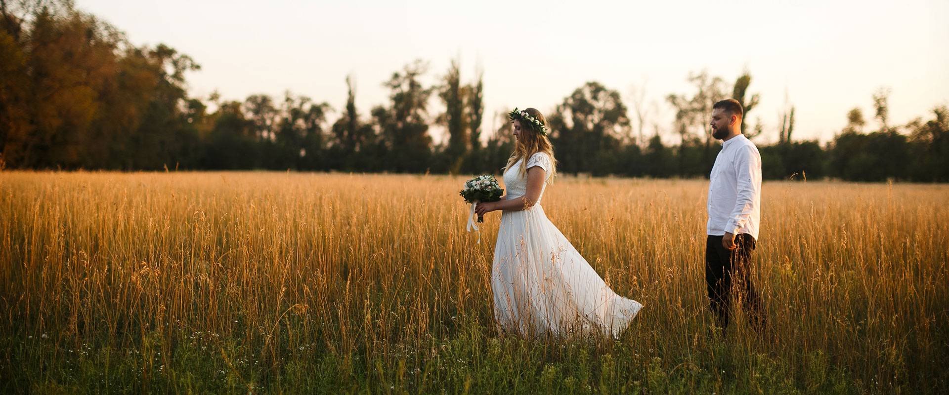
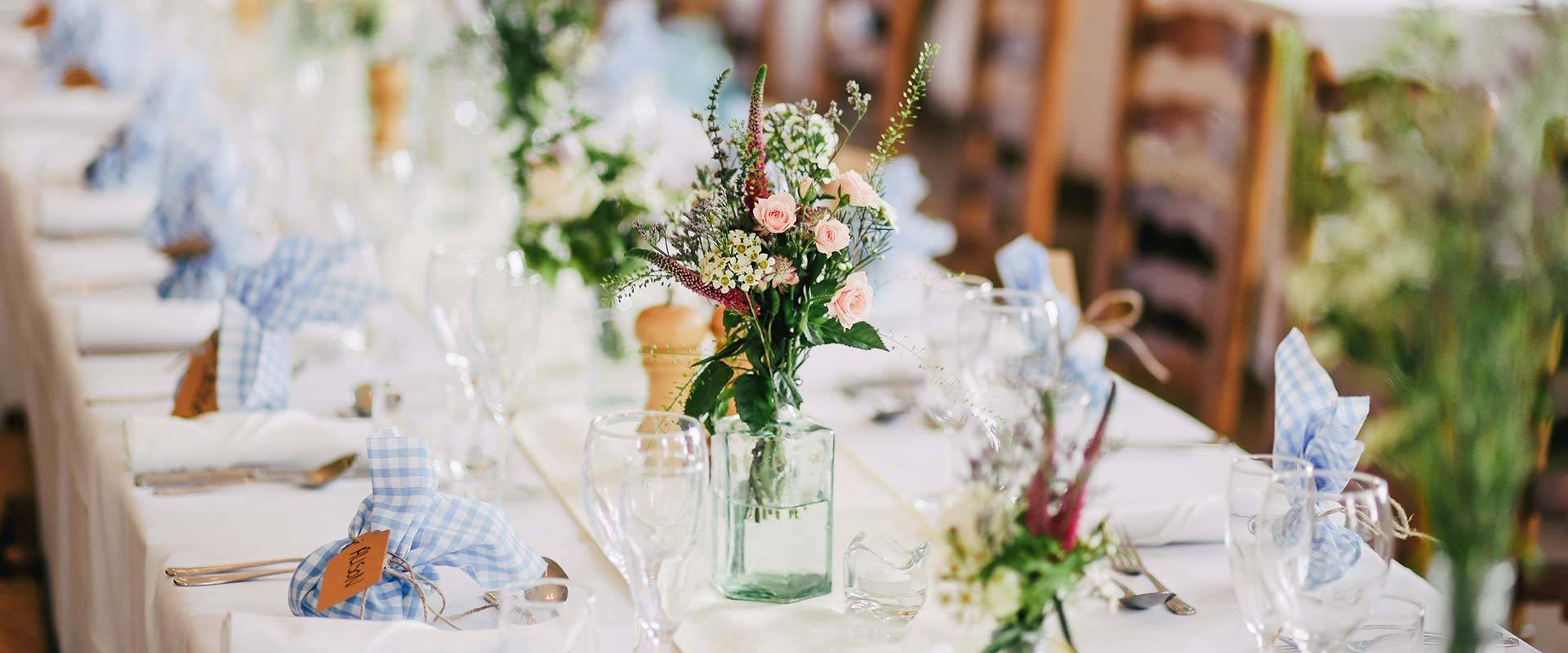
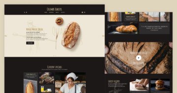
The wedding page group stays from 6 sliders. The first is an autoplaying slider with a static overlay and navigation. The second and third sliders are blocks, so have only one slide in the slider.
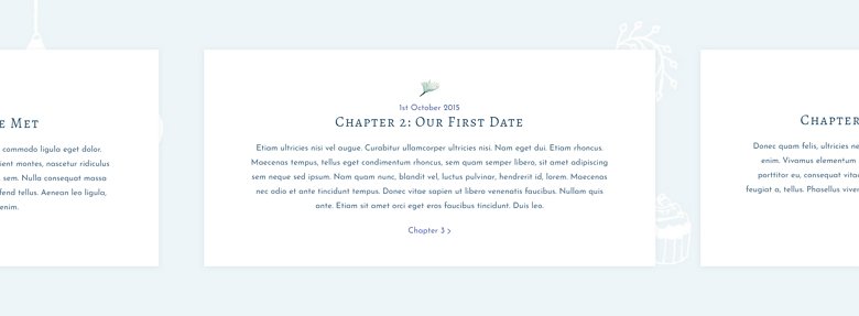
The 4. slider is a showcase type slider. Showcase sliders need a certain amount of slides to create a full carousel. Since this slider has only 3 slides, the last slide can’t appear on the left side of the first one. This creates an interesting effect, which is great for story telling. And the last 2 sliders are also blocks, and have a special layout.
Layers
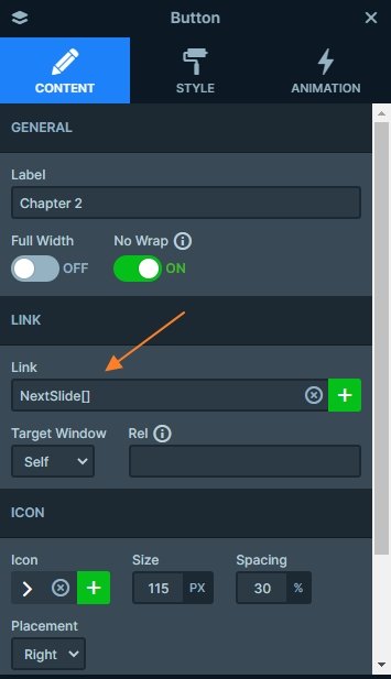
The wedding slider group stays from basic layers like headings, texts, buttons and images. Since these sliders are together, they should have used the same styling and matching colors to keep the harmony. There are more layers with a link which you can navigate to the next slides thanks for the link actions.
Animations
When you load the wedding page, you can notice a lot of animations on it like layer animations, or the Ken Burns effect. The Ken Burns is a panning and zooming effect, and it is simple, elegant and works on any kind of images.
Layout
The Wedding Gallery slider’s layout looks beautiful and unique. What makes it special is the row with the small images, which break out of their grid and cover a part of the big image on the left. Creating this layout is quite simple.
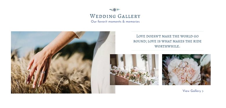
Create a row with two columns.
- Put an image layer on each column and select the image you want to display.
- Remove the paddings from the columns and row. (Press and hold the Shift key to adjust the paddings on the opposite sides, too.)
- Select the row and add a top margin on it. This slider has 20px top margin.
- Give a negative left margin to the row. This slider has -80px left margin.
Responsive
The slider group is fully responsive, and looks good on any device. Showcase sliders have special responsive behavior. You can set a size for the slider itself, and one for the slides inside. Thanks to this, you can control the amount of slides that will show up in your slider. For instance, if you set your slider size to be 1500px wide, you can make 3 500px wide slides appear with 0px slide distance. Being able to specify different slider and slide sizes creates many possibilities for your slider.
In this example, we took advantage of another great feature, the Maximum slider height. This setting prevents the slider from getting taller than the set size. We set it to 700px, the same as the height of the slider, which means as the slider gets wider, more slides will be visible. This setup is close to the best way to set up a showcase type slider.
Related Post: How to Create Beautiful WordPress Landing Pages That Convert
Related Post: Why do You Need a Video Slider on Your Website?
Related Post: Use the Popular Ken Burns Effect on your Slider


