Slider Settings
Creating beautiful sliders in Smart Slider can often result in having many sliders on your dashboard. To help you organize the sliders you made, you can create Slider Groups and place sliders inside them. Slider Groups are like folders: they help categorize your sliders, making it easier to find the one you’re looking for. Additionally, groups can help simplify the publishing process. Instead of having to publish all sliders one by one, you can publish the whole slider group.
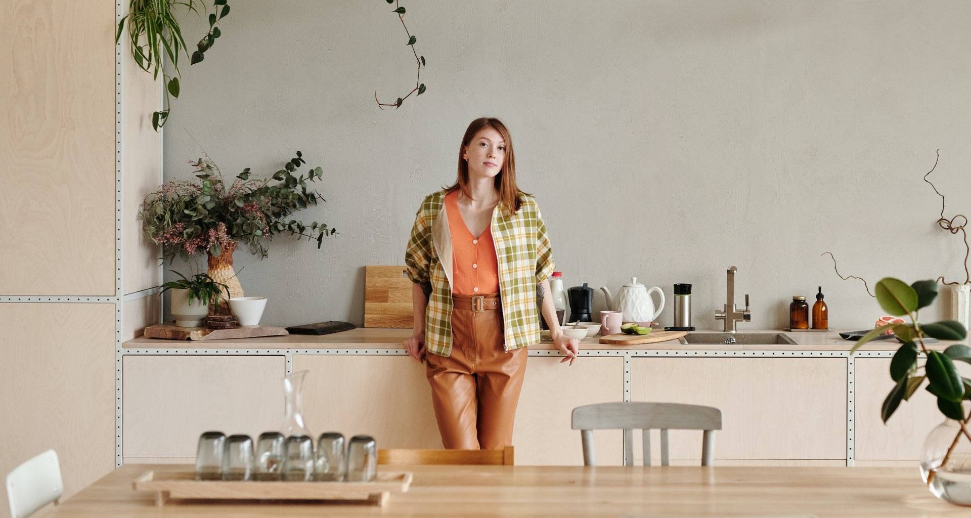
The Vlogger template contains 4 blocks in a slider group. Blocks are special slider types in Smart Slider. They’re not exactly sliders, as they don’t slide, since they can only display one slide. Think of blocks as sections, where you can use Smart Slider’s features, without having to create an actual slider. Most blocks in the Vlogger template are full widths, but the third one is a full page block. As a result, it fills the whole browser window both vertically and horizontally.
Layers
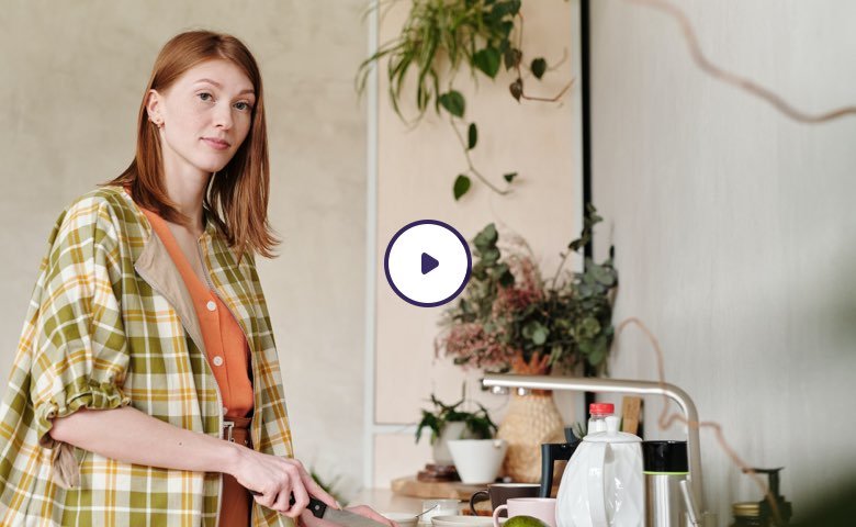
The Vlogger template is full of interesting layers. Even in the first block you can find two interesting layers: a video and an input layer. Of course, you can find the common layers in this template as well. There are headings, texts, CTA buttons and images on most slides.
Videos are great storytelling tools at your disposal. They help introduce your brand or product better and deeper than static images could. So, it’s a good idea to use a video on your website. The video we use at the first block starts automatically, immediately capturing the attention of the visitors. Also, it pauses when they scroll away, so they can continue watching it where they left off.
Animations
There are cool layer animations on most of the layers at each block. For example, at the first block the headings on a yellow background, the input and video layers show up using the Reveal layer animation. The Reveal animation is a special kind of layer animation that animates a solid background before revealing the content of the layer. This effect looks trendy and modern, and suits well on today’s sites.
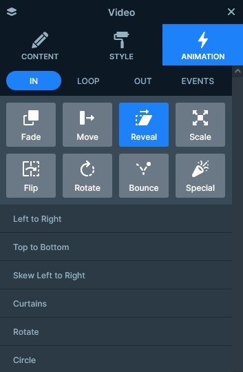
The other kind of layer animations you can spot is the Basic Animation. It’s not as fancy as the Reveal animation, as it simply animates the layer it was applied to. On the first block you can spot this animation on the first and last text layer.
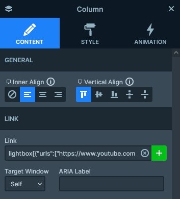
At the second block you can find a nice lightbox, which displays a video from YouTube. Adding a lightbox is easy in Smart Slider. First select the layer that you want to click on to start the lightbox. Then click on the + sign at the Link field and go to the Lightbox tab. Finally, enter the link of the video you want to show in the lightbox. At the second block, the lightbox is added on the column that contains the image and heading.
Layout
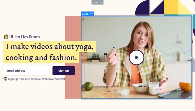
The most interesting layout is the broken grid-like layout in the first block. The yellow heading slightly covers the video layer next to it. This happens because of the negative left margin on the video layer.
Responsive
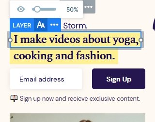
Smart Slider is a responsive slider for WordPress and Joomla. It offers many great tools to fine-tune how your sliders look on small screens. For example, you can hide layers, or change the font size on mobile. For this, simply use the Font resizer.
Related Post: How to Create Beautiful WordPress Landing Pages That Convert
Related Post: 12 Stunning One Page Examples Which You Should Check

