Nowadays people browse on their desktop computers, laptops, mobiles and tablets. They have different screen sizes so your website needs to adapt to any size. Unless your visitors can find what they look for on your WordPress website, they’ll leave. If your website looks bad on the visitor’s device you can lose a potential customer. Not only do you need a responsive website, you need a responsive WordPress slider as well. Luckily, Smart Slider 3 is a great tool to create beautiful and fully responsive sliders.
How to make a responsive WordPress slider?
The easiest way to create a beautiful responsive WordPress slider is via Smart Slider 3. Even the free version allows you to create sliders which look perfect on mobile. Once you finish creating your slider you can easily add it to your website using its shortcode.
You need to decide what kind of slider you need. Should it be a full width or full page slider?
Think about the layout of your slider. What kind of content will your slider have?
Create the slider using Default layers, in desktop view.
Use the device icons and switch to tablet and mobile view and check your slider.
Use the font size modifier if needed, to adjust the font sizes for a better look.
Hide unnecessary layers on mobile or tablet.
The new way to build a Slider
Next generation visual editor, customizable animations & effects, and access to hundreads of premade templates.
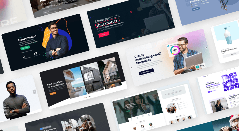
Smart Slider 3 is a responsive slider plugin for WordPress which you can use to add sliders to your website. The user interface is easy to learn and there are many slider settings which let you fine-tune your slider. Smart Slider 3 supports adding image and video slides as well. The slider is SEO friendly, so when you add images, you can give them alt and title text. For rich media support, you can add YouTube and Vimeo videos, and in the pro version, MP4 videos as well.
Layouts in Smart Slider 3
Here’s a few things to consider before you start making a responsive WordPress slider. First, you should think about how you want the slider to behave. It should be responsive, of course, but what more? Do you need the slider to be full width or full page, or should it fill the area where it is in and nothing more?
Smart Slider 3 has 3 different responsive layouts: Boxed, Full Width and Full Page.
Boxed Layout
A Boxed slider has a simple behavior: it fills the container where you’ve placed it. For instance, if you put the slider to your post content, it will be as wide as your post area. This way your responsive WordPress slider does not break your theme’s layout.
Today, most layouts are full width, but you can still find a couple of boxed designs. These sliders are great for a boxed layout, as they fits into its container. This responsive layout is the best for adding a slider to your WordPress post.
Full width layout
A full width slider fills the total width of the browser, even if its container does not. What’s so great about these sliders is that they have plenty of room. There’s enough space to put the content and the visitor can enjoy the background, too. Most themes feature a slider on their homepage, and this slider is usually a full width one. This makes them the most popular sliders around. If you check out a few full width sliders, you’ll understand why: they look gorgeous inside any theme.
Full width sliders are great for pretty much any purpose. Whether you want a post slider, a hero slider, or a simple image slider you can’t fail with this mode. The best part is, you don’t need to buy the pro version to create full width sliders with Smart Slider 3.
Full page layout
Full page sliders fill the browser width and height on every device. On desktop screens it gives you lots of space to place your layers, which is great. The problem width full page sliders is that their mobile size is short and narrow. On such a small size, there isn’t enough space to add more than a couple of layers.
Full page sliders are great for hero sliders. You can also take advantage of their greatness if you decide to create a landing page. This layout is available in the premium version of Smart Slider 3 only.
Get on board! Join our 142,416 subscribers!
Get our latest news, tutorials, guides, tips & deals delivered to your inbox.
No spam. No charge. Just curated emails.
What are Default layers and how to use them to make a responsive WordPress slider?
Default layers provide a unique editing experience for Smart Slider users. Such layers are not available in any other responsive WordPress slider plugin. When you use Default layers, you can work on your slide as you would use a page builder. You can create rows with columns and place layers or other rows into the columns. Layers have connection to each other and align themselves based on their surroundings. For instance, put down a heading layer and place a button below. As you write more text to the heading layer, it pushes the button down. This behavior prevents the text ending up on top of or behind the button.
Creating a responsive WordPress slider using Default layers can seem hard at first glance. Default layers don’t allow the free positioning what most people are used to. It’s crucial to understand how it works and get used to thinking in structures. You need to spend some time to learn, but after you know the basics, you can work faster and better in this mode.
The basic responsive behavior of Default layers
We’ve created Default layers with the purpose to help you reduce the time spent with the slide editing. Structures let you work faster and more precise. The best part of working with Default layers is that when you set them up properly, it’s unlikely to get bad results on small screens. There’s a constant font size on each device, which makes sure the texts are legible on mobile.
The layers can adjust their position based on their surroundings. Additionally, Default layers layers will always fit the slider. When they need more space, they make the slider bigger. Rows wrap each column after the other on mobile to create a more mobile friendly layout.
Creating a responsive WordPress slider with Absolute layers
If you’ve ever used any slider plugin, you know how Absolute layers work. They’re based on simple drag and drop editing, which lets you put the layers anywhere within the slide area. The upside of Absolute layers is that t it looks easy and takes almost no time to learn. The downside is that the more layers you add the harder it will be to make the slider responsive.
Absolute layers have no connection to each other. Let’s say you have a heading layer and a button below then add more text to the heading layer. The heading layer won’t push the button below to make more space for itself. As a result, it can cover the button or move below it depending on the layer order.
The basic responsive behavior of Absolute layers
Absolute layers work on a very simple responsive idea: they scales with the slider. If you make the slider bigger, the font sizes and images will grow larger. If you make the slider smaller, the text and images will shrink. This means the text can get tiny on mobile, and lose their legibility. Since the layers have no connection to each other, they’re likely to overlap.
Tools that help you create a responsive WordPress slider
Smart Slider 3 has many useful tools to make the most of the editing mode you’re using. You can use these tools to optimize your slide’s look for different devices. Let’s go through them so you can start creating your responsive WordPress slider.
1. Font size modifier
You can use the Font size modifier to adjust the font sizes for each device. For instance, if your texts shrink too much on mobile, you can make them bigger. This helps keep the texts legible on all devices.
Available in
Free and Pro version
Layer position
Absolute and Default
Use it to
Increase or decrease the font size for each device
2. Hide on devices
When you create a responsive WordPress slider for desktops, you can add lots of layers. But on small screens you probably don’t need as many layers. Using the Hide on devices feature you can disable any layer which you don’t need on any particular device.
You can use this feature to optimize your content for mobile in several ways. As an example, you can remove long text layer, or images that are only for decoration. Do you use layer animations on your slides? Lots of animations can be resource-heavy for mobile phones. You can hide the desktop layers, which have the animation, and create new layers for mobile.
Available in
Free and Pro version
Layer position
Absolute and Default
Use it to
Create device specific layers
3. Custom Slider size
Default layers can increase the size of the slider if your layers need more space. While you can set a custom slider size even if you have built your slide using Default layers, it’s not needed to create a proper layout. But if you’re working with Absolute layers, you might need to set custom slider sizes. The challenge here is finding the perfect size for your slider, which isn’t easy to figure out.
Available in
Pro version
Layer position
Absolute and Default
Use it to
Increase the slider size for different devices
4. Link layers together
Using the layer linking feature, you can link an Absolute layer to another Absolute or a Default layer on the same level. Linked layers keep the same distance, so you can make sure the layer you link to another stays where you put it.
Available in
Pro version
Layer position
Absolute
Use it to
Connect layers to each other
5. Nesting
You can place Absolute layers into Default rows and columns, which opens up many cool design possibilities. For instance, if you create a product slider you can up an “On sale” badge to the corder of the image by placing an Absolute layer above the Default image layer in the column where the image is.
Available in
Free and Pro version
Layer position
Absolute
Use it to
Create stunning layouts
Summing up
Creating a beautiful responsive WordPress slider can be a challenging task. Luckily, you can make your job easier in several ways. If you plan your slider before you start working on it, you can save yourself from lots of trouble.
You should also work with Default layers, to reduce the time you need to spend editing your slides. For adding content, you shouldn’t use Absolute layers, unless you definitely need to work with such layers. In that case, try nesting your layers. In any case, using Default layers will save you from lots of trouble in the long run.
Hi, I’m Ramona and I’m a member of Nextend‘s awesome support team. You’ve probably chat with me if you’ve submit a support ticket. When I’m not answering support emails I read a book or go cycling. I enjoy writing as well, both for our blog and for my private projects.