Slider Settings
The Sports Cars template is a simple slider, which displays one slide at a time. These sliders are super popular on websites, as they let the visitor focus on one message at a time. Additionally, the Sports Cars template is full page. A full page layout means that the slider takes up the available width and height of the browser.
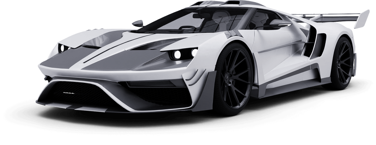
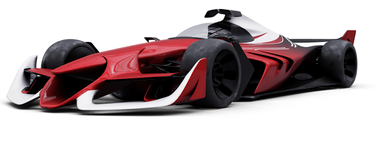
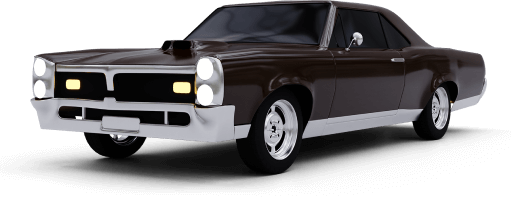
There are three slides to see in the Sports Cars template. They’re immediately visible thanks to the thumbnail control at the top of the slider. The thumbnails are great for navigation, as they provide a preview of the slide’s content before switching to it. As a result, they can encourage visitors to change slides. Due to their size, thumbnails are not always good for smaller screens. For this reason we changed the thumbnails to bullets on tablet and mobile devices.
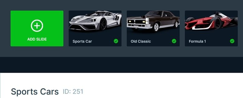
Behind the slide content there’s a slider background image, which has a radial gradient. Slider backgrounds are behind all other slides in your slider. So if you want to see them, it’s worth creating the slides without background, or with a semi-transparent color.
Layers
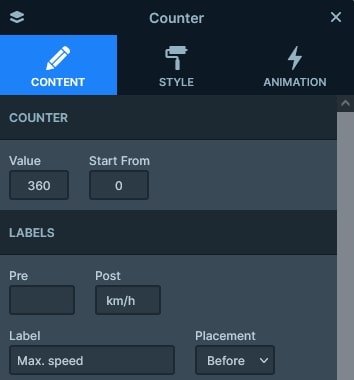
Most of the layers you can find on the Sports Cars template are basic layers. There are images, headings and texts which let you create your slide content easily. However, there are some super interesting counter layers on each slide. The counter layer is a special kind of layer where you can set a starting and a finishing value and it will count up or down from the start value.
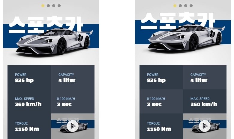
The bottom contains a 6 column row, and the last one has a lightbox that opens a video.
Animations
You can find a couple of layer animations on each slide to make them more outstanding. In fact, you can add a layer animation to any layer on your slide. For example, in this template there’s a layer animation, an image and a row as well. If you add a layer animation to a container (like a row or a column) then everything inside the container will be animated.
Apart from the layer animations, the template also uses the layer parallax effect. The layer parallax effect is similar to the background parallax, but in this case it moves the layers based on the movement of the mouse. So, if you move your cursor above the slider from left to right, then the layers will try to move away from it.
Layout
The Sports Cars template uses some cool layout solutions. Specifically, the colored stripe behind the cars. How to create a layout like this? It’s actually simpler than you think. First, you need to add a row to your slide. By default rows come with two columns, so remove the unnecessary column. Then put the car image into the column.

Next, switch on the Absolute position switch and add an area layer into the column. Absolute positioned layers don’t take up space, just float on the slide so you can place them anywhere. Size this area layer in the following way: at its Style tab make it have 50% height and 500% width. A large width is needed to ensure that the stripe covers the slider on super large monitors. Change the Vertical align to top and set Top value to 0. That’s it, the shape will stay behind the car in every responsive scenario.

Responsive
Smart Slider is a responsive slider that offers a bunch of tools to ensure your slider looks great on small screens. For example, you can reduce the font size using the Font Resizer. Or you can hide layers you don’t need on small screens.
If you’re using columns then you can also change their order device specifically. As a result, you can move a column to a different place on mobile. We used this trick to create the pattern of the car details.
Related Documentation: Layer animation
Related Post: 12 Inspiring Examples of Stunning Modern Homepage Sliders
