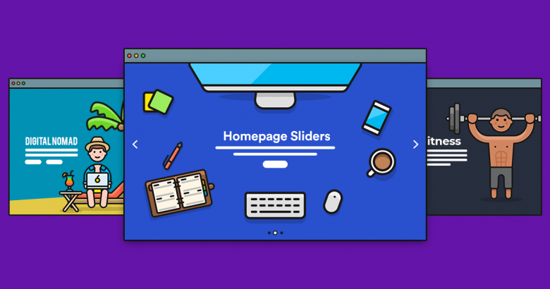
Homepage sliders are back! Or, should I say, they never left in the first place. If you’d believe the anti-slider brigade, homepage sliders are boring, annoying, and bad for conversions. But the actual evidence proves otherwise.
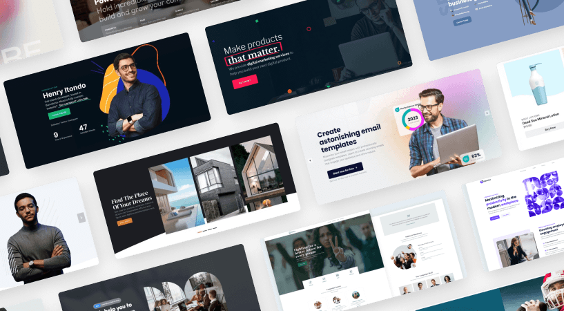
Modern sliders have evolved beyond the basic slideshows that were everywhere 10 years ago. Big brands like SpaceX or Microsoft feature well-designed sliders on their websites. Contemporary sliders are gorgeous. They feature stunning imagery – usually high-resolution photography – along with thoughtful copywriting, well-placed CTAs, and design elements that ensure information is well-timed so users can absorb the content on each slide.
Why use a homepage slider on your WordPress site? The many benefits include:
- Focus. The ability to focus users on your key messages above the fold.
- Visuals. Users love stunning imagery. Sliders let you display more than just one image.
- Calls to action. Sliders provide opportunities to display multiple CTAs for your important content.
Let’s take a look at some examples of how you can use homepage sliders.
1. Productivity app

🎓 Available in Smart Slider 3 Pro – Productivity app
Give your website a clean, modern edge with the Productivity App slider. Designed to feel focused and purposeful, this template highlights features, workflows, and key benefits in a way that feels calm, clear, and easy to follow. The structured layout and balanced spacing help your content breathe, while subtle animations keep things engaging without becoming distracting.
👍 Why it works: The app-style layout is perfect for showcasing features, dashboards, or step-by-step flows. Clear typography and well-defined sections guide the eye naturally, making complex information easy to digest. Thoughtful animations and transitions add polish while keeping the overall experience fast, professional, and user-friendly, ideal for SaaS, tools, or productivity-focused projects.
2. Undiscovered Universe
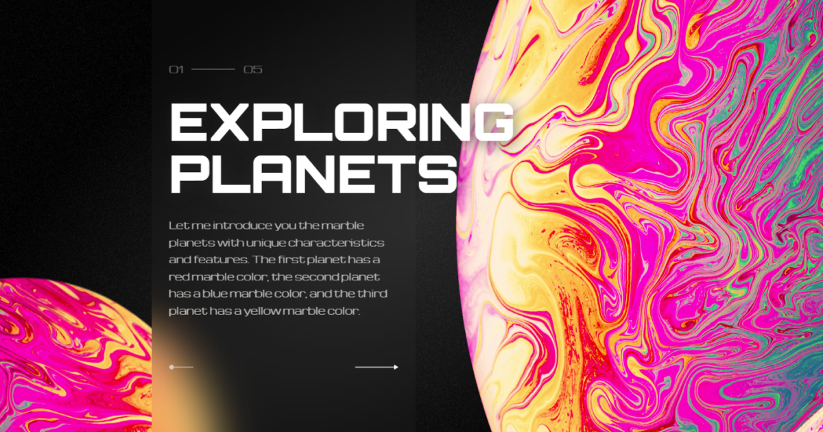
🎓 Available in Smart Slider 3 Pro – Undiscovered Universe
The Undiscovered Universe’s mind-blowing cosmic design will take your website to a whole new level, just like a powerful banner that grabs attention instantly. Each slide features its own arrows and a cool rotating planet image, making navigation a breeze. With captivating visuals and mesmerizing animations showing the wonders of space, your audience will be hooked and they’ll keep scrolling through the galaxies.
👍 Why it works: Its two-column design, completed with unique layers like the Area layer and Absolute Layer, adds a touch of cosmic beauty. The custom CSS blur effect elevates the overall aesthetic. With mesmerizing animations like the Crossfade Main Animation and Distortion-Wrap Background Animation, the experience is completely lively.
3. Gibraltar
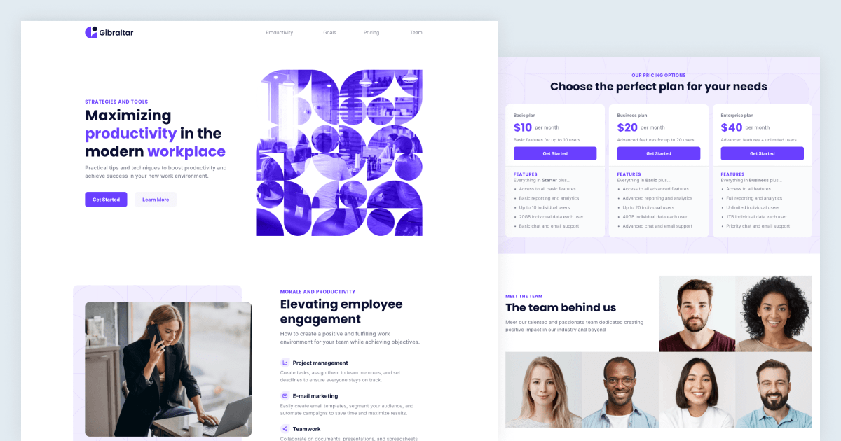
🎓 Available in Smart Slider 3 Pro – Gibraltar
Upgrade your brand image effortlessly using the Gibraltar template. With its sleek and user-friendly design, along with captivating layer animations, this flexible template is perfect for a range of uses. Whether you need a professional portfolio or a vibrant website for your company, this template has got you covered.
👍 Why it works: As a Slider group, it allows for a seamless presentation of your content with an unlimited number of slides. The engaging layers, including the menu bar and CTA buttons, grab and hold the visitors’ attention. With absolute layers, custom CSS features, and captivating animations like the Reveal animation, it adds a modern touch to any website. It has a gallery-like layout on the last block, highlighting the template’s versatility, and making it a perfect choice for various branding needs.
4. Favorite Resort

🎓 Available in Smart Slider 3 Pro – Favorite Resort
Create a warm, inviting first impression with the Favorite Resort slider. This template blends stunning visuals with a relaxed, spacious layout that instantly sets a holiday mood. Large imagery paired with soft text placement lets the destination speak for itself, making it easy to draw visitors into the experience before they even start exploring.
👍 Why it works: The image-focused design is perfect for travel, hospitality, or lifestyle websites where atmosphere matters. Clear navigation and smooth transitions keep the slider easy to use, while subtle animations add a sense of movement and escape. The overall layout feels calm and immersive, helping visitors imagine themselves already there.
5. Beauty products

🎓 Available in Smart Slider 3 Pro – Beauty products
Imagine showcasing your products in a way that grabs attention, feels effortless, and makes your customers want to click ‘Add to cart’. That’s exactly what the Beauty products slider does. It’s a vertical slider designed to look great and be super easy to use, so your products take center stage while you focus on growing your business.
👍 Why it works: This slider is all about simplicity and style. Customers can glide through your products by dragging the slider or clicking the handy bullet points on the side, whichever feels right for them. And the best part? You can customize it to match your brand perfectly.
6. Watch showcase

🎓 Available in Smart Slider 3 Pro – Watch showcase
If you’re looking for a stylish way to highlight your watches, this slider has you covered. With smooth animations and tons of customization options, it’s designed to make your timepieces truly stand out. Whether you’re a watch enthusiast or just want to take your website to the next level, this template is a must-try.
👍 Why it works: Each slide is crafted to let your watches shine, literally. A subtle pulsing effect brings them to life with clean, eye-catching animations that grab attention without overwhelming the design. Plus, navigating the slider couldn’t be easier. With options like dragging, bullet points, and more, your visitors can explore your collection however they like.
7. Magic Devs

🎓 Available in Smart Slider 3 Pro – Magic Devs
You can celebrate your team in style with the Magic Devs slider. This template is perfect for showcasing your developers and their skills in a fun and engaging way, all while looking great on any device.
👍 Why it works: The slider uses a nice progress bar to highlight your team’s expertise, and the interactive design keeps things exciting. On the first slide, team members’ names are displayed in a clean, rounded background. Hover to reveal their profiles, or click to jump directly to their dedicated slide. It’s interactive, visually appealing, and a great way to spotlight your developers.
8. M-ARC

🎓 Available in Smart Slider 3 Pro – M-ARC
Make a bold first impression with the M-Arc slider. This template stands out with its shapes, strong contrasts, and modern composition that immediately draws the eye. The design creates depth and motion, helping your key message stay front and center while still feeling visually dynamic.
👍 Why it works: The layout and layers add a unique visual rhythm that feels fresh and contemporary. Clear focus on the main content keeps the design usable, while smooth animations and transitions bring everything together. It’s a great choice when you want something that feels modern, expressive, and a little different without sacrificing clarity.
9. Mental Health

🎓 Available in Smart Slider 3 Pro – Mental Health
Create a calm and reassuring first impression with the Mental Health slider. This template uses soft colors, gentle imagery, and a clean layout to convey trust and approachability from the very first glance. The balanced composition helps your message feel supportive and clear, making it easier for visitors to connect with the content emotionally.
👍 Why it works: The thoughtful spacing and subtle animations keep the focus on the message without overwhelming the viewer. Clear typography and simple navigation make the content easy to follow, while the overall tone feels warm and human. It’s an ideal choice for wellness, healthcare, or any project where empathy and clarity matter most.
10. Tattoo Studio

🎓 Available in Smart Slider 3 Pro – Tattoo Studio
Let your artistic vision shine through the online world using the Tattoo Studio template. With its modern design, it adapts to any device and is easy to navigate. This template enables artists to effortlessly display their amazing work. Whether it’s tattoos or services, this design perfectly merges creativity with practicality.
👍 Why it works: The Tattoo Studio template provides a smooth and easy browsing experience. It includes cool arrow options and a special hover effect that adds to the overall appeal. With its cool layers and animations, the showcase becomes vibrant and eye-catching. The adaptable layout guarantees a dynamic presentation for various types of content, making it perfect for artists who want to make a bold statement online.
11. Brew Yourself

🎓 Available in Smart Slider 3 Pro – Brew Yourself
Spice up your product showcase with the Full Width Product Carousel template, a cool slider that effortlessly combines style and practicality. By using the Carousel slider type, this template offers a visually stunning full-width layout, ideal for showcasing products and captivating your audience.
👍 Why it works: The Carousel slider is great at showing multiple slides at once, which really gets users interested and makes it easy for them to compare products. You can navigate through the slides using arrows, or by dragging, so there are plenty of ways to explore the featured items. Plus, the design is responsive, so it looks great on any device you’re using.
12. Bloo Festival

🎓 Available in Smart Slider 3 Pro – Bloo Festival
Upgrade your office wellness routine with the Office Exercises slider. This template is loaded with smooth animations and effortless navigation, making it the perfect tool to highlight exercises that are suitable for busy professionals. Captivate your visitors, encourage healthier habits, and make your content shine.
👍 Why it works: This slider is designed to keep things straightforward by displaying one amazing slide at a time, allowing for a complete view. It features a full-page layout that gets rid of any potential distractions. You can easily navigate through the slides in three different ways – by dragging it on your phone, tapping the bullet points for a smaller screen, or clicking the arrows on your desktop. Additionally, it includes some impressive layers, like the Image Area layer, which adds a touch of extra style to everything.
Creating Your Own Beautiful Homepage Slider with Smart Slider 3
With Smart Slider 3 you can easily create beautiful home page sliders. If you like any of the Smart Slider examples above, you can use them — just import them into your WordPress install when you sign up for Smart Slider 3 Pro.