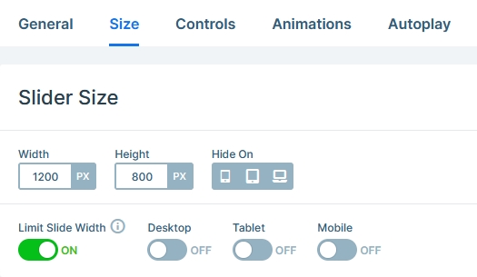
Slider Settings
The Diet Block template is a full width block. Full width elements are kind of elements, that fill the browser horizontally, but not vertically. While filling the browser horizontally gives plenty of space to display content, it’s recommended to keep the content narrow. The reason behind this is that it’s much harder to read wide content on monitors because the eye needs to move a lot more, which is tiring and uncomfortable. Make sure you always use the Limit Slide Width option to ensure your content doesn’t get too wide.
Blocks are special kind of sliders. In fact, they’re not actual sliders, because they can’t slide. As a matter of fact, blocks can only display one slide. They’re good to create sections on your site where you can take advantage of Smart Slider’s amazing features.
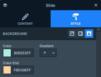
The single slide of the Diet Block tempalte has a gradient slide background. A greenish color starts at the bottom left corner and changes into a peachy color in the top right corner.
Layers
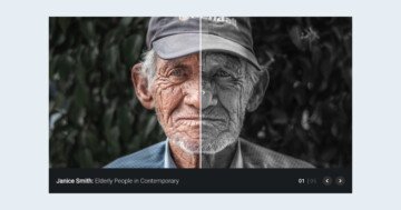
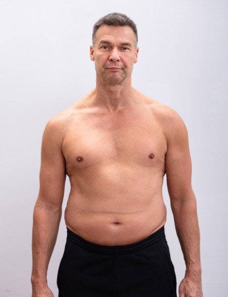
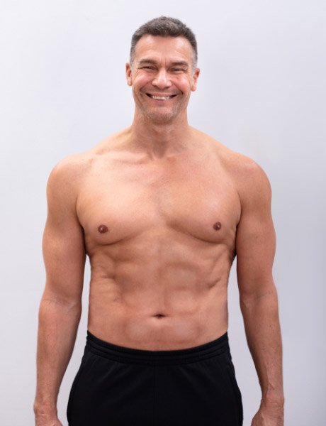
The most important layer in the Diet Block slider is obviously the Before After layer. It’s a cool layer you can use to create a comparison between two images. In this slider we use it to show the before and after photos of the new diet.
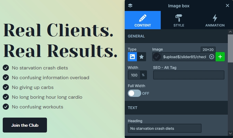
Another cool layer is the image box layer which we used to create the checkbox list on the left hand side. It’s a simple layer where you can select an image or icon and write some text that displays next to it.
The other notable layers in the Diet Block template is the heading, text and image layers. Of course, there’s also a CTA button.
Animations
The Diet Block template is full of motion. All layers have their own animation. So they all introduced to the slide with a subtle movement. As a result, the slide looks fantastic when it appears.
Layout
The base of the slide is a two column row. Rows and columns are the building blocks of Smart Slider, as they help you create nice and responsive layouts. In the background of the second column there are 3 Absolute positioned image layers, making the Default positioned Before After layer look more interesting.
Another cool layout you can do with Smart Slider is the book preview at the left. It’s another two column row added into the main row’s left column. When building layouts, b{you can freely add rows into other row’s columns} , which lets you create anything you imagine.
Responsive
Smart Slider is a responsive slider, and it has lots of cool options to fine tune how your slides look in small screens. The option you’ll almost always need is the Text Scale, which allows you to change the size of the font for tablet and mobile. On this block we used it at most layers that contain text.
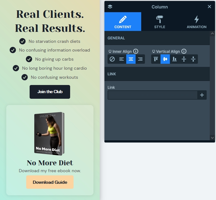
Another think you’ll probably notice if you check the Diet Block on your phone is that the checkbox list is no longer left aligned but centered. The Inner align on the rows and columns is device specific. This means you can freely change it on any device.
When you optimize your slider for mobile, we recommend making sure that the slides are not taller than 600px. Browsing a tall slider on phones is uncomfortable, as there’s a good chance the visitor will not be able to see the full content at once. Since this template is a block, which means it will not have more slides but one, it can be larger than that. In fact, the total height of the Diet Block template on mobile is around 1040px.
Related Post: Introducing Before After Layer
Related Post: How to Create WordPress Call to Action?