Slider Settings
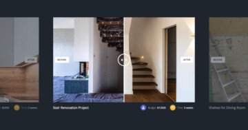
The Photo Compare slider is a traditional looking slider. This means it displays one slide at a time. As a result your visitors get only one message at a time which they can fully understand before moving on to the next slide. The layout of this slider is “boxed” which means it fits into the container you place it. This makes the Photo Compare slider perfect addition to your blog posts.
There are no common controls to switch slides in this slider. In other words, none of the standard controls are enabled for this slider. The two arrows you can see are custom arrows created from image layers.
Layers
Two of the most important layers on the slider are the image layers that display an arrow. They’re the elements your visitor can use to switch slides. Since it’s an image layer, you can freely replace the arrows to something that suits better to your website’s design. To create the slide switching we used the Link Actions on these layers.
The other most important layer is the Before After layer, as it’s the base of the slide. The Before After layer is a cool element to compare two photos. In this case, it compares the monochrome and colorized version of the picture.
Another notable layer is the heading layer, which displays the caption of the photo. It makes the name of the photographer bold and shows the photo description in normal weight.
Animations
The only animation on the Photo Compare slider is the Main Animation. The Main Animation is the basic slide animation, which moves all elements on the slider. It can move horizontally or vertically, or with a simple fading effect.
Layout
The base layout is pretty simple at this template. First there’s a Before After layer. Below there’s a two column row, where one column contains the caption and the other has the navigation.
In this second column there’s an interesting layout element. This element is the slide counter, which displays the “01|05” text on the first slide. To create something like that on your slider, first add a new row. Second, add another column to the previously added row. Now all you need to do is to add the layers that display your content to each row. Finally, disable the full width option of the row.
Responsive
A responsive WordPress slider like Smart Slider has many cool options to ensure your sliders look perfect on all screens. The most important option for this is the ability to adjust the font size for every device. As a result, you can achieve better looking designs while maintaining the legibility of your text.
If you checked the slider on your phone, you’ve probably noticed that the previous arrow moved around. On desktop the slide counter appears first, then the previous and next arrows. However, the order changes on phones. The previous arrow appears first, then the slide counter and finally the next arrow.
Related Post: Introducing Before After Layer
Related Post: How to Create a WordPress Gallery Slider for Your Website