When you create a WordPress website, you have a single goal in mind which you want your website to achieve. Any content you add to your website, whether they are images or texts, need to serve this goal.
For example, the goal of a photographer’s website is to get new clients. For this reason, the photographer creates a page for their portfolio. They can also create another page to read the previous clients’ testimonials. Most importantly, they need a contact page, where soon-to-be clients can reach them.
But how to get the visitors to find these pages? With the power of the WordPress call to action!
What is a Call to Action button?
The Call to Action button, also known as CTA is a type of button, tells the visitor to do something specific. For instance, if you sell a product or service, you can place a CTA to your homepage to urge the visitor to buy it. A good CTA can increase your conversions and give you a heavy revenue boost.

How can I use a Call to Action button?
CTAs are super versatile design elements, so you can use them for any purpose that suits your website’s main goal. For instance, if you have a newsletter or an email list, create email opt-ins with a CTA. Do you have a social media page which they should check out? Use A CTA button to send the visitors there!
How to create a good CTA?
Let’s make it simple: a good CTA button stands out. If the visitor can’t see your call to action button, they won’t click on it. Play with the colors, to make sure it stands out from the background. Consider creating a couple of variations, and split test your call to action buttons to see which one works best.

Choose the perfect label
Another way to create a good CTA is to craft the button label carefully. A simple, yet easy-to-understand text like “Buy now” is much more effective than a long and complex text. Of course, you don’t have to aim for two words long CTAs, just make sure your message is clear and simple.
For instance, let’s see the CTA on our Rotating Banner demo. The label isn’t just two words long, it says: “Download Now – It’s Free”. But it’s still encouraging, because it says the download is free, and who doesn’t like free stuff?

Try to use effective words, like “now”, “free”, “get”, “try” or even use numbers to get more clicks. For instance, use “Buy now – 60% off” instead of “Buy now and get a discount”.
Always test your CTA
Don’t make up your mind too early about your perfectly designed and labelled CTA. Be sure to split test it to see if it performs the way you want it to. It’s also useful to monitor and track your conversions with analytic plugins. If your CTA’s click rate is low, it means your CTA isn’t as effective as it should be.
If you believe your CTA isn’t effective, try varying the colors or find a more suitable label to deliver your message.

How to add a Call to Action button to your WordPress website?
The most popular WordPress themes have the ability to create gorgeous CTA buttons. The upside of this is that the button will surely fit your theme’s layout with minimal effort. On top of that, these CTA designs are made by the designers of the theme. As a result, they’ll look gorgeous on your site lowering the time you’ll need to spend on split testing the look. The downside is that you’ll need to create a new button everytime you want a new CTA.

Creating a CTA with WordPress plugins
If your theme doesn’t have the option to create CTA, visit the WordPress.org repository. You’ll find many call to action plugins there to help you create gorgeous CTAs. After setting up your CTA with these WordPress plugins, you’ll probably get a shortcode to display it.
This means you don’t have to create your button on every page where you want to use it. Using a plugin has another great advantage. Your CTA actually exists in one place only, so if you need to make changes, you can do it at one place. For instance, if you want to try a more effective label, you won’t have to go through all your pages. You only need to go to your Call to Action plugin, do your edits and you’re done!.
Use Gutenberg to create a Call to Action button
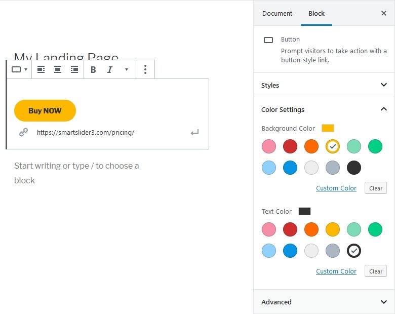
If you use Gutenberg, WordPress’ block based editor, you don’t even need a plugin for creating a CTA button. Gutenberg has its own Button block which is perfect to create your next amazing call to action!
With Gutenberg, you can configure your button in a visual way, like you can edit any other block. You can select different colors for the background and text. You can also choose the button style, which can be the default “pill” type of button, outlined or square. That’s enough for any kind of button you’ll want to create!

Creating Call to Action with Smart Slider 3
Smart Slider 3 is a powerful tool to create gorgeous sliders and blocks for your website. You can create fully responsive sliders and you can add Call to Action buttons to them. Best of all, you don’t even need the Pro version of Smart Slider 3 for this. Even with the free version of Smart Slider 3 you can create eye catching CTA for your WordPress site.

How to create a gorgeous CTA with Smart Slider 3?
Smart Slider 3 makes it super easy to create your own CTA. Simply create a new slider, add a slide and put down a button layer. You can completely customize the button to create a converting CTA. For example, you can change the color and font size to create the perfect WordPress call to action for your site.


