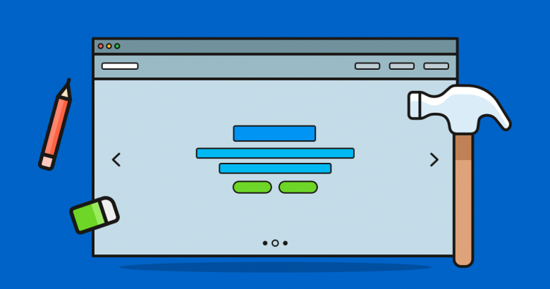
Let’s assume you have just downloaded the free version of Smart Slider 3 and you are facing the challenge of creating your first or next slider. In the previous weeks I redesigned almost all of our template sliders so I have bulletproof design process to share with you. This article won’t be a tutorial but it will guide you how to design your new slider, block or page with Smart Slider 3.
Sliders help your visitors understand your company, product or brand through images, videos, texts, and interactions. But how can you achieve the best result and create a perfect slider? Simply follow the next 5 points and deliver more successful sliders faster and much more efficiently.
Get our latest news, tutorials, guides, tips & deals delivered to your inbox.
No spam. No charge. Just curated emails.
💡 Planning
Planning is the most critical part of the slider design process. Take your time and identify the slider’s goal in this early, initial stage. If you don’t have the clear goal, you won’t be able to create a proper slider design.
Questions to answer during this step:
a, What is the main purpose of your slider? Informing, selling, or entertaining?
b, What do your visitors expect?
c, What type of slider do you need? Full width slider, carousel, or just a simple block?
d, What will be the content of your slides?
e, How many slides do you need?
Take your time and answer these questions before jump right into the slider settings. It’s really easy to skip the planning stage, but this is critical for creating a successful slider.
Through these answers, you will outline the first concept of the showcase that would fit the client’s specifications.
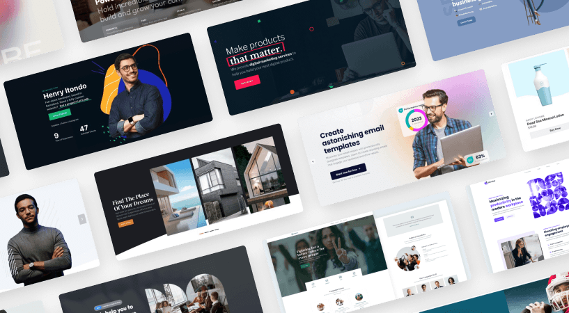
After you figure out what the project is exactly, you can start to come up with ideas and solutions. At this point, I strongly recommend to take inspiration from our Slider Library. Those examples are all great sources to learn what’s trending now or to get new ideas.
✂️ Preparation
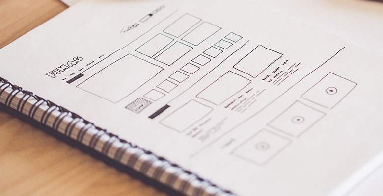
Using the information gathered from stage one, it is time to put a plan together. Visualization can help you organize your thoughts and shape the design of your slider. Nowadays there are several design tools available on the market, but a simple pencil and paper can be surprisingly helpful.
Paper wireframing
First and foremost, your aim is to create a wireframe then if you need you can move into a realistic mockup using a designing software such as Photoshop or Sketch.
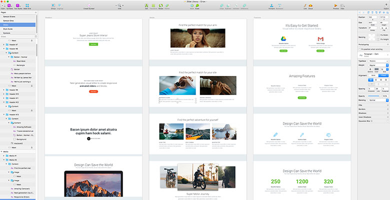
Slider mockups in Sketch
Main points of preparation
Images: Background images have a more significant role in slider design now than ever before. Use high quality pictures and don’t be afraid to try more. It’s very important to find those photos which resonate with your goal and communicate your message clearly.
The best size for a background image is usually the size of your slider.
But the maximum should be around 1920x1080px. The most common background image size that I use is 1920x600px, because it fits very well into a full width slider. On the other hand I like to set the maximum height to 600px because it’s ideal for any content, it’s not too tall and not too short. If you have the exact image, try to compress it as small as possible. For the transparent pictures use PNG8 format and for background images use JPG and try to set the quality as low as possible without radical quality loss.
Content: While the images and effects will steal the show in slider design, you still need a good content. The content includes headings, paragraphs, images, videos, icons, buttons, and multimedia. Fortunately in Smart Slider 3 the most popular content types are available as layers. Your content is the reason why people come to your website and one of the most important parts of the good content is the good copy, because your copy will make or break the success of your slider in terms of trust, engagement and SEO.
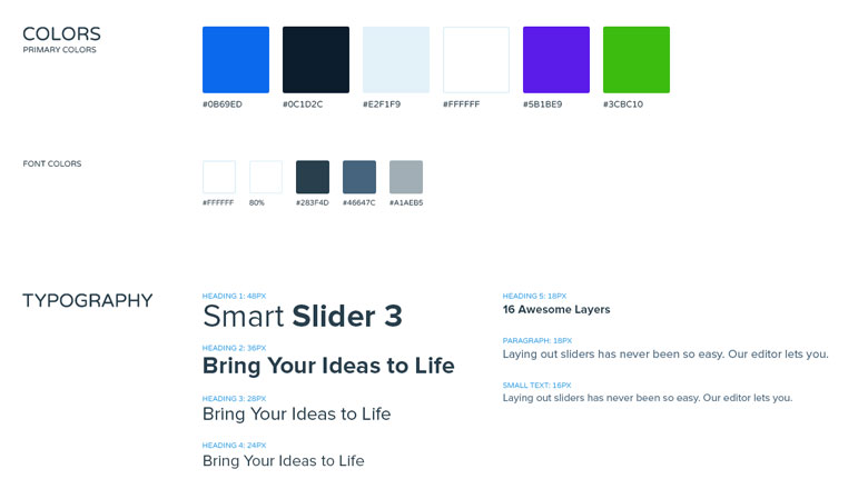
Style Guide
Style: Your challenge as a designer is balancing the visual content and information content. A good design should be both pleasing to the eye, and also communicate the key messages to your audience. The really great designers have strong intention behind every decision. Generally the most important aspect of the style is the consistency. Whatever font, color, and icon style you choose, make sure that you use the same decision through all of your slides.
🎓 Creating Your Slider
We’re now at the end of the planning and preparation phase where we can start the actual visual slider design because your slider should more or less get into shape. Let’s sum up quickly what we know or what we have presently:
Purpose of the slider
Slider type, slide count
Design assets (images, videos, icons and so on…)
Content (with good copy)
Style (outlines the design of the layers)
Here is the time to turn your vision into a live working slider or block for your WordPress or Joomla website. There are two popular ways to start: import a slider or create a new one.
The new way to build a Slider
Next generation visual editor, customizable animations & effects, and access to hundreads of premade templates.
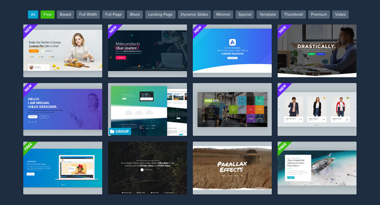
As a newcomer the most comfortable way to create a slider is to import a ready to use slider from the template library. By one click you can instantly start to discover the slider settings, tweak the layers and play with the animations. When you have got familiar with the interface you will be able to replace the background images, paste your copy and change the style to your own in minutes. The whole process will usually take about 5 to 20 minutes with responsive settings and testing.
Available slider templates
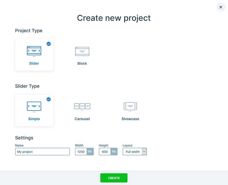
Creating a brand new Slider
In this section, I’ll be covering the most important slider related questions, options and design decisions that you have to figure out. However I’ll focus on a normal slider because this is the most common usage. Here are the crucial points to setup the slider correctly:
Slider size: In short, it can be really different because of the nature of the different sliders, but with the 1200×600 px you can’t go wrong. Doesn’t really matter if it’s a boxed, a full width, or a full page slider, this size will be a great starting point.
Create a new slider
Slider settings: Smart Slider 3 is one of the most advanced slider plugins on the market so there is a ton of options. For example you should go to the General tab and find the perfect main animation for your slider. This is the only essential animation which will move your slides. On the Size tab you will find every height and width related settings, here I really like to use the maximum slider height. Mostly because on a bigger screen the slider can scale up really big without this setting. Last but not least you should consider to use the slider autoplay.
Controls: Scroll down a little bit and you will find the control settings like the arrows, bullets and thumbnails. This is a key moment to add a good navigation to your slider. The easiest step if you choose an arrow, later maybe you will build your own navigation with layers.
Create an experience: This is the area where Smart Slider 3 starts to really shine. It’s time to think about how you can use animations and effects to truly delight your visitor. Background animation, Ken Burns effect, animated shape divider, particle effect, every type of parallax effect? No problem, but keep in mind less can be more in the world of animations and effects.
In order to this, you will add few slides at first then go back to the Slider options and set the previously mentioned parameters like the autoplay.
🎨 Designing & Building Your Slides
This area is where all of your design assets, content ideas and style concept come into play. Once you’ve created a Slider, you will be able to add different type of Slides. Slides are those elements which have a background and can contain various types of layers. This slide creation part will be super easy for you because you made the background images and videos previously. In 2008 probably it would be the end of this article, because the slider is ready with your images. But in 2018 you’re able to build complex layouts with layers.
Because you’re reading this article, you probably have web designer or developer career behind your back. I’m sure you have seen (or made) images with fix text without a single line of HTML before. It’s the time to forget it! This is terrible for your website in different aspects like: SEO, responsive behaviour and readability.
Working with Layers
In the free version of Smart Slider 3 every essential layer is available. As a result of this, you can transmute the previously specified content and style into a layer in no time. Every heading, text, image, button and video can be edited easily with the customization options. You can change every detail that really matters in typography and style.
Layer Positions
Smart Slider 3 stands above all of the premium sliders because it comes with two positioning modes which is totally unique: Default and Absolute positioning.
Absolute positioning: It gives you the absolute freedom, because the layers which are in this mode can move anywhere and overlap each other on the slide. This behaviour can be familiar from Photoshop or from every other premium slider plugin. At first glance this mode looks really promising but when the mobile editing comes in the picture, the editing process can be time consuming and far from effective. By default, the canvas mode maintains relative spacing between layers of the slide. So if the slider scales down then the layers also have to scale down to keep every ratio.
Default positioning: To avoid the previously mentioned responsive problems we released the Default positioning in version 3.2. In this positioning you can put the layers below or above each other and with rows and columns you can position them next to each other. The whole approach is closer to HTML structure. With this mode your layers will determine the height of the slider automatically in mobile and every other view.
Default or Absolute positioning?
The proper answer is both. Sometimes you need the freedom or the overlapping behaviour of the Absolute layers but sometimes you need the advantage of the structured content of Default layers in the same slide.
But all in all, try to add every layer with Default positioned layers and use Absolute layers only for overlapping and decorating.
🏗️ Building Tips & Risks
Here are few of my favorite and most useful tips to edit the slides correctly:
Three Fonts Rule
Try to limit the number of font families to maximum 3 and stick to the same ones through the entire slider. Unnecessary fonts make your slider slow, unstructured and unprofessional.
Limit the Length of your Lines
Having the right amount of characters on each line is key to the readability of your slider. The optimal line length for your text is considered to be 60-80 characters per line. Therefore, use bravely the max-width option to limit the width of your layers.
The Power of White Space
Whitespace is the distance between different elements that gives visitors some visual breaks. If used correctly, it can provide many advantages to your slider. For example: better legibility, highlighting a particular element, better user experience and more interactions. In Smart Slider 3 you can easily insert whitespace with various techniques such as margins, paddings, gutters or aligns.
Keep Mobile in Mind
It’s common problem for beginners to design different quantity of content on the slides. For example the first slide contains only a few sentences, but the next one is full of images, paragraphs or buttons. At first, everything looks great on desktop but on mobile the height of the slides can be really variable which results in awkward experience for your visitors. I typically start with a desktop layout first, however I keep mobile in mind from the start.
Try to distribute the content equally among the slides. If one of your slides has too much content, don’t be afraid to hide the unnecessary parts, and just keep the important message on mobile. Smart Slider 3 is full of responsive options and tools which will help you design the perfect slider for mobile and tablet. You can optimize the slides for mobile easily with the following device specific options: hide layer, text size modifier, align, position, size, gutter, padding, margin.
Avoid too Many Slides
My recommendation is to use maximum 5 slides per slider in normal slider scenario. Of course, if you create a product carousel, this number can be so much higher because you can see 3-4 slides at the same time. I think the only exception if you would like to create a gallery slider where your aim is to show plenty of pictures. In that case don’t forget to turn on the lazy loading option and the image optimization, with these settings you can speed up the loading time drastically.
Never Stop Testing
Testing your slider is critical both in the building phase and after you’ve got what you’ve built. Don’t forget to preview your website periodically to make sure the slider works correctly.
Closing
Design is a fluid and ongoing process that requires constant maintenance. Probably you will add new content from time to time or keep the existing content up-to-date. By following the 5 steps above, your slider design process should go more smoothly. What does your slider design process look like? Do you have any suggestions how can we improve the process? Post your ideas in the comments below.
PS.: During the next weeks we would like to write a whole bunch of articles. The topics will cover in-depth guides about responsive settings, slider loading, SEO options and so on. If you are interested, stay tuned and subscribe to our newsletter.
Hi I’m Daniel David, one of the co-founders at Nextend and the designer of the Smart Slider 3. I’m all about web design, video games, series and sci-fi/fantasy books. Wanna drop me a line?