Slider Settings
Creating a full width header slider is a popular choice amongst website designers nowadays. These elements look great on any device, especially on the popular wide monitors. With Smart Slider you don’t necessarily have to create a sliding element to have a nice full width section on your site. You can actually create a block type project. Blocks are special sliders, which can display one single slide, which never moves.
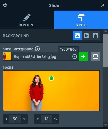
The main element of the 404 image slider is the slide background image. When you add a new image slide to your slider, it focuses on the middle part of the image. At this template we changed the focus point to the top-middle part of the image, to ensure that the girl’s head stays in the slide area.

Layers
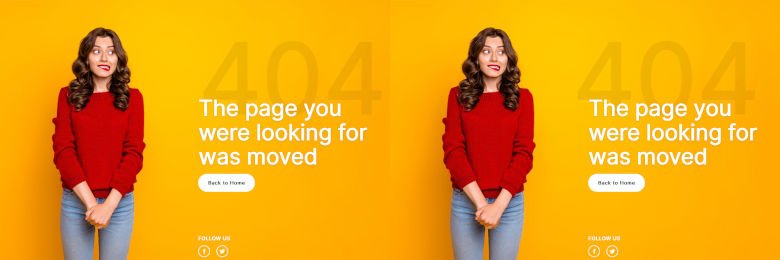
There’s a bunch of interesting layers on this slide. The most obvious one is the Animated heading layer, which is the big text with the white font. This layer is special, because it can rotate word(s) with special animations, saving space on your slide and making it more interesting to watch.
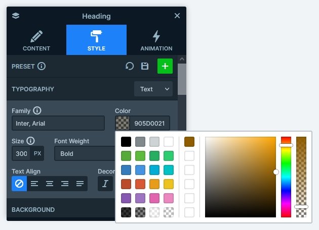
Above the Animated heading layer you can find a common heading. What makes this layer looks special is its large font size, which immediately raises the attention of the visitors. Another special thing with this layer is that it’s font color is semi transparent.

You can find two additional layers on the 404 Image block. One of them is the CTA button, which helps moving back to the home page. The other is the image layer, and there are two of them. They’re used to display the social icons at the bottom of the slide.
Animations
You can find a couple of layer animations on the 404 Image block. They introduce the layers to the slide with a subtle fading and moving effect. This simple animation really fills the block with life and makes it interesting to watch.
Layout
If you’re looking for layout inspiration for your next slider, you’re at the best place. The 404 Image slider some amazing layouting ideas you can try! First, the most obvious one which is the white text covering the yellowish one. This happens because of a negative top margin on the white text, that reduces the distance between the two layers. This small overlap makes the whole block look special!
The other cool idea is the negative left margin on the 404 text. It moves the text to the left, causing it to break the grid of the content. The result speaks for itself: the layer stands out!

To ensure that the social icons always stay at the bottom of the slide, while keeping the content at the middle, we turned on the Stretch option on the row. This setting makes the row fill the height of its parent, and in this case it also pushes the icons down.
Responsive
Smart Slider is a responsive slider solution and it offers many great tools to fine tune how the slider looks on mobile. There are three key responsive options we used at the 404 Image block. First, we removed or reduced the negative margins. As a result the 404 text is aligned with the other layers, and the white text doesn’t cover it too much. Also, the text was resized at both layers. The last responsive change we made was adding a bottom padding to the column where the layers are. This creates a nice white space between the button and social layers.
Related Post: Why do You Need a Video Slider on Your Website?
Related Post: Why Do You Need a Good WordPress 404 page?


