Black Friday Super Sale! 🔥 Enjoy a jaw-dropping discount of up to 50% OFF on all Smart Slider plans. Hurry, the offer ends on December 2nd!

Buy Now
Design

What is a Full Page Slider and How to Use it?

Bernadett Toth
Bernadett Toth
April 27, 2020
Full page slider

Sliders and carousels are popular web design trends in their own right. An interesting application of this type of web page element is the full page slider. I’m sure that you have encountered this type of slider on a lot of websites. But what is a full page slider and why is it good? Read the article and you will know everything about the full page sliders.

What is a Full Page Slider?

A full page slider is practically synonymous with the concept of a hero image, which refers to any large header design. A WordPress hero image can be described as a large banner image prominently placed on a web page. More specifically, a hero image, like a full page slider, is generally placed at the top of a web page and fills the whole screen.
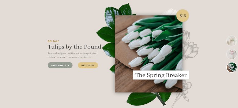
Flower Shop Smart Slider 3 template

Many full page sliders are photographs that relate directly to the content, but several web designers have incorporated the use of additional types of media that include backgrounds, illustrations, and even videos. It can help create a positive first impression, and with the CTA elements you can navigate the user.

The full page sliders are available in the Pro version of Smart Slider 3, it is easy to use and fully responsive. Browse our gallery of full page sliders to see what this concept looks like in action!

Why should you use a Full Page Slider on your site?

Full Size Slider
Full Size Slider

Full Screen Sliders like Hero images, have earned their place in today’s top website design trends because of the many benefits they provide to those who use them. Here are just a few reasons to consider why to put full page sliders on your website:

  • They catch attention. New visitors of your site only have 0.05 seconds to form an opinion about your website and you want your first impression to be a good one.
  • They add a personal touch. Use a full screen slider to show off products or services (or both!) in a way that’s unique to your company and branding.
  • They help build trust and credibility. Having a full page slider can help give your visitors an idea of what the site is about and can help build a positive first impression.
  • They direct users to a link or call-to-action. You can use buttons if you want to give the visitors something to click and take an action.

How to create a Full Page Slider in WordPress?

The simplest way to create a Full Page Slider in WordPress is to find a slider plugin that has an option to create full size sliders. For example, you can use Smart Slider Pro to create such sliders. In fact, Smart Slider makes it very simple to create a full size header slider for your website, as you can enable the full page behavior with one click.
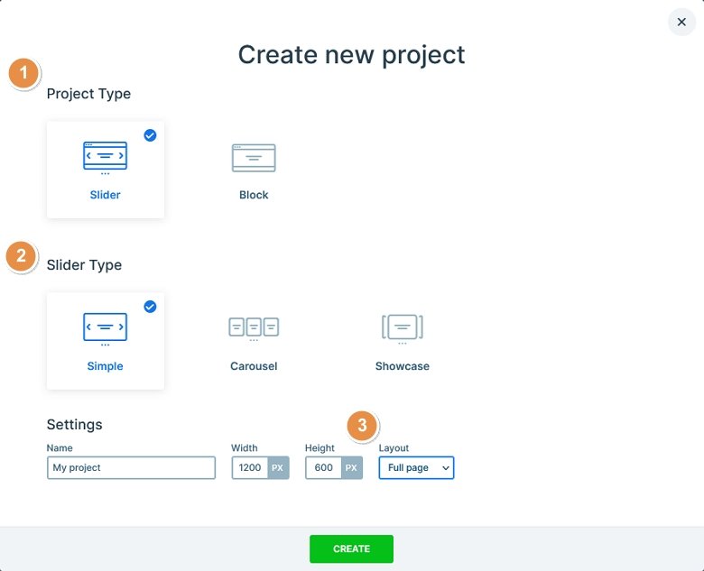
Creating a full page slider using Smart Slider in 3 steps

Settings of Full Page Slider in Smart Slider 3

With Smart Slider 3 Pro you can easily create a full size homepage slider, all you need is to choose the Full page layout in the Slider settings. If you use this layout, your slider will have full width and 100% height of your screen. It is fully responsive, so in mobile and tablet you can achieve the same full page behaviour.
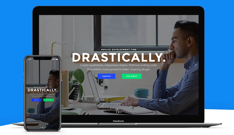
Smart Slider 3 is fully responsive

The Fullpage layout works the way that it calculates the size to the full screen. But it can happen that you have a menu above the slider and you want to decrease the slider height to adjust it to your menu. In this case you can use the modify slider height option with which you can set a smaller height to your slider.
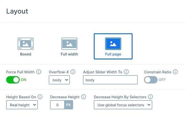
Full Page slider settings

A frequent usage is to navigate a full page slider with vertical scroll. You can turn on this scroll control at the General settings and even you can set the main animation to vertical.
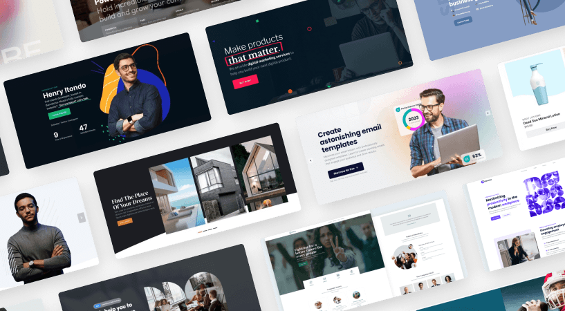
The new way to build a Slider
Next generation visual editor, customizable animations & effects, and access to hundreads of premade templates.
Get Started
Smart Slider 3 - The new way to build a Slider

Types of Full Page Sliders

Full page sliders can be configured to display many different types of content, and have a few practical usage:

  • Product sliders. They give the visitor an idea of what your website is about right off the bat.
  • Founders or owners of site. This is the most important for people who try to establish a personal brand. Showing prominent images of themselves makes visitors start to see and trust them.
  • Contextual sliders. Best for services as they give visitors an idea of what the website is about by providing an image to demonstrate a concept.
  • Non-contextual sliders. These sliders don’t necessarily give an idea of what the site is about but are used because they are trendy or look visually appealing.

How are Full Page Sliders used

There are multiple use cases to consider when it comes to using full screen sliders:

  • Single page design: Full size sliders add a great aesthetic to single page designs, breaking up the rest of the text content in an appealing way.
  • Full-screen background: If your company or offerings are visually-focused, using a full page slider can help you draw attention accordingly.
  • Featured post content: Running a news site? Magazine type themes and featured posts that make use of full size sliders draw attention to trending content.
  • Rotating Galleries: Great for showcasing products or portfolio work when there’s more than one item you want to draw attention to.

Full Page Slider Best Practices

If you’re still a little confused as to how your full page slider design should shape up, consider these best practices.

1. Be picky when choosing hero images

Non-contextual images can disrupt the UX and these types of images often distract from the message. So choose images that reflect the website’s theme, purpose or campaign. Watch out as to whether the image truly adds value or not.

2. Optimize image sizes

Using large images can affect loading times, especially for mobile. As a result, a delay in page loading time can affect multiple aspects on a website: customer experience, sales, SEO, conversion, and revenue among them. In Smart Slider 3, there is a lot of options with which you can speed up your slider, but the best is if you optimize your images before you upload it.

3. Choose images that have an emotional appeal

Humans are emotional creatures, if you want them to act a certain way, you have to make them feel emotional attachment to something.

Fashion Slider
Fashion Slider

4. Use high-resolution images

Your hero image will be located in the front and in the center on your website. Besides being aesthetically displeasing, having a pixelated image shows that you don’t care about the small details on your website and customers may assume that you don’t care about them either.

5. Emphasize the CTA

Technically, your full page slider doesn’t have to have a call-to-action but you should definitely make use of this feature when relevant. Design the CTA in a contrasting color compared to the hero images color palette to truly catch attention and get people to act.

6. Consider designing for different screen sizes

More people use mobile devices to access the internet and mobile responsiveness is an important cornerstone of Google’s search algorithm. Because of this, make sure that you’ve chosen a responsive slider plugin like Smart Slider 3.

Full Page Slider Examples

Creating a gorgeous full size slider can be challenging. Here are 5 gorgeous examples to inspire you and give you cool ideas to create your own full page slider. All templates are included in Smart Slider Pro and you can download them with one click.

Full Page Portfolio

Full Page Portfolio - Full size slider example

Live Preview

The Full Page Portfolio slider is a great way to introduce yourself or your business to the visitors of your site. It has a modern design that contains all important information. Additionally, it’s super comfortable to browse on all screens. On desktop, a single scroll can switch slides, while on mobile tapping does the same.

Static Slider

Live Preview

The Static Slider is perfect for creating a hero header. It’s content doesn’t move at all, however the images in the background keep rotating. There’s a Shape Divider on the template, that looks like a large, downward pointing arrow that indicates the visitors that there’s more to see below the fold.

Flower Shop

Flower Shop Smart Slider 3 template

Live Preview

The Flower Shop slider grabs the attention with its modern animations first. The image slides in slightly, then the texts are revealed in perfect harmony. You can find trendy pastel colors in the template, which make it suitable for any modern website.

Cosmetics

Live Preview

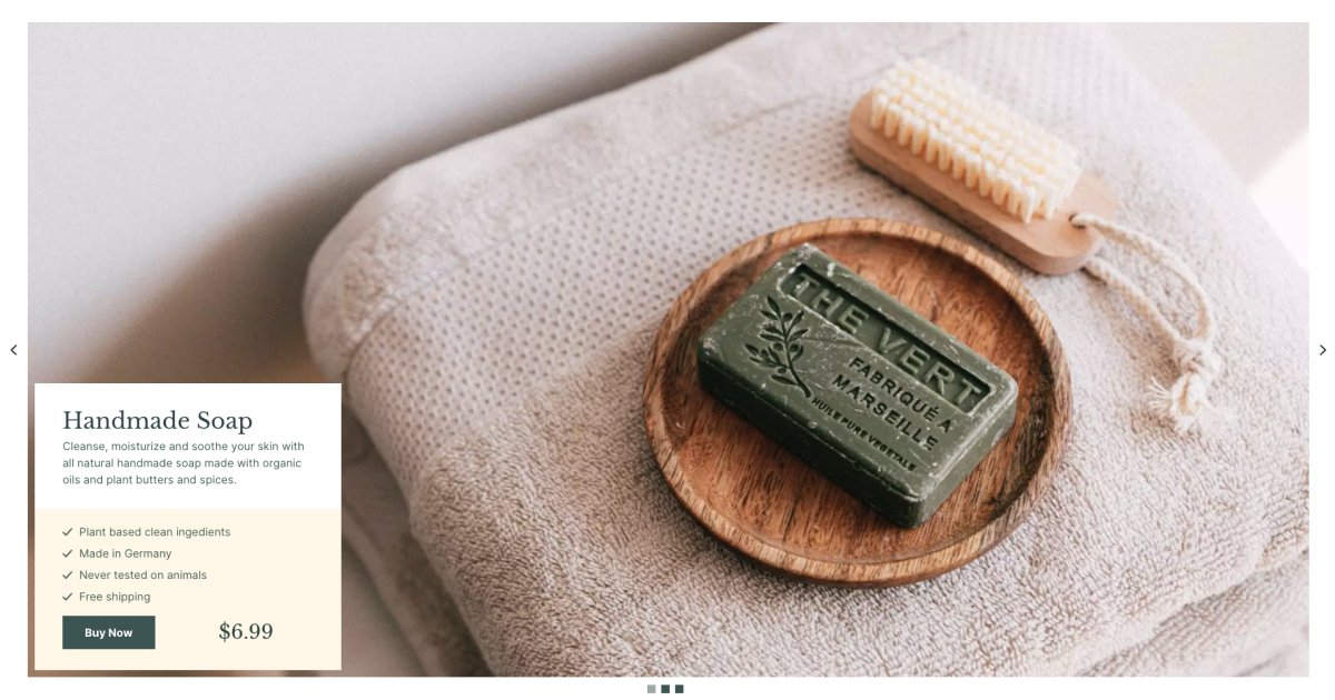
The Cosmetics slider is a kind of full screen slider, that doesn’t look full screen. It takes up the whole width and height of the page, but it has a white border, keeping some distance between the edge of the screen and the images. As a result, the Cosmetics slider looks absolutely stunning and very unique.

Full Page Hotel

Live Preview

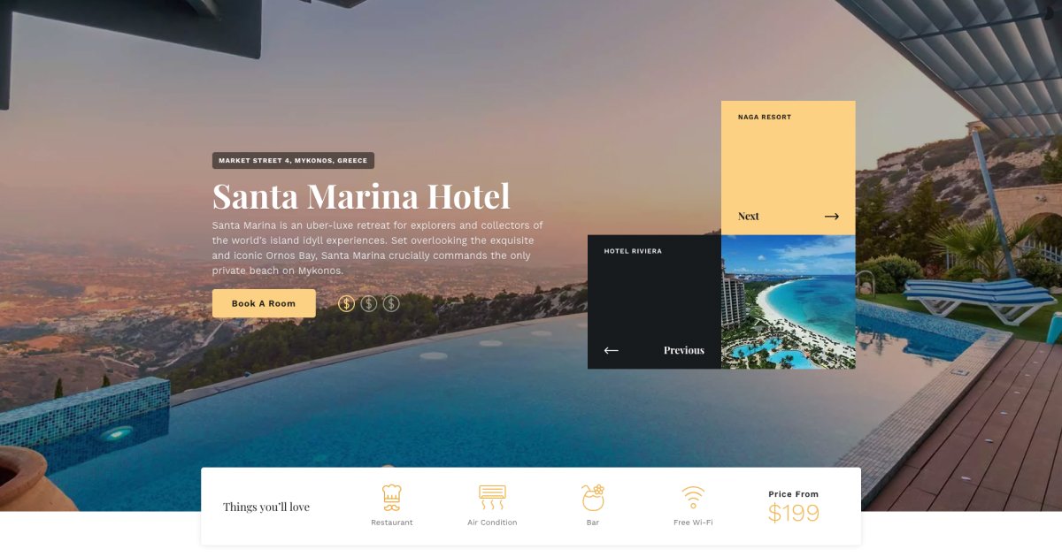
The Full Page Hotel slider, similarly to the Cosmetics above, is a kind of full size slider, that doesn’t completely look full page. At the bottom of this slider there’s a Shape Divider, creating the white line. This line covers the bottom of the image, but the slide content appears above it. As a result, the broken grid effect is created, which gives a modern look to the slider.

Final Thoughts

Full page sliders are not only design elements, they can be an important part of your page. They catch the visitor’s attention and add a personal touch.

Use it on your homepage and the full page slider will give the first positive impression about your website. With Smart Slider 3 Pro you can easily create a full page slider, and you can customize it to your website content. Give it a try, you won’t regret it!

Bernadett Toth

About Author

I’m Bernadett Toth and I’m a member of Nextend‘s support team. I have two dogs, in my free time I teaching them. Besides that I often ride a bike, watching movies or reading.