Settings
Showcase sliders shine if you want to create a slider that shows many slides at once. This slider type keeps the main video slide in the middle while it shows parts of the next and previous slides beside it. This shows visitors that there are more slides to see and encourages them to check them out. In the current slider’s case, the slides on the left and right are semi-transparent, and also smaller than the middle one. This helps the visitor clearly identify the content they should interact with.
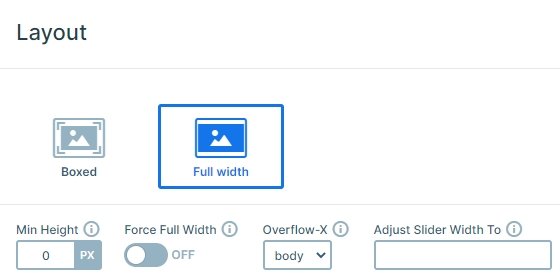
The slider is full width, which means it will cover the browser width. This makes the Video Showcase slider a great header slider or a landing page slider. It’s also great for post sliders or showing images instead of videos.
Layers
Each slide has the same layers: an image, 2 headings and a button layer. This button uses link action to go to the next slide. Each video in this slider opens in a lightbox. This means that the actual video doesn’t load with the slider, only the placeholder images do. Lightboxes are great to show videos, because they allow the visitors to focus on the video with no distraction. The videos in this slider come from YouTube, but they can be simple MP4 videos or hosted by Vimeo.

Animations
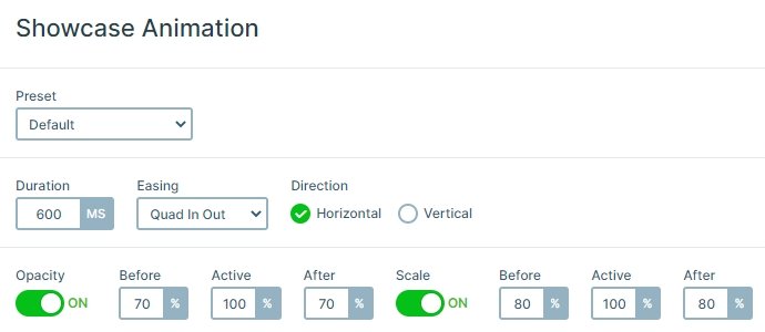
If you switch a slide it moves horizontally. This is the main animation of the slider which you can set in the Animations tab of the Slider settings. Here you can set the showcase animations, too. The previous and next slides are a bit smaller and have an opacity, so you can focus on the active slide in the middle.
Layout
We created the slides with default position, which ensures the great responsive behavior for the layers. In this case, this means that the texts remain legible on all devices, including the smallest mobiles. Visitors can navigate between the slides using the bullet dots, dragging or swiping or using the “Next video” button.
Responsive
Showcase sliders have a special responsive behavior, which allows them to display more than one slide on each device. The problem is that on mobile the slides can shrink too much because of this. We set this slider up to ensure it has the best responsive behavior a showcase slider can have. Thanks to that, the slider looks gorgeous on mobile.
Related Post: Why do You Need a Video Slider on Your Website?
Related Post: Add Lightbox Slider to your WordPress site


