Slider Settings
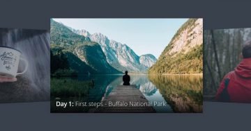
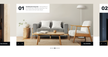
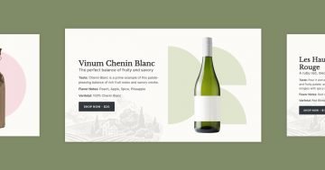
This slider type shows your content in a cool way. With the Showcase slider type, you see more slides next to each other, always with one slide in the spotlight.
The layout spans full width, filling your browser horizontally. Slides on each side have a lower opacity, giving them a subtle faded effect. It can very easily be set up, just head to the Animations settings. From there, you can adjust the opacity of the Before and After slides to your liking.

Navigation is tailored to all screen sizes with two options. For smaller screens, just drag each slide horizontally. Additionally, you can click on the slightly shown slides on each side of the main one to move between them one by one.
Layers
This template has many cool layers. As you can see each slide has the same layout and layers.
However, the most special looking one is the Audio layer in the bottom left corner of the slide. It allows you to add an mp3 sound to your slider for visitors to listen to.

In addition, you can find the usual layers like Image, Heading, and Text, which are pretty common in most slides.
Animations
In Smart Slider, events allow you to trigger layer animations precisely when you need them. It provides an excellent way to captivate your audience and maintain their interest in your content.

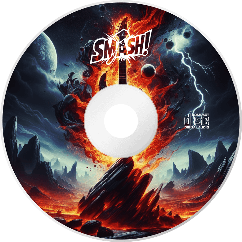
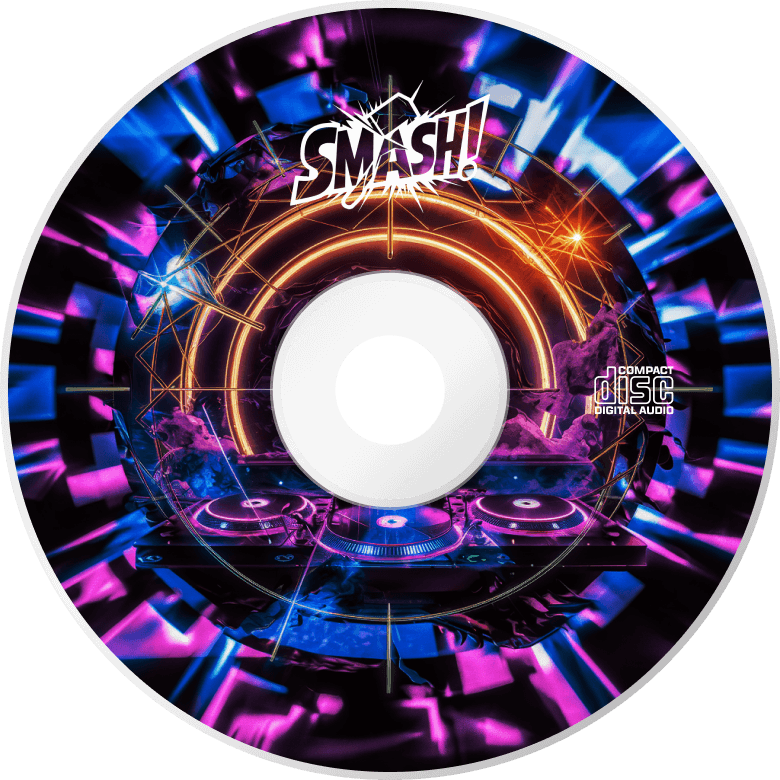
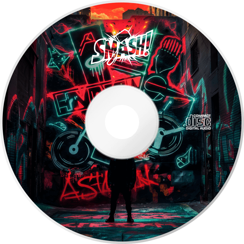
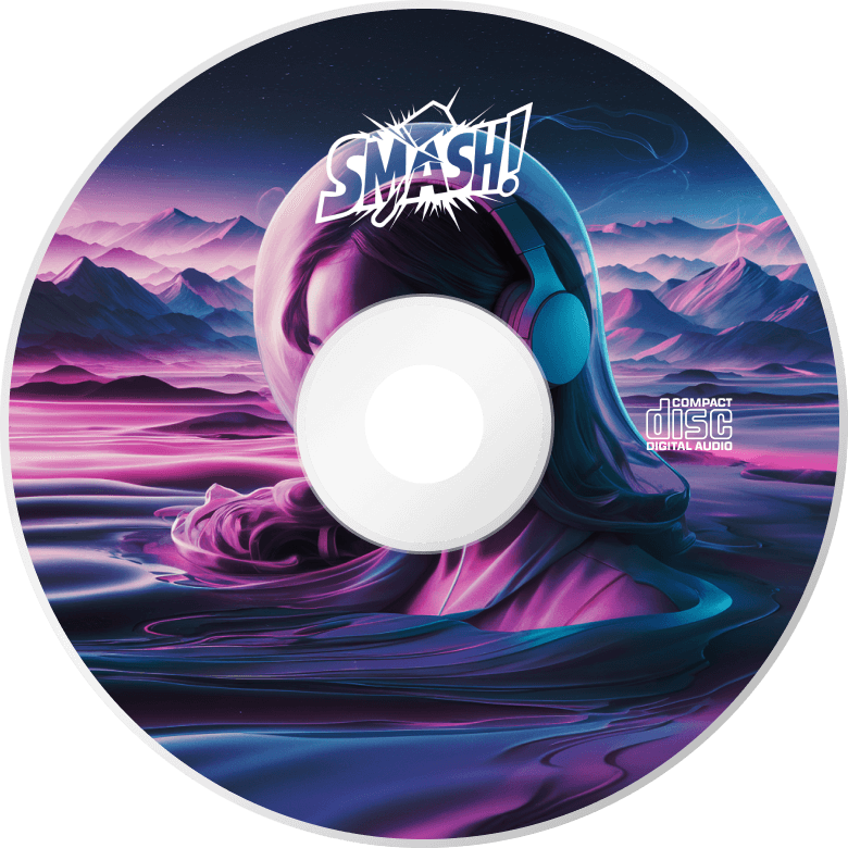
In this template, activating animations is easy, just click on the small white image in the bottom right corner to make the CD roll out from its cover.
Unlike other templates, this one focuses on these specific animations, ensuring a captivating experience for your users.
Layout
Initially, the slider might seem to have a complex layout with many rows and columns nested within each other. But the layer list is here to help you understand the structure. You can easily navigate through rows and columns by opening or closing them using the small arrows next to their names.

However, the real highlight of this slider template is the CD, which is an Absolute layer. These layers float on the slide without occupying any physical space. This gives you the freedom to position them wherever you like, allowing you to create truly unique content on the slider. You can easily spot them on the layer list, as they are marked with a purple A badge.
Responsive
Smart Slider offers a range of tools to optimize our slider for smaller screens, which ensures a seamless viewing experience across devices.
With automatic responsive settings, your content adapts effortlessly to different screen sizes, requiring minimal adjustments from you.
But if you feel the need to customize further, you have the flexibility to adjust font sizes or hide specific layers that you prefer not to display on smaller screens. This gives you full control over how your slider appears across various devices so your content can always look its best.
