Settings
Sliders are the most widely used design elements on websites. They are usually the first parts of the page that the visitor sees when they arrive. People use sliders to showcase their most important content. Since sliders are so important parts of the site, they often have some kind of inner navigation. For example arrows or bullets but if there are many slides to see, arrows are a bit uncomfortable to use. Bullets are slightly better, but they’re hard to use on mobile devices. This is why slider developers came up with the idea to create a thumbnail slider.
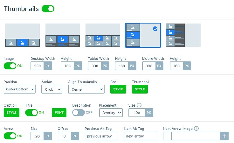
Thumbnails are one of the best navigation elements in a slider that you can use, and in Smart Slider 3 you can easily create a slider with thumbnails. At the thumbnail control you can turn it on and simply customize it. You can even upload a picture, so you don’t need to use the same image as you have used in the background.
Layers
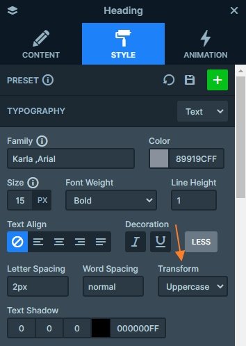
Each slide has the same structure and layers: there are 2 headings on the top, after an image comes, and then a text layer. The first heading is uppercased which you can set at the Style tab of the layer window under the More button.
Animations
Everyone loves animations on a website and on a gallery slider, they can make your page more powerful. Besides the main and background animations in the Pro version of Smart Slider 3 you can put animation on every layer. In this demo slider you can see the same animations coming one after another on every slide.
You can check every layer animation in a visual timeline, where you can set the delay, the duration and the sequence. If you click on the animation on the timeline, it will open the layer window animation tab where you can edit the selected animation. Pressing the space key will start the animations, so you can see a preview of the animations.
Layout
All of the layers are in a 1 row 1 column structure. The row has a white background, and the column has a 2px border which gives a frame to the content. The content layer has a maximum width so the white box will have the same width on bigger screens.
Responsive
All of the layers are visible in smaller screens, just in this case they are smaller. You can customize the font size with the Text scale option on smaller screens. Also, by default the thumbnails are hidden on mobile, but at this slider we have enabled them, so they are visible, and the visitors can navigate between slides.
Related Post: Create A Responsive Thumbnail Slider
Related Post: How to Create Beautiful Responsive Image Slider?
Related Post: Use Beautiful Layer Animations in Smart Slider 3 Pro


