Settings
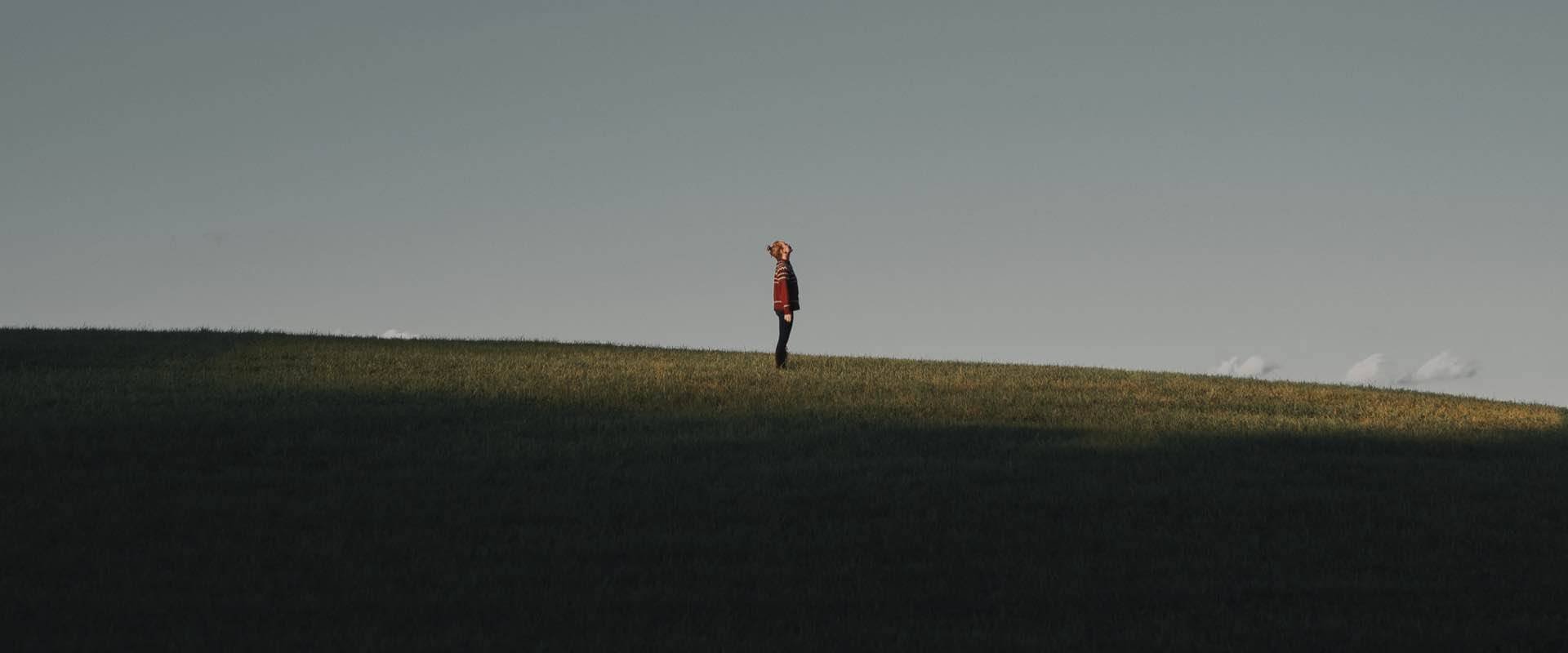
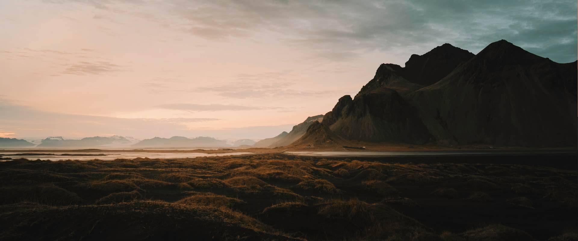
The Photo Story is a full width image slider, you can easily use it on your photography page. Each slide has a background image which can be your photo, and you can link a story and navigate to your blog.
The slider uses the full width layout so it fills the horizontal area of the browser. When you switch a slide the next image will fade in. This fade animation is coming from the Main animation. You can set or change it in the Slider settings → Animations tab.

The slider doesn’t use any controls. The arrow that you can see on it are image layers, and are linked with link actions which you can navigate to the next or previous slides.
Layers
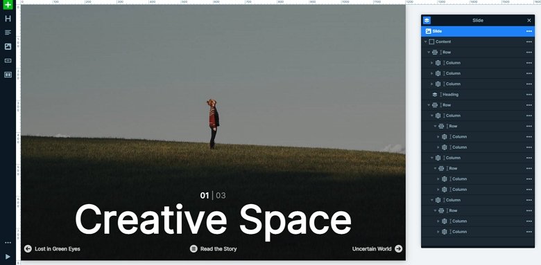
The slider uses basic and simple layers: headings, and images. They are ordered in rows and columns. You can find all of the layers in the layer list. You can fully customize them. These layers were added manually into the slider. If you want more than 3 slides, then you can change the “03” to “04” which you can easily do in the layer window.
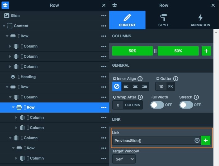
The layers have important roles in the slider. They aren’t just content, but you can also navigate with them. With the 2 rows where the previous and next titles are you can navigate with link actions.
Animations
The best feature of this slider is the text animation on the big heading at the bottom. When you switch slides, the text will move with a nice animation. You can customize this animation if you click on the layer → go to the layer window → Content tab. Here you can find a text animation section, where you can reach the animation manager. You can set the modes where the text can move, the duration or the transform.

Layout
At first sight you might think the slider uses a complicated layout. There are a lot of rows and columns in each other. The layer list can help you to find out the structure. Also, you can open or close a row or column group with the small arrows near their name which you can make the layer list simple.
Responsive
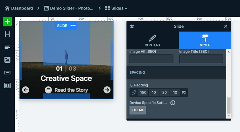
The slider is fully responsive. 2 columns are hidden on mobile devices, so you can see only the arrow images. In Smart Slider your slide’s height is based on the layers and all the slides’ height are based on your highest slide. Since this slider doesn’t contain too many layers, then it will be small. With using paddings, you can make the height taller which you can set at the Slide settings.
Related Post: How to Create a Cool Text Animation
Related Post: How to Create Beautiful Responsive Image Slider?
