Settings
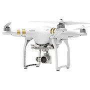
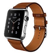
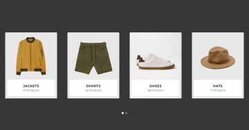
A product slider is the best tool at your disposal to encourage visitors to buy from your store. Most product sliders display many products next to each other. While that approach saves space, it makes one specific product harder to focus on for the visitor. This full-width slider took a different approach than most product sliders. It shows a large product image as background. This raises attention and makes the visitor focus on the product more easily. This slider won’t leave the customer wondering what they should do to shop. There’s a clear, minimal CTA on the slider delivering the clear message: buy now!
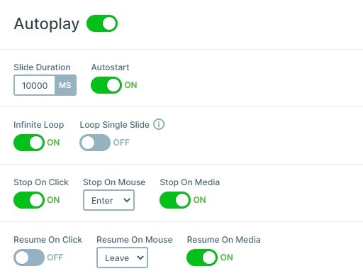
The slider switches automatically after spending 10 seconds on each slide. However, when the mouse enters the slider area, the slider autoplay gets paused. This allows the visitor to read the text and enjoy the slide without interruption. The navigation is also an interesting part of the Full-width Product Slider. At the bottom, there are thumbnails with the product images. This is a simple but effective way to encourage visitors to check all slides.
Layers
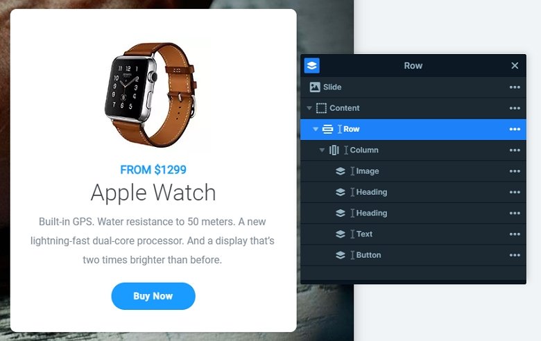
Each slide contains the same layers. There is a row with a column where all of the layers are. The row has a white background color, a small border radius and a nice box shadow. The width of the row is maximum 450px, so the row looks like a white box. There is an image, 2 heading, a text layer, and a button layer in the column.
Animations
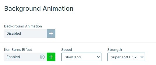
The background images have the popular Ken Burns effect on them. This gives a slight movement to the slider. After the slides switch, the layers on the right side appear with a flipping layer animation.
Layout
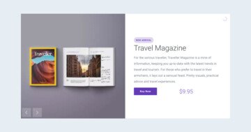
Once the visitor gets interested in your product, they can learn more about it. There’s a white description box about the item at the right side of the slider. This info box was created using default positioning, which guarantees that the description looks perfect on every device.
Also, you can notice the controls around the slider. You can see an autoplay indicator on the top, arrows on the left and right, and thumbnails on the bottom.
Responsive
Lots of people use their phone for browsing. They expect almost the same user experience as desktop users do. This includes being able to read all content without having to zoom in. Default positioning helps with this, as it keeps the text sizes the same on every device, so they’ll be large enough on mobile.
Related Post: Use Beautiful Layer Animations in Smart Slider 3 Pro
Related Post: Do you Need a Product Slider for your Webshop? Yes, you do!
Related Post: 11 Beautiful Full Width Slider Examples
