


Settings
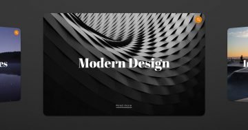
Every WordPress website needs a good looking slider. Sliders come in sizes, the simple slider type being the most popular of them. The simple sliders show one slide at a time, which the visitor won’t find distracting. The Feature Slider is a gorgeous visual boost for any website. It’s especially great to enrich your posts with it.
Adding a slider to a blog post is a great way to give a powerful visual impact. This slider uses the boxed layout so it can fit on any WordPress post or page. Since Smart Slider allows you to add texts to the slides, you can use these simple sliders to deepen your message. Using a slider, you can highlight the most important points of your content. For instance, Feature slider is a great way to in an astonishing way.
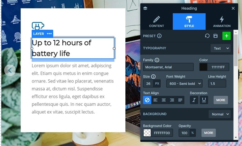
Layers
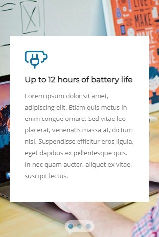
Each slide has the same layers: there is an image layer on the top and then a heading and a text layer comes. These layers are in a row which has a white background color. You can customize each layer in the slider, you can change the text and you can change the style of the layers in the layer window.
Animations
Clicking on the arrows or bullets, the next slide will come in with a fading effect. This fade animation is the main animation of the slider which you can change at the Animations tab of the Slider settings.
When you hover over the slider, the arrows pop up on the two sides. This allows visiting the next or previous slides in the slider.
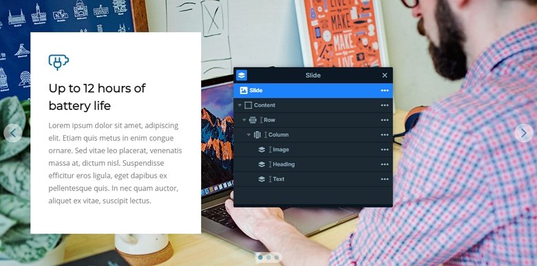
Layout
The slider has 3 slides, and each slide uses the same layout. There is a 1 row – 1 column structure where the layers are. The row has a maximum width, and the content layer is aligned to the left which you can achieve this layout.
Responsive
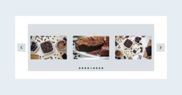
What’s makes Feature slider even more outstanding is that it’s mobile friendly. On touch screen devices, visitors can switch slides by dragging. Of course, there are other navigation options available. For instance, there are bullets at the bottom of the slider, which you can use to switch slides.
Another mobile friendly feature of this slider is the way it looks on mobile. The texts remain legible, which is excellent, as it means your readers won’t have problems interpreting your content. Thanks to default positioning, Smart Slider’s unique way of slide editing, achieving this awesome result isn’t hard at all.
Related Post: Create a Unique Layer Slider with Smart Slider 3