Settings
The Agency page template is a special kind of template you can import into your Smart Slider 3 Pro. That’s because it’s not a single slider, but a slider group. What are slider groups? They’re folder-like containers, and you can put sliders or blocks in them, which you can publish together.
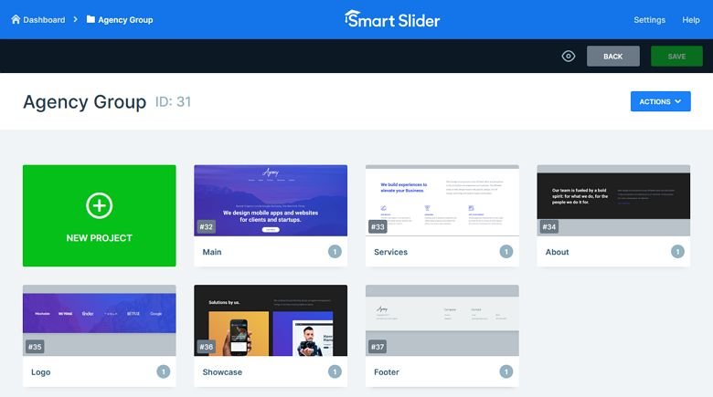
The Agency group contains 6 slider blocks. Blocks are special kind of sliders, that aren’t actual sliders, since they can only display one slide. Since they don’t have many slides, they load fast. Additionally, you can take advantage of Smart Slider 3’s amazing features there.
Layers
There are many different layers on the Agency template. You can find headings, texts and images across the blocks that build the template. On the first block you can find a CTA button, which scrolls to the next block.
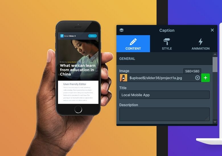
On the fifth block you can see two large images. On mouse enter the images are enlarged and covered by a semi-transparent color. Additionally, a caption appears on top of them. This special layout was created using the Caption layer. This layer makes it simple to create such layouts, as you just need to pick your image and type the caption text.
Animations
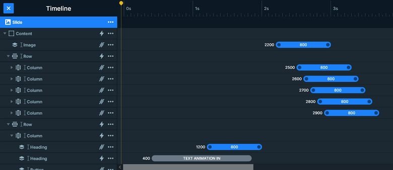
Since there are no actual sliders on this page, you won’t find cool slide switching animations here. However, each block has cool layer animations to introduce their content. On the first block you can also find a Text animation. What’s the difference between the Layer and Text animation? The Layer animation affects the whole layer, while the Text animation only works on the actual text. Also, the Text animation is available on the Heading layer only.
Probably the best animation is on the fist block. That’s because the main heading appears fist, then the secondary heading, the CTA button, the logo and finally the menu. To fine-tune your animations this way, just make sure you open the Timeline.
Layout
When you add a new layer to your slide, you can chose to place it above, below or between your existing layers. To place layers next to each other, you’ll need to use the Row and Column structures. Simply add a new Row layer, then create as many columns as you need. Finally, drag the layers into the columns.
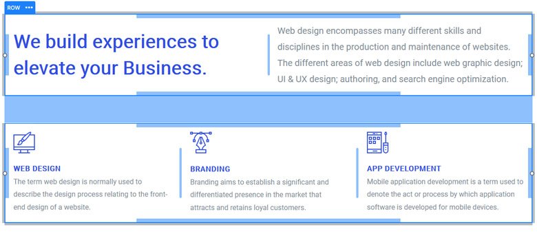
To create a layout what you can see on the second block, just create two rows: one with two and another with three columns. Then place your layers into the columns of these rows.
Responsive
Smart Slider is a responsive slider solution for WordPress and Joomla. In fact, it’s natural responsive behavior is often enough to make the layout look great on mobile. Certainly, there are many tools you can take advantage of if you wish to control the look on smaller screens. Some of the tools you can use are the font resizer and the ability to hide layers on devices.
Related Post: What is a Full Page Slider and How to Use it?
Related Post: 11 Beautiful Full Width Slider Examples


