Settings
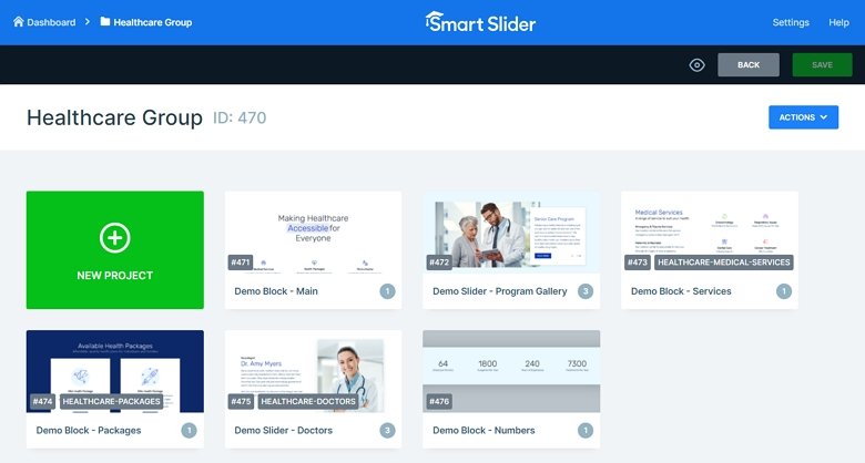
Nowadays it is a common usage to create a nice-looking, clean and modern landing page where the users get useful information about your website. Have you thought that the whole page above has been made by using sliders and slider blocks? This landing page is built up from 6 sliders. If you have Smart Slider Pro, you can import the whole landing page easily from the Template Library.
The sliders and blocks are in a slider group, which can help to put your sliders in one place. Also, you have an option to publish the whole group, and then all of the sliders inside the group will be on the published page under each other.
Layers
The first slider begins with a Heading layer with a reveal animation and after that 3 boxes come in from the bottom. This usage can be unusual because no heading image is used at the top of the page. However, because of that the user can focus on the most important part of the page. The light colors determine the whole landing page, which makes the page clean and modern, and there aren’t crowded or annoying parts.
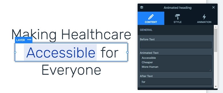
You can encounter more kinds of layers in this slider group: with headings, animated headings, images, text layers, buttons and with counter layers. You can customize all of the layers in the sliders, also you can style them in the Style tab of the layer window.
Animations
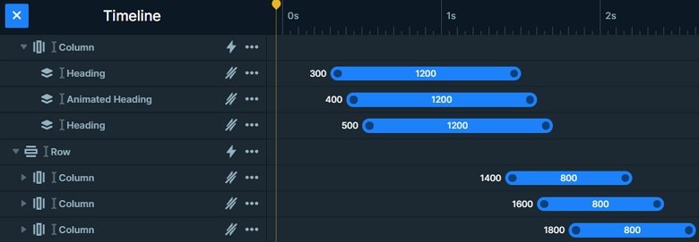
The first slider starts with animations. It looks beautiful, it is fast and the reveal animation makes a stunning effect on the whole page. The main slider is the most important part of the slider group which can call the visitors’ attention. The animated heading with the reveal animation attracts the eye. The incoming cols have a nice hover effect, which can make the visitor click on them. So it can be a good use-case to put a link on the Col, and the visitor can navigate to another page. Also, each layer comes in with a nice layer animation, which you can see in the timeline.
Layout
I would like to highlight the layout of the second slider. Here you can see an image below the box, you can have this overlap with absolute positioning. Absolute positioning lets you drag your layers anywhere, and you can put a layer above or below another.

In the box there are 2 arrows with an action which navigates to the next or previous slide. You can also see that the slider has a slider background which you can set in the General tab of the Slider settings.
Responsive
The whole slider group is fully responsive. The sizes of the text are smaller on mobile, the rows wrap if it’s needed, and there are layers which are hidden on smaller views. You can set the font sizes device specifically with the text scale option, so you can set different font sizes on different devices.
Related Post: 12 Stunning One Page Examples Which You Should Check
Related Post: How to Create Beautiful WordPress Landing Pages That Convert


