Slider Settings
This Full-width slider is designed to look great on any screen size, making your website visually appealing across devices. It comes with handy controls to make browsing easier for your visitors. You can simply drag the slides left or right, which works especially well on smaller screens where swiping is common. Beneath the slider, you’ll see three dots that act as bullet points. These help users choose which slide they want to see and show how many slides are available.
The slider automatically changes slides every 8 seconds, adding a nice touch of movement. But if you want more time to read the text, just click on the slide to pause the autoplay feature.

Layers
Besides the columns and rows, this slider keeps things simple with just two layers on each slide: text and headings positioned at the top.
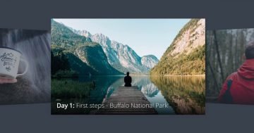
But here’s the interesting part, on the bottom half of each slide, there’s a column featuring unique background images. These images are custom-made with gradients, adding a stylish touch. Plus, the column itself has rounded corners, all thanks to its border-radius settings, giving the slider a clean look.

Animations
Each layer comes with a cool animation that kicks in as the slide loads, appearing one after the other. The text and heading layer smoothly enter from each side of the slider with basic incoming animations, while the column featuring the background image unveils itself with a captivating green reveal animation.
To see these animations, just check out the timeline. It gives you a visual look at all the animations happening on your layers. Plus, you can adjust how long they last and when they start. And if you want, you can even add new animations or copy them from one layer to another right there.

Layout
The slider uses a simple layout: there is one row with 2 columns and another with one column. The top two columns contain the textual layers, and the bottom column has the above-mentioned image background.

On mobile, the first row wraps after 1 column, so the textual elements are below each other.
Responsive
The slider works great on mobile devices, offering some important benefits for small-screen users. It’s entirely touch-friendly, so you can swipe through slides effortlessly. Plus, getting it to look good on small screens doesn’t take much effort. It adjusts automatically to fit any device.
To improve readability on mobile, you can adjust the text size using the Text scale option. You can also hide certain layers on mobile to keep the slider from getting too tall. You can still find these layers in the Layer List.