Settings
With the block type slider you can create any kind of layout, what you would like to have on your website without having to learn any coding. This template uses the block layout, and it can be a great hero header on your page.

Another advantage of the block type against the slider types is that it doesn’t need to load a lot of code, which is required only for sliders. This makes the loading time much better, and you could truly create your whole website from it.
Layers
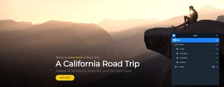
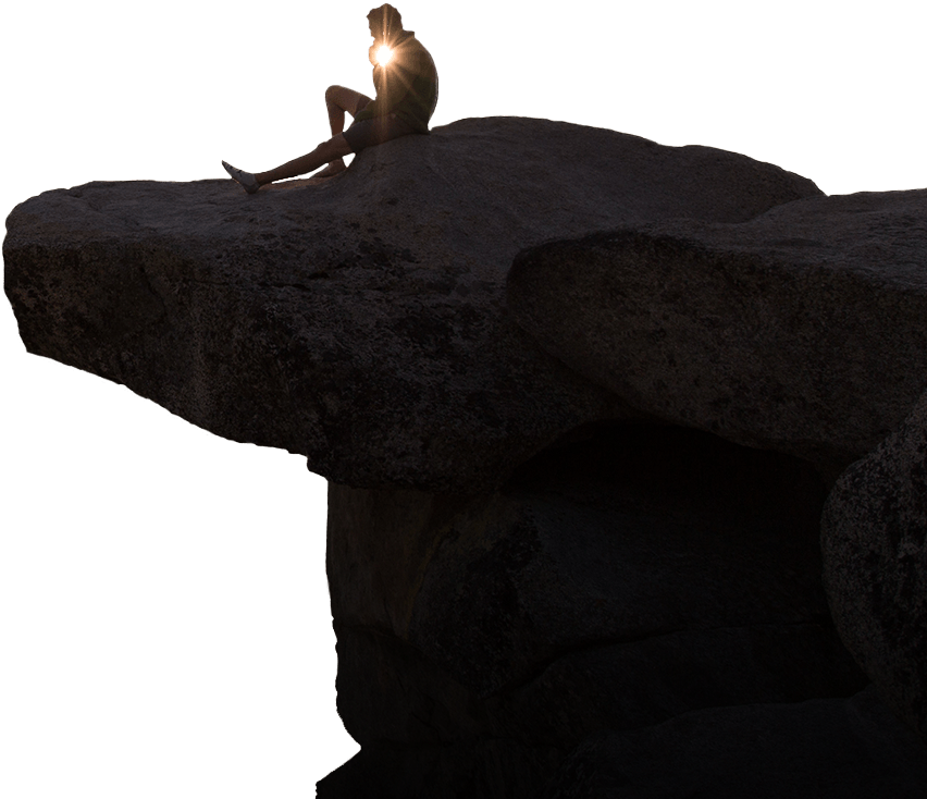
The slider has a text layer, 2 headings, a button, and an image layer. The image layer is in absolute position because there is an effect on it. The text layer contains a link which can link to the author’s page. The read more button also can have a link, which can point to the actual blog post.

Animations
If you hover over the slider and move your mouse, you will notice the image is moving on the right. This effect is a layer parallax effect which cheers up your slider, and makes it more interesting.

Layout
The block has a simple layout: the layers are under each other. The image layer is in absolute position. With absolute position you can put your layers anywhere in the canvas, which can be useful at the decoration elements like this image.
Responsive
The Rock demo is fully responsive. If you check it on mobile, you can notice the image layer is hidden. With hiding a layer you can save space, and the visitor can focus on the content. The texts are also smaller, for that you can use the text scale option which is a device specific setting, so you can set the size in each device differently.
Related Post: Use Beautiful Layer Animations in Smart Slider 3 Pro
Related Post: 11 Beautiful Full Width Slider Examples


