Settings
Basically a split slider is a slider which left and right side moves to the opposite direction. For instance, the left side moves downwards and the right side reveals itself from below. Of course, the two sides meet at the middle of the slider. The split slider effect is gorgeous and it’s not hard at all to set it up. But if you prefer our example you can always import it to your site and tweak it to your heart’s content. You can add more layers, change the colors and pictures or remove anything you don’t like.
This slider example is a full page slider, so fills the available horizontal and vertical space of your browser. The slider doesn’t have controls, you can change slides with the links on the top menu, or with a mouse wheel.
Layers
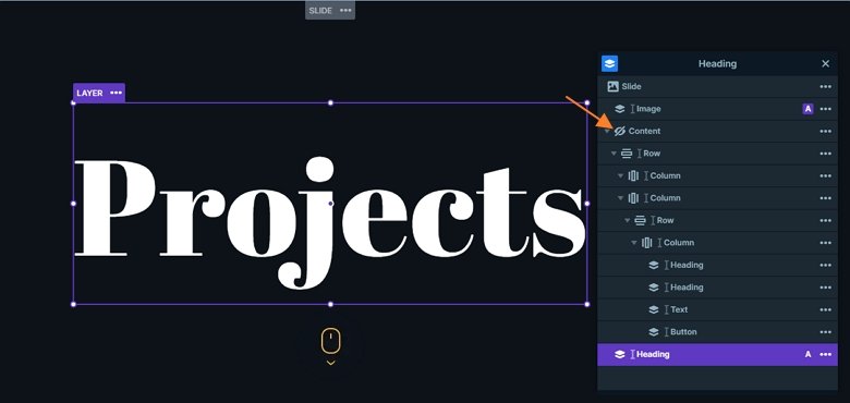
Smart Slider 3 has all the tools which you can use to create any modern WordPress slider. You can use layers to add your content which help you tell your story. The easiest and fastest way of creating a split text effect is to use default positioning. You should add a row with two columns and add your content to each column. You can add text layers, images and buttons to both sides of the split slider.
This slider uses more kinds of layers: there are heading, text and button layers, there is an image layer in the middle of the slide. After each side switches there’s a second heading where you can see a big heading behind the layers. That’s actually a heading layer as well, added in Absolute position and moved behind all other layers.

Animations
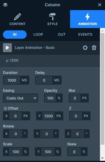
Once your content is ready it’s time to create the actual effect. For that you should select one of your columns, go to the Animation tab and pick the Top animation. Then select the other column and pick the Bottom animation. You can actually select any other layer animations you prefer, but a Top and a Bottom animation will look best.

Layout
The split slider has a simple navigation menu at the top of it. This navigation menu allows the visitor to switch between the slides. Smart Slider 3 makes it super easy to create a menu like that without having to code. At each layer’s link you can select a special link called Go to slide where you can type which slide you would like to go to. The slider will handle the rest. Creating this menu on a static overlay will ensure that the same menu is visible over all other slides. So you don’t have to add it to each slide one by one.

Responsive
Creating a responsive slider has never been easier thanks to Smart Slider 3’s default positioning. It allows you to create your sliders as if you would be working with a page builder. The responsive result is amazing and it doesn’t take ages to achieve it. If you prefer the causal slide building experience, use absolute positioning. It lest you drag’n’drop your layers anywhere.
Related Post: What is a Full Page Slider and How to Use it?
Related Post: Use Beautiful Layer Animations in Smart Slider 3 Pro


