Slider Settings
The Showcase Portfolio template is a modern looking slider you can use to display your portfolio items. It’s a full width slider which is the most popular way to display a slideshow on a website. The slider type is showcase, which displays an “active” slide in the middle of the slider, and displays additional slides on its left and right sides. So, the Showcase slider type can only display an odd number of slides. In fact, it always displays at least one slide. But if there’s enough horizontal space, it can display additional slides as well.
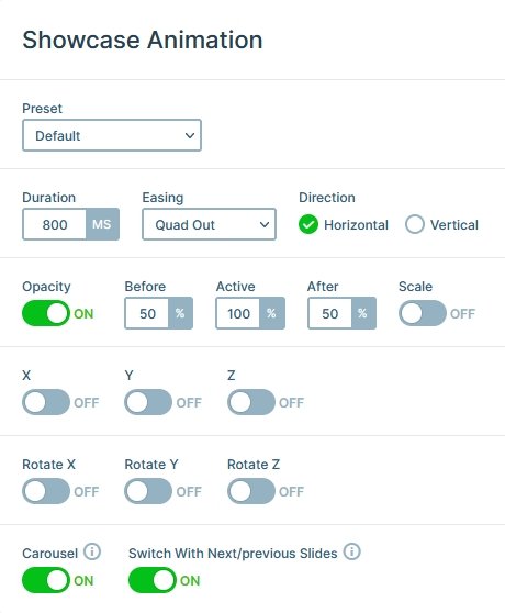
The Showcase slider type uses the extra, non-active slides for slide switching. As a result, buttons or other elements won’t be clickable unless they’re on the active slide. This provides a nice navigational experience which visitors can quickly understand. If you want to disable this behavior, head over to the Animation settings and turn off Switch with next/previous slides.
Layers
There aren’t many layers on the slides of this slider. Only two headings and a CTA button are at your disposal. But for a slider that displays your portfolio items you don’t need too many layers. In fact, the less layers you use, the more curious the visitors will be and they’ll more likely to go and check the details of your portfolio.
Animations
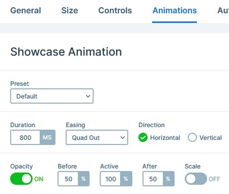
There are no layer animations on the Showcase Portfolio slider. But there’s a special effect you can see if you switch slides. All slides but the active one have a dark overlay. This effect is created by setting a background color for the slider. Then at the Animation settings the Before and After opacity values were lowered. This way the non-active slides are semi transparent, and the slider background color gets visible below them.
Layout
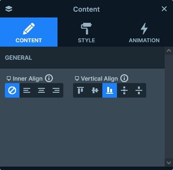
The base of the slide is the background image. The Focus point was slightly changed to ensure that the content doesn’t overlap the focus of the image, even on the smallest screens. The content is aligned to the bottom of the slide, which leaves enough space for the background image.
Responsive
The default responsive behavior of Showcase slider is that as it downscales, it starts hiding the extra sliders that fit next to the active slide. When the screen gets smaller than the set slide width, the active slide starts downscaling. As a result, on mobile you’ll only see one slide.
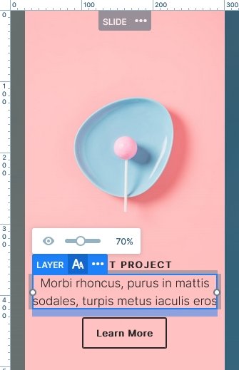
Just like at every slider type, you can use the responsive tools Smart Slider has to fine tune the mobile and tablet result. For example, you can use the font resizer to make the texts fit better into the slide.
Related Post: 11 Beautiful Full Width Slider Examples
Related Post: 12 Stunning One Page Examples Which You Should Check


