Slider Settings
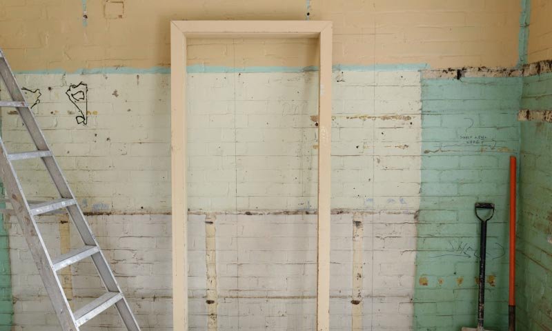
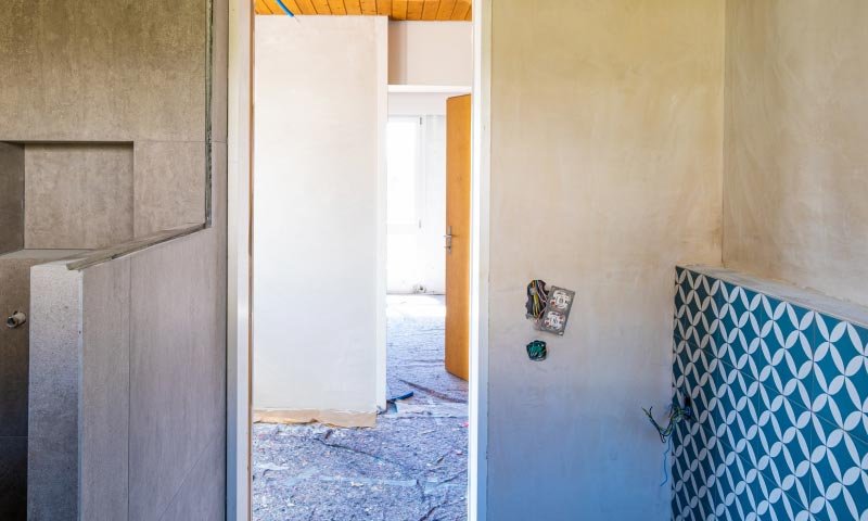
The Renovation Showcase slider is a special looking slider, what we call Showcase type. The Showcase type slider displays more slides next to each other. It always shows an odd number of slides, keeping one slide in the middle. This slide is the so called “active” slide, which the viewer can focus on.
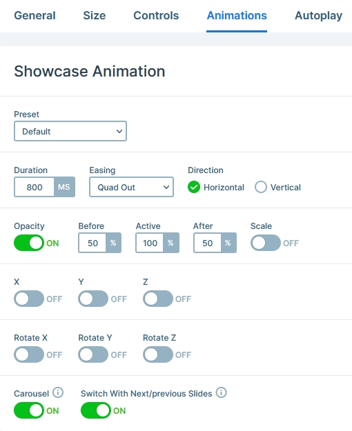
The layout of the slider is full width, which means it fills the browser horizontally. As a result, it’s easier for more slides to display, especially on today’s large monitors. The slides next to the active slide are faded out. To achieve such effect, first make sure you set a slider background color. Then head over to the Animations tab and change the Opacity of the before and after slides.
Layers
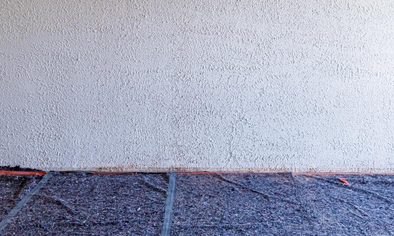
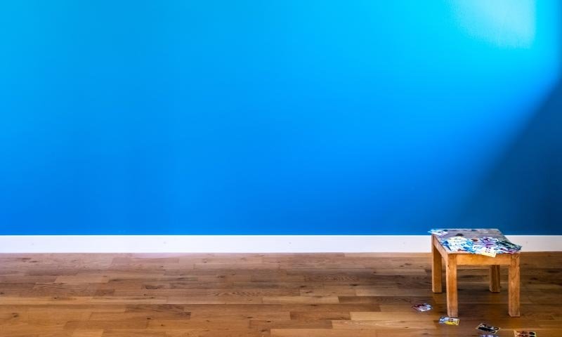
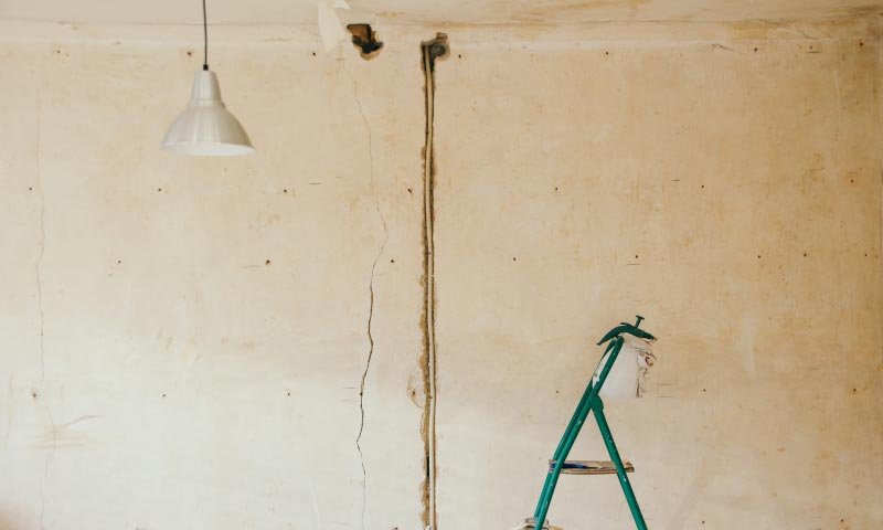
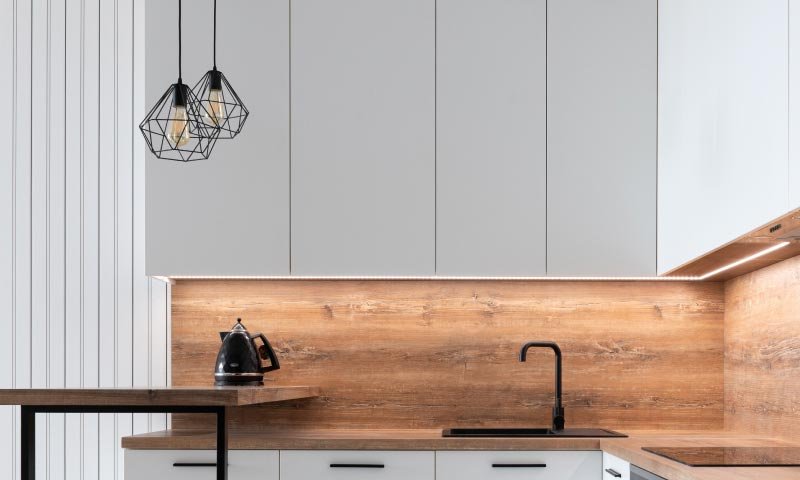
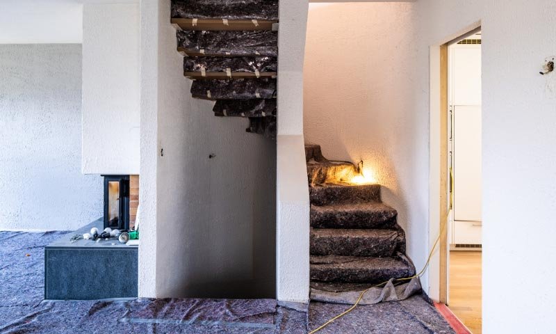
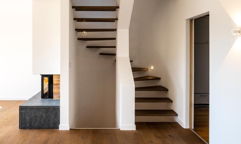
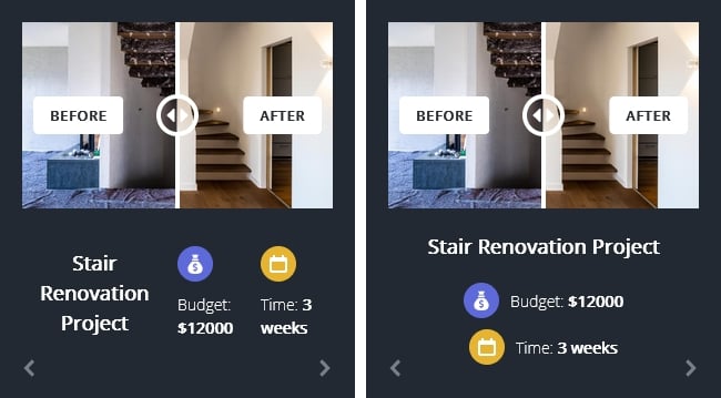
The most interesting layer on the Renovation slide is, without question, the Before After layer. This layer lets you compare two images in the same place. It’s perfect for showing the starting and ending stages of a renovation.
Another notable layers on this template include heading and simple image layers. These image layers display the colored logos.
Animations
There are no layer animations on this template. As a result all layers are immediately present when the slide gets visible. While the Showcase type has many special animations, we chose not to use them. So you can see a simple horizontal movement when you switch slides.
Layout
The layout of the Renovation slider is plain simple. There’s a before after layer at the top, and a three column row below. To ensure the last two columns stay this close to each other, we set a Max width at both of them.
Responsive
The basic responsive behavior of the Showcase slider type is that it always fully displays the active slide, which is in the middle. If there’s room to display more slides and equal amount of new slides are revealed next to the active slide.
On mobile the layout didn’t need much adjustment, as the font sizes were good. Also, the row automatically breaks its columns into new lines on small screens. But if you’d have to make changes, you can always use the Text Scale option to reduce the font size. Also, you can change the Wrap after on the row if you don’t want it to break the columns to new lines.
Related Post: Introducing Before After Layer
Related Post: What Do You Need to Know About Slider Types?
