


Settings
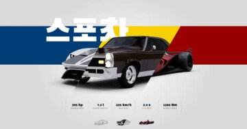
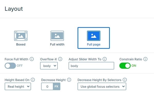
This slider is a clean, modern looking product showcase using pastel colors which fit perfectly into any kind of website. It features a photo app product but it can be used to feature any other product, or even your company itself. It is a full page slider which means that it fills the width and height of the browser in any screen size. The size of the menu is excluded from the calculation, using the Decrease Height option.
There are some interesting features set at the slider settings that would worth mentioning before we would talk about the slides individually. If you’ve checked the slider already, and you went back to a previously visited slide, you might have noticed that the layer animations are not playing again. It is happening because of the Play once setting, which was turned on for the Photo App Slider.
Layers
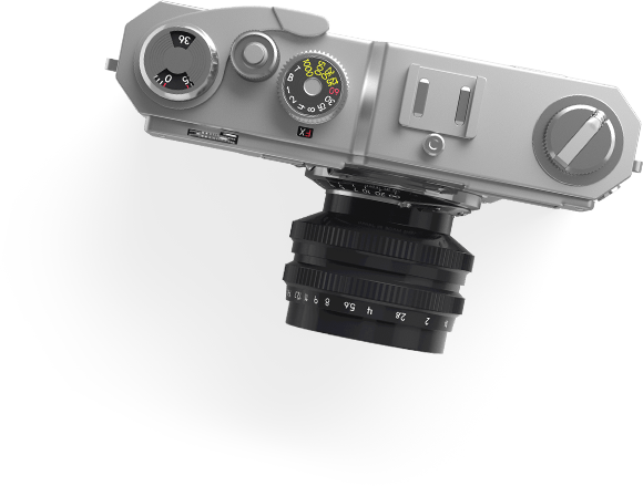
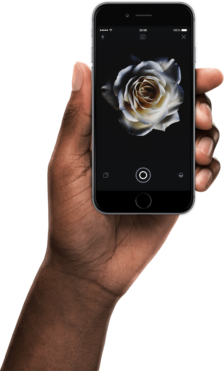
Now let’s take a look at the first slide. It’s a simple, clean slide, with a few layers: image, heading and text. While the first slide was a simple but elegant one, the second slide is way more interesting. Here you can meet with a transition layer. This layer can display a different image if you hover over it.

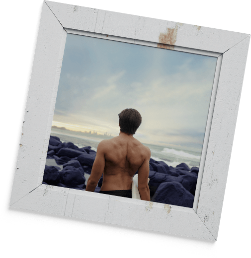
On the third slide you can find a YouTube video in a lightbox. You’ll also find smaller icons created using the image layer. Finally, the last slide contains a nice-looking call to action button beside the large image.
Animations
When you check the slider and scroll through the slides you can see the layer animations on the layers. It is a perfect and fancy way to introduce your product or your company.
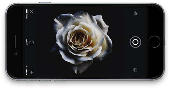
The most special slide is the second one. This slide has layer animations just like the first one, but most of these animations are tied strongly with the events: for example, the “Hover me” layer stays visible until you hover over the first transition layer, but if you don’t hover over this layer, only the other two transition layers, it will stay right there. While you hover over any transition layer, you’ll notice that the image beside the mobile gets covered by another one that appears because the transition layer was hovered. Hover on the other transition layers, too, to see a different image appear beside the mobile each time. It looks fantastic, your visitors will love it!
Layout
In Smart Slider you can use 2 positioning modes: default and absolute. With default layers you can build your content, and absolute layers can be used as a design element as you can notice in this slider.
There are several possible methods to navigate between the slides in this slider: on the right side, there is a bullet control, it is possible to switch slides using the arrow keys (down key to go to the next slide and up key to go back one slide), the slides can be dragged to the same direction. It is also allowed to scroll upwards or downwards to go from a slide to another one. Since the Carousel option is turned off, after the last slide is reached, the slider will allow to scroll further down the page without switching slides continuously, so the visitors can check your other content.
Responsive
This slider is fully responsive. The absolutely positioned layers are hidden on mobile. With that the content has enough space, and the visitors can focus on it.
Related Post: What is a Full Page Slider and How to Use it?
Related Documentation: Full page layout