Settings
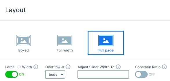
The Ride & Connect slider uses a full-page layout, meaning it fills the entire screen, with no distractions. This creates an immersive experience that keeps your visitors focused on your message.
Only one slide shows at a time, so users can take it all in before moving on. Navigation is easy: on smaller screens, they can swipe through, while on larger screens, they can click the arrows in the bottom right corner.
To set this up, just use the link action on your layer. Click the + icon next to the Link field under Actions, and you’re all set.
Layers
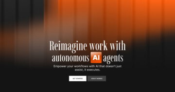
All the slides in this template use the same set of layers laid out in a clean way, like rows, columns, headings, text, buttons, and images. Nothing fancy at first glance, but a few thoughtful details really bring it to life.
Take the button, for example. It has a simple hover effect, a slightly darker yellow when you mouse over it, but that tiny touch makes it feel more interactive.
There’s also a soft blur effect behind the text and button, which gives the content a modern, almost frosted-glass vibe. It’s a subtle detail, but it really elevates the design.

If you want to try that blur yourself, just add some custom CSS into the Developer settings of your slider. Then, in the Style tab’s Advanced settings of any layer, add your custom class.
Animations
This slider template has some really cool animations that make everything feel more dynamic and engaging.
First up are the layer animations. When the slide loads, the text and button row in the bottom left appears with a nice Reveal animation, like a colored box swipes over it to introduce the content. It’s a small touch, but it adds a lot of visual interest.

At the same time, the image layers in the bottom right (the ones you use to navigate) slide in from below, giving everything a coordinated feel.
There are also loop layer events built in, which means certain animations are triggered by user actions. For example, just hovering over the bottom-right images with your mouse kicks off an animation, super simple, but great for keeping visitors engaged.
And when you switch slides, there’s a smooth background animation that creates a parallax-like effect. Both background images move, but at different speeds, so the new slide comes in while the old one moves away behind it.
Layout
Since this slider keeps things minimal, the layout stays clean and straightforward, no need to get fancy. Most of the content sits nicely in the bottom left, stacked in a single column so everything’s easy to follow.
The image layers used for navigation are placed using absolute positioning, which just means they’re carefully positioned right where they need to be without affecting the main layout.

And the big, eye-catching image is set as the background of the slide. It grabs attention without interfering with how the rest of the content is arranged, which is smart and stylish.
Responsive
Smart Slider is fully responsive, which means your sliders will look great on any screen, from desktops to phones. And if you want to tweak things for smaller devices, it gives you some pretty useful tools to do just that.
Some of the most useful features are the font resizer to easily adjust your text, and the option to hide layers on specific screen sizes. So you can keep things clean, readable, and perfectly tailored, no matter where your visitors are viewing from.