Settings
With the portfolio categories slider, you can showcase your portfolio in a modern way. Just import this Smart Slider 3 Pro template, change the images, write a short description for your portfolios and use the slideshow on your portfolio page.
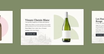
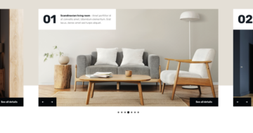
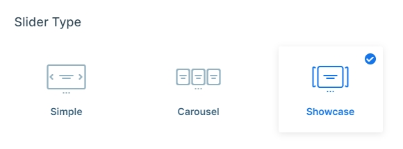
This slider was built with the showcase slider type which is a special type of slider. With a showcase slider you can show more slides at the same time as at the carousels, however, in this case you can showcase not just the whole slide even a part of a slide, too. In these kinds of sliders the active slide is in the middle which the visitor will see first and focus on. Clicking on the previous or next slides, you can switch slides, and see the others.
Layers
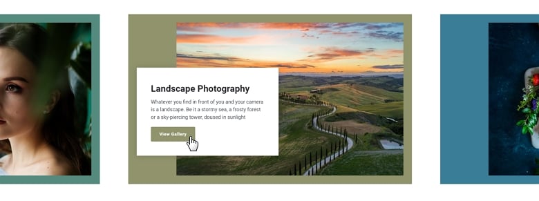
You can see the same layers on every slide: a heading layer which can be the title of your portfolio, a text layer, which can be a short description, and a CTA button, where you can navigate to your work or open it in a lightbox.
The speciality of the slider is that every slide has different background colors, and every background image is smaller than the size of the slide. What is even more awesome is that if you hover over the button, you can see the same color as the background color is.
Animations
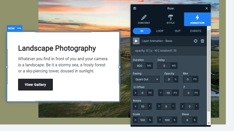
When you switch to the next or previous slides, you can see that the white box comes in. The row has an incoming layer animation, which attracts the eye and calls the visitors attention and makes your page more powerful. This animation is on the row, it rotates the box a bit, and fades in.
Layout
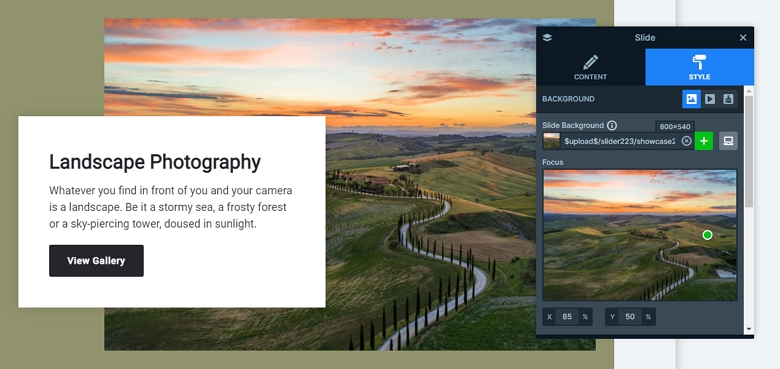
At the background images we have used the center fill mode which puts the background image in the center with its original size by default. If you resize the window it won’t change its size based on the screen’s width so it will be cropped on small screens and it will show the image on its focus point. You can change that focus point if you need to. In this template the Y focus point is 50% so the slider is vertically in the middle and the X focus point is 85%, which means that the slider is aligned in the right side. In this template we have worked with 800×540px images, so you can reach the best result, if you work with the same image ratio.
Responsive
The slider is fully responsive and looks good on mobile and tablet as well. In mobile we have used paddings, and with that you can see a part of the background image, also you can see the white box and the content on it.
Related Post: 11 Beautiful Full Width Slider Examples
Related Post: All You Need To Know About Carousel Slider Type
