Slider Settings
The Mega Magazine template is a full page slider for your website. Full page sliders fill the browser viewport both vertically and horizontally. As a result, they’re perfect for various use-cases, including header sliders.
It’s also uses the Simple slider type, so it displays one slide at a time. This helps the visitor focus on the slide’s main message.
Navigating the slides in the Mega Magazine slider is easy. People can use the CTA button with the label “Next Category”. This button uses Link actions to start the slide switching. Touch swipe and drag navigation is also available.
Layers
You can find the most common layers in the Mega Magazine template. There are lots of headings, since there are many headlines, but there are couple of text layers, too.
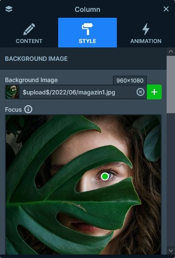
Additionally, you can find a handful of image layers. Also, there are lots of rows and columns that create the cool layout. Also, main image on the left side is displayed by a column, because it’s the background of the column.
Animations
There are two kinds of animation on this slider. One is the Main Animation, which is the special effect that switches slides and moves the layers at the same time. The Mega Magazine slider uses the Vertical Main Animation.
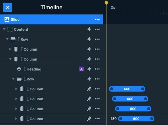
Apart from the Main Animation, you can also find layer animations on this template. They help displaying the grid on the right side.
Layout
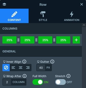
The Mega Magazine template contains many interesting layout solutions. For example, there’s a 2×2 grid on the right side of the slider. We created it using a single 4 columns row that wraps after the second one.
Another interesting element in the layout is the Absolute positioned layer at top left part of the slide, that displays the category of the current slide. Absolute positioned layers are just floating on the slide, so they can be placed anywhere. For example, at this template we placed it behind the 4 column row.
Responsive
Smart Slider is a responsive slider that offers many great tools to create perfect looking sliders for mobile. For example, you can adjust the font size for tablet and mobile devices without affecting the other devices. You can also hide any layer on any of the devices.
Hiding layers can be useful on smaller screens to ensure that the content can fit. It can be especially important thing to do when your slider is full page, as long content can end up cropped.
Related Post: What is a Full Page Slider and How to Use it?
Related Post: 7 News Slider Designs to Inspire Your Next Web Design Project


