Slider Settings
The Masterclass template uses the simple slider type. This slider displays one slide at a time and it’s the most common slider type you can see on the web. Displaying a single slide at a time helps the visitor focus on a single message only. Additionally, the template is full width, which means it fills the browser horizontally.
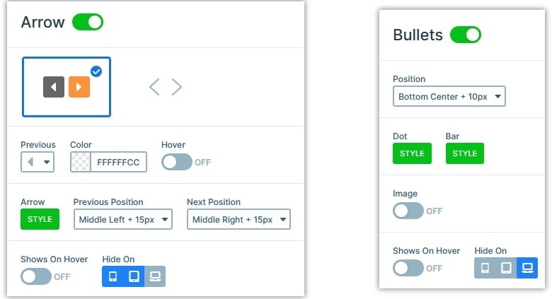
The Masterclass template uses arrows for navigation, but they only appear on desktop. For smaller screen navigation bullets are available instead. Bullets are useful for navigation as they allow the visitor to pick and choose the slide they want to see. Additionally, they also help indicate how many slides there are to see. However, arrows can only be used to navigate one slide at a time forward or backward.

Layers
You can find the most basic layers on this template. There are headings to display the main headlines: the occupation, name and signature line of each person. There’s a text layer that you can use for a longer description. Additionally, there’s a CTA button on each slide to call the visitors to action. Also, we used an image layer to display each person’s picture.
Animations
The only animation you can find on the Masterclass template is the Main Animation. The Main Animation can move both the backgrounds and layers when the slides change. We used a horizontal effect which looks perfect for a slider like this.
Layout
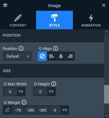
The Masterclass template uses lots of interesting layout solutions. Specifically, it uses lots of negative margins to break some layers out of the grid. For instance, the main picture and the two boxes have negative margins. The result is quite spectacular and interesting to view.

Responsive
Smart Slider is a responsive slider, which offers tons of responsive settings to fine tune your sliders for small screens. For example, you can reduce the size of the texts using the Font Resizer. Or you can hide layers you don’t want to show on small screens.
There are some responsive settings which the slider does for you automatically. For instance, if you use a row, it automatically wraps its columns into new lines on mobile. This way the content has more space to display.

Related Post: Are You Looking for a Free Slider Revolution Alternative?
Related Post: 11 Beautiful Full Width Slider Examples


