Settings
Lightboxes are some of the most elegant ways to display large images for visitors. Using lightboxes to enlarge images allow saving space on the website. You can display a smaller image for the visitor by default. Then, if they launch the lightbox, you can show a big, high quality image. This saves you loading time as well, because the smaller images will load a lot faster.
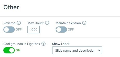
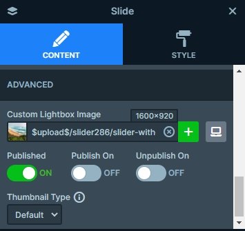
The lightbox is created using the “Backgrounds in lightbox” feature. This feature automatically creates a lightbox from the background image of each slide. If you care about the loading time of your site, you won’t use large images there. Which means the lightbox might lose its purpose. Luckily, Smart Slider got a nice feature for you to help you create better lightboxes. After enabling “Backgrounds in lightbox”, visit each slide and locate the Custom lightbox image feature. You’ll find it at Slide settings → Content tab. What does this feature do? It lets you pick a custom lightbox image, even for tablet and mobile devices. This way you can ensure your visitors will see the best possible lightbox image.
Layers
The content of the slides is just a simple background image. Therefore, the Lightbox with caption slider does not contain any layers.
Animations
If you switch a slide, you can notice a fading animation. This is the main animation of the slider which you can change and customize at the Animations tab of the slider settings.
Layout
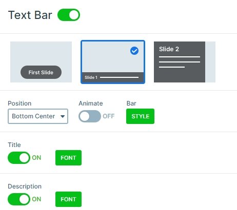
In this slider example, every slide has a simple background image. They all have captions as well with a short description. This text is displayed by the text bar control, which shows the slide title and description. The text bar is highly customizable, which means you can change several aspects. For instance, you can change the background color of the bar or remove it, if you don’t need it. Although, we advise using a background color to increase the contrast and make the text more legible. Speaking of texts, you can change their color, font family and size. Of course, you can decide if you want to show the slide title, description or both.
Responsive
The slider looks good on smaller devices as well. The texts are smaller, and the arrows are visible. But if you have more text on your text bar, maybe your slider won’t look good. In this case you can hide your text bar on mobile, and the visitor can focus on your images.
Related Post: How to Create Beautiful Responsive Image Slider?
Related Post: Add Lightbox Slider to your WordPress site
