💡 Best features in this slider
- CTA button
- Button with lightbox
- Image box
- Arrow control
- Shape divider
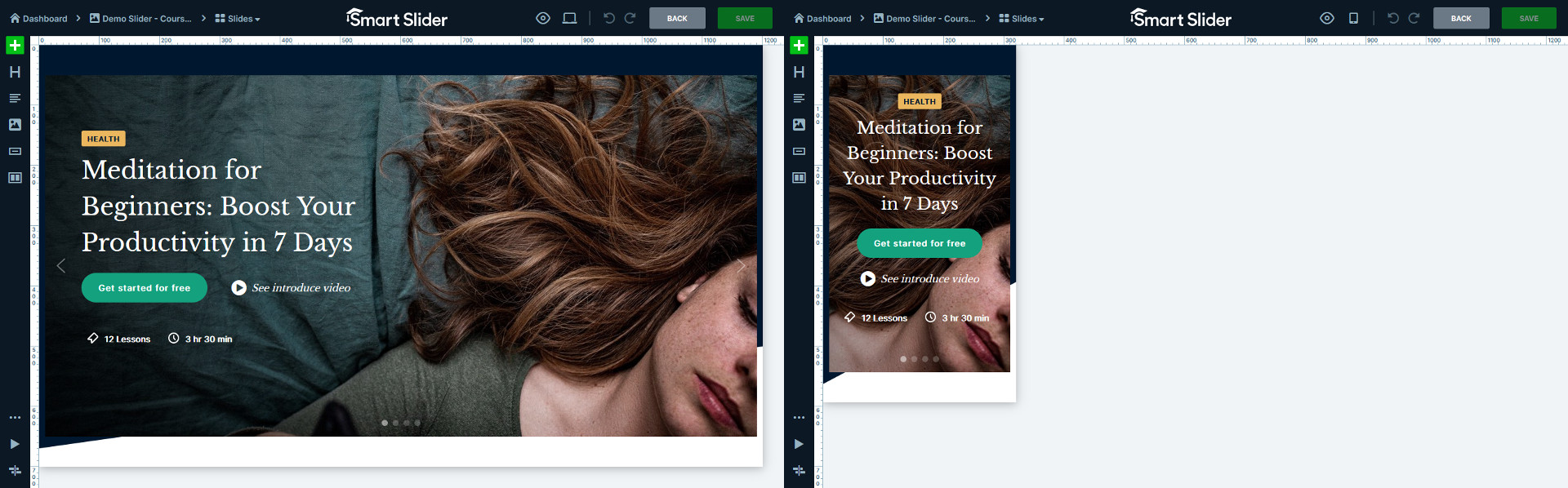
Settings
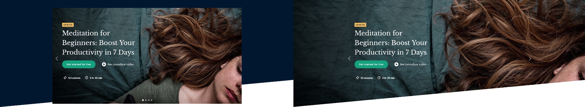
Courses slider is a gorgeous full width slider what you can use on your website. It features a nice image in front of single colored background. This gives a modern look to the whole slider. Additionally, this dark background the Shape Divider at the bottom truly stand out.
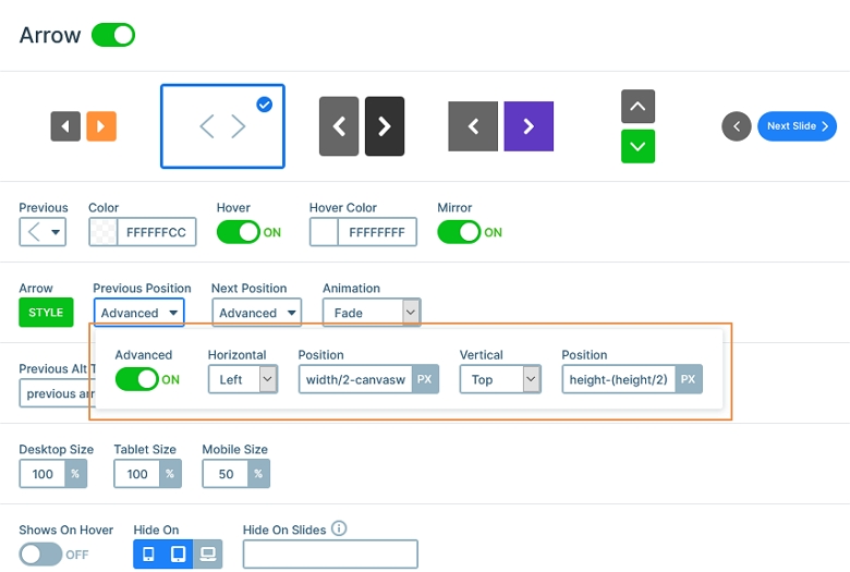
The arrows on the Courses slider stay inside the slide content. How to create arrows like that? Using the Advanced Position at the arrow control. With the Advanced Position feature you can use Control variables for positioning. This way you have a lot more options to place your arrows, bullets and thumbnails on your slider.
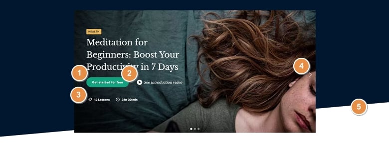
Layers
You can find some special looking layers on this Courses slider. Let’s start with the button layer, that has an icon in front of the textual content. At the button layer you’re able to select an icon the layer shows, which can help you make better CTA.
At the bottom of the slide you can find two image box layers. These layers are special, because they let you hold an image or icon, a heading and a description in a single layer. This opens up many designing possibilities.
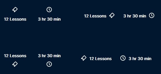
To get this left-aligned layout, we put 540px max width on the row. As a result, the layers are taking up approximately half the slide, which gives a nice layout.
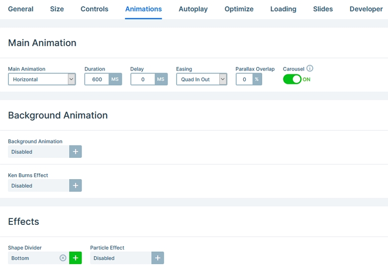
Animation
The most special part of the Courses slider is its animation. What makes the animation look so cool is that the Main animation got combined with two layer animations. So, what does exactly happen when the slides switch?
The Main animation moves the downscaled Content layer to the middle. Then the Content layer starts to scale up, and during this time, the layers in the row move in from the right.
Apart from these cool effects, the slider has a lightbox feature which you can launch from a CTA button. It prompts the visitor to learn more about your course by watching a video.
Layout
The layout of the Courses slider is based on the Content layer. This Content layer has the image of the slide. The reason this creates a special look, because the Content layer can only as big as the slide canvas is. In other words, it does not always cover the whole slide.