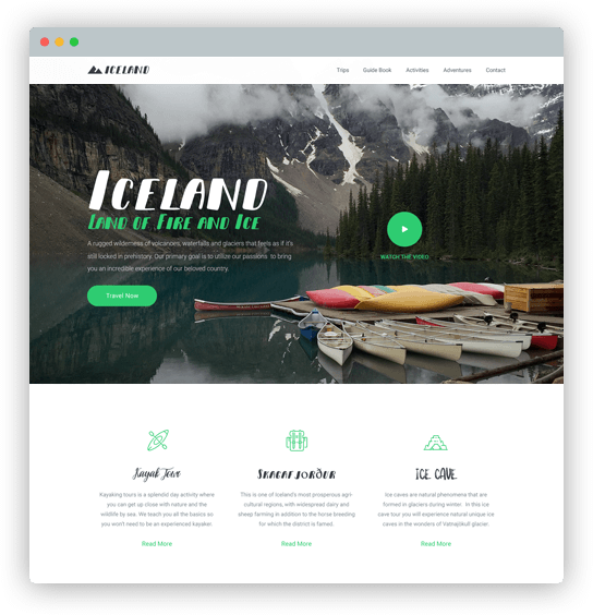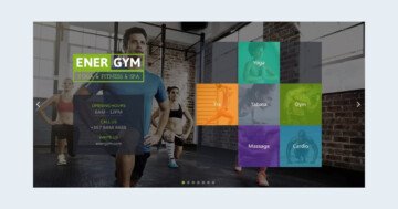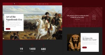
💡 Best features in this slider
- Animated Heading
- CTA buttons
- Slide background image with overlay
- Number type bullet
Settings
With a Layer slider you can cheer up the visual appearance of your website. You can tell your story by using layers like a heading or text.
This slider stays from 4 slides, and every slide has a different background color which makes your website colorful. It is important to keep the harmony between the layers and the background, the layers should be legible and clearly visible like in this Layer slider.
A navigation is also important on a slider, in this sample you can see the number type of bullets where the visitors will see how many slides there are, and can switch them. What is more, you can see arrows too, but the carousel mode is turned off here, so you can’t switch from the first slide to the last one, you can navigate only in one way.
Layers
The goal of this sample is to catch the visitors’ attention and with the buttons and icons call to an action. In this sample slider the animated heading layer is the first what you will see, which keeps up interest on your website. The animated heading changes more words with a nice animation, and the visitors will focus on that. In this example, the typewriter effect is used, but you can choose from more animations at the layer window.

The last slide is special where the HTML layer is used, which contains a contact form, and gets the visitor to do something. I can suggest the HTML layer for developers who want more functionality in their slider. In the background video is played, and with a video slider and with the animations your slider will come alive and be powerful.
Animations
Everyone loves fancy transitions on their website and layer animation helps you create really amazing sliders. The layer movement catches the visitors’ eye like in this example and that makes the slider complete. Use the timeline where you can set the duration and the delay of the animation, and can see how they work together.

Layout
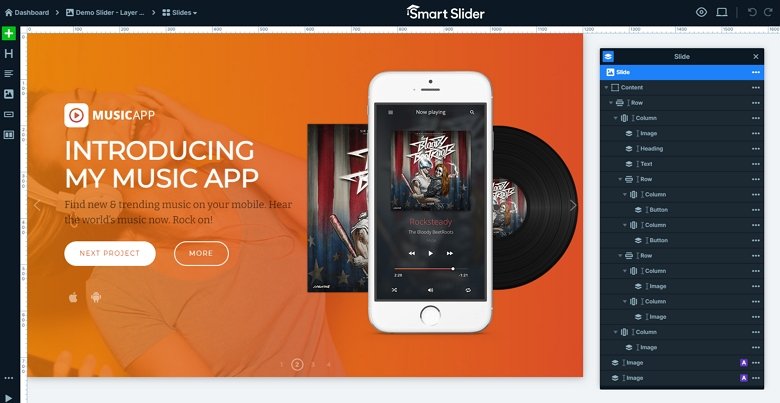
Go to the second slide, and you will see this slide has a special layout. There is a basic row with 2 columns, so you can see the content on the left side, and images on the right. There are 3 images, but if you check it you will notice that 2 images are under the third thanks for the absolute positioning.
Responsive
Smart Slider has more responsive settings which you can make a fully responsive slider. With the Text scale you can make the text lower on different devices, also you are able to hide layers. If you have too much content on your slide, it can make your whole slider bigger. So take care of the sizes, and hide layers if it is needed.
Related Post: Why do You Need a Video Slider on Your Website?
Related Post: Use Beautiful Layer Animations in Smart Slider 3 Pro
