Settings
The base of the Infinite Logo Carousel is a carousel type slider. The Carousel slider type is a special type in Smart Slider 3, that can display more slides next to each other. In this case, you can see 4 slides beside each other. The amount of slides the slider can display depends on two factors: the current slider size and the set slide size. If you don’t want to display too many slides next to each other, you can use the Max pane width option.
The slider uses boxed layout, which means it will always have the same size as its container. For example, if you place the slider into a 800px wide container the slider will have this size as well. Additionally, it will only display two slides. The slider has a white background color. You can change that at General tab → under Slider Design.

Layers
Every slide contains a one column row, that contains the image layer with the logo. Each image layer has 100x102px size, which makes them fit perfectly into the slides. To help you prepare the perfectly sized image, you can find how big image is used at each image layer or background. Just check the top right corner of the image field.

Animations
The most obvious animation on the Infinite Logo Carousel slider is the Autoplay. This option makes the slides change automatically, without any user action. The autoplay is a great way to get your visitors to engage with your slider. But be careful! An autoplaying slider that switches too fast will have a negative impact. People don’t like being interrupted when they read or watch a video. So make sure you set the autoplay duration carefully.
Layout
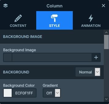
As mentioned above, each slide contains a row and a column inside. This column is the place where we set the gray background color. This color is a great way to create contrast with the white background of the slider. Additionally, it helps to make the slides stand out.

Responsive
The Carouse slider type’s basic responsive behavior is hiding the last slide if it can’t fit anymore. As a result, the smaller the screen where you check the slider, the less slides are visible. For example, on most mobile devices this slider will display one slide at a time. Because of this, the slides in a carousel slider always look great on mobile.
Related Post: How to Create a Stunning WordPress Logo Slider
Related Post: How to Create Beautiful Responsive Image Slider?


