


Slider Settings
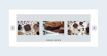
The Digital Art template is based on the Carousel slider type. The carousel is one of the slider types of Smart Slider which can display more slide at a time. It’s also a full width slider, which is very popular because it looks great.
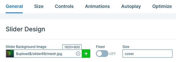
Another interesting feature displayed on this template is the slider background image. Slider backgrounds sit behind all slides of the slider without moving away. So its perfect to give a nice touch to any slider you create.
There are bunch of navigation options available on this slider. The most obvious are the arrows sitting on the left and right side of the slider. They’re super great for slide to slide navigation and make it simple to navigate the slide. Another navigation option are the bullets, which also indicate how many slides there are to see. Swiping on touch screens and dragging with the mouse is also available to switch slides.
Layers
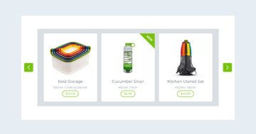
The Digital Art template uses the most basic layers: image, heading, text and button. But as you can see even with such simple layers it’s perfectly possible to create a stunning slider.
Animations
The most interesting aspect of the Digital Art template is its animation. The template has both layer animations and events. In Smart Slider you can use events to trigger layer animations on various actions. Like at this template’s case hovering on the slide makes the two rows appear. Not hovering on the rows anymore makes them hidden again.
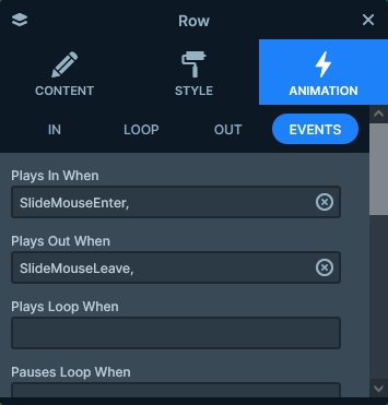
As touch screen devices don’t have hover actions, hover based events turn into touch based events on these devices. So, for example, a mobile user can touch the slide to reveal the layers and touch somewhere else to hide them.
Layout
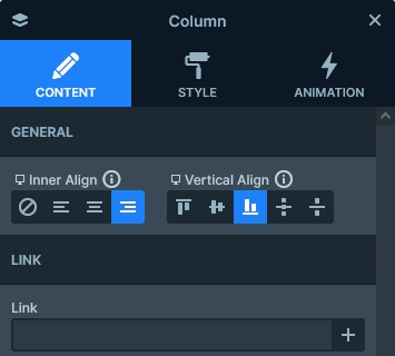
The base layout of each slide is two rows. One row is at the bottom with it’s Stretch option enabled, which pushes the other row to the top. At the bottom row’s column the content is vertically aligned to the bottom. This makes the layers appear at the top and bottom of the slide.
Responsive
The basic responsive behavior of the Carousel sliders is that as they display as many slides as can fit into the current slider width. Then, as the screen gets smaller, the slide that can no longer fit disappears and the remaining space is divided between the remaining slides. As a result, the Carousel slider’s slides have approximately the same size on desktop, tablet and mobile devices.
Because of this, it’s generally very easy to make Carousels look good on mobile. Additionally, they usually need little to no responsive adjustments. But if you feel you need to make changes, you can always adjust the font size or even hide some layers you don’t want to show on mobile.
Related Documentation: Layer animation
Related Post: 9 Inspiring WordPress Carousel Examples