Slider Settings
The Crossfit template is a full width slider. People love full width sliders, because they fill the available horizontal space. As a result, they can create gorgeous sections on their site.
The slider type is Carousel, which means more slides can appear next to each other. Carousels are great for creating a product or a post slider. But they’re also great for creating a slider about your team. There’s a slider background image set for the slider. This image creates the dark background behind the slides.

Although displaying three slides at a time suggests there are be more slides to see, there are controls to help the navigation. For example, there are nice green arrows on each side of the slider. They’re prompting you to view the next or previous slide. Additionally, there are bullets at the bottom of the slider. Bullets are useful elements to add to your slider, because they can help in many ways. First, they tell the visitor how many slides there are to see. Second, the bullets allow easy navigation to any slide.
Layers
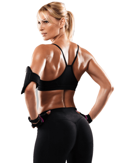
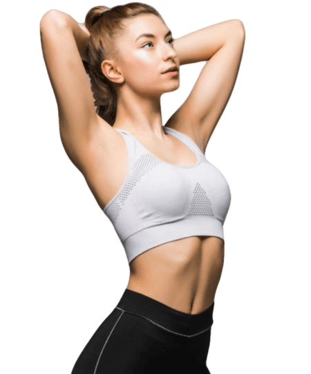
The Crossfit template uses the most basic layers. First, there’s a heading layer that displays the person’s name. Second, there’s a text layer to display their occupation. Then the actual image of the person is an image layer.
There’s also a decorational image next to the heading and text layers, inside a two column row. Rows are the building blocks of Smart Slider and they help you place layers next to each other.
Animations
The Crossfit template uses layer animations and events to display the details of each person. How does this work? If you hover over the slide, the layers at the bottom show up. Of course, mobiles and touch screen devices don’t have hover state. So the layers show up when the visitor taps on the slide.
Layout
The layout of the slides is very simple but it looks amazing. There’s an image with a nice shape as the background of the slide. Then there’s the person’s image, which is an Absolute positioned image layer. Absolute positioning is great for decorative content to your slider. That’s because it allows placing the layers anywhere within the slide. This can happen because Absolute layers don’t actually take up space, they float above the slide.
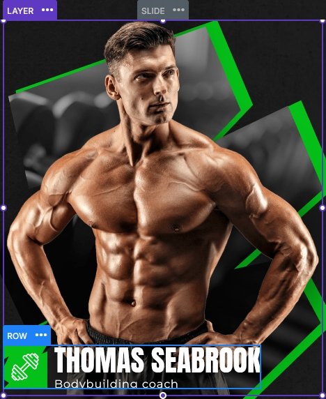
The textual contents are in Default position. They also have a Max Width set to ensure that they always stay next to the image.
Responsive
Smart Slider is a responsive slider and offers a bunch of tools to fine tune your slider. However, at the Crossfit template we didn’t need to use most of the available tools. In fact, we only needed to reduce the font size on mobile using the Font Resizer.
Related Documentation: Layer animation
Related Post: All You Need To Know About Carousel Slider Type

