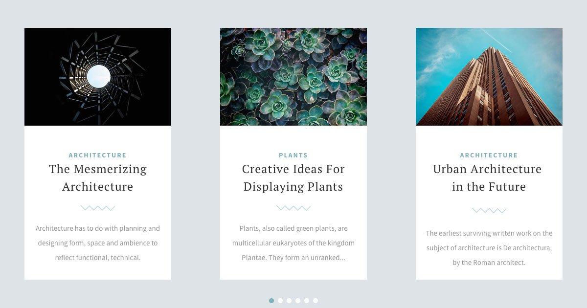
People think of sliders as rotating images, because that’s what they typically see. But a slider can be much more than just a moving gallery. In fact, it doesn’t even have to contain any image, or have one as its main element. A slider like that is called a text slider.
What is a text slider?
A text slider is actually what its name suggests. It’s a slider, that’s main feature is to have lots of textual content. One of the most typical examples for a text slider is a testimonial slider. In fact, a testimonial slider has lots of text. For example, the person’s details and their thoughts of the product or services. Usually a testimonial slider has an image of the person or the company, but no other pictures.
Post sliders are another great example for text sliders. They try to gain clicks by displaying the engaging post title and a short excerpt of the copy. They might display the post’s featured image for decoration, but the main focus is on the text.
How to create a text slider in WordPress?
The simplest way to create a responsive text slider in WordPress is using a plugin. There are many great WordPress plugins available that let you create a slider. What we recommend you to use is Smart Slider, which is the most popular slider plugin for WordPress. It has over 900.000 active installations and has an impressive 4.9 of 5 star rating. So, it’s a popular and beloved slider plugin, and it’s worth a try.
Smart Slider helps you create gorgeous responsive sliders for your website. You can create image sliders, text sliders, post sliders and many more.
How to create a text slider using Smart Slider?
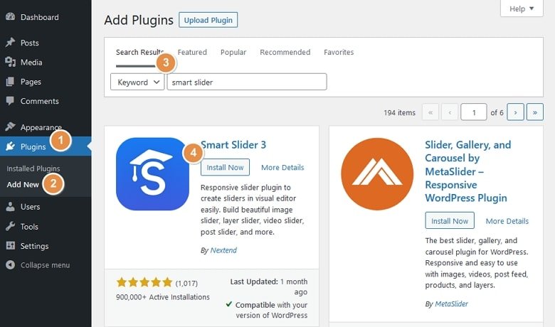
To be able to use Smart Slider, you’ll need to install it on your website first. Go to Plugins → Add New and use the search field at the top right to search for Smart Slider. A matching list of plugins will appear. Find the Smart Slider’s block and click on the Install Now button. Then click on Activate.
Now that you have installed Smart Slider on your website you can start creating sliders. Find the Smart Slider menu item on your WordPress menu and click on it.
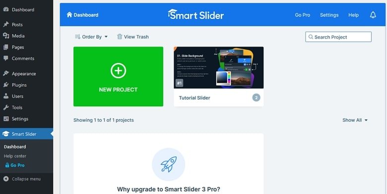
Now you’re at Smart Slider’s Dashboard. Here you can see the sliders you’ve created and create new ones. Click on the large green New Project button to create a new slider. You can import any template or start from scratch. To do the latter, choose Create a New Project.

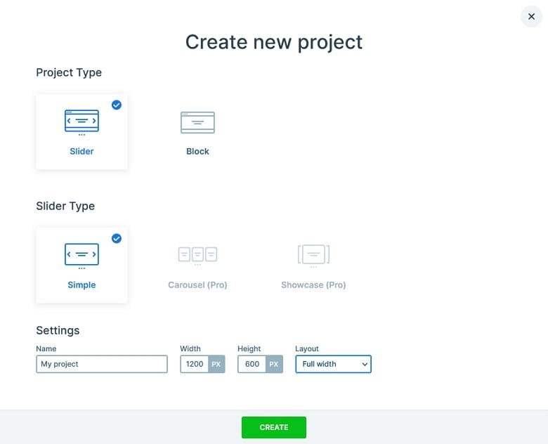
In the next popup you can configure the most important details of your slider. You can choose the type of the project and slider you want to create. Then you can name it, set its dimensions and layout. Of course, you can change any of these options later. So if you’re unsure what you need, you can use the default settings for now. Let’s click on Create.
The next screen you’ll end up on is the Slider Settings page. This is where you can configure your slider and add slides to it. Let’s add a new slide by clicking on the Add Slide button then choose Blank.
The slide is created and you can click on its thumbnail to edit it. Now that you have a slide all you need to do is to add layers for your content. For example, if you want to add a Heading click on the green plus icon on the top left side and click on Heading.
7 text slider examples
Do you want to create a text slider, but not sure where to start? Check out our beautiful collection of gorgeous text sliders. They’re great for inspiration for your next slider. Additionally, they can save you time as you can import any of them into your Smart Slider 3 Pro installation.
1. Career
The Career slider is the most literal example of a text slider. That’s because the only images it has are small, 60px wide icons. The main content is the text (and there’s plenty of that) which the heading and text layers display.
2. Testimonial Showcase
This is another example which barely has any images. In fact, images are not that important when you create a testimonial slider. Actually, what’s important is the testimony itself, and the person or company who wrote it.
3. Post Carousel
This example is a great choice for a post slider. It focuses on text, since the textual area is a lot wider than the image’s. The Post Carousel is also a minimalistic example, so it works for any website.
4. Team Slider
Introducing your team can be a powerful tool to gain more customers. Typically, a team slider only contains the team member’s picture, name and position. But a text slider which describes your team members in great detail is much more powerful.
5. Virtual Conference
The Virtual Conference is not a typical text slider. In fact, it uses a large image behind the textual content to support the message. This gorgeous slider also uses a textual thumbnail (with no image) as its main navigation.
6. Full Page Portfolio
Portfolio sliders usually have lots of images. People want to showcase as much from their past projects as possible. However, this example doesn’t have too many images. In fact, it only has one image on each slide and contains more text, strengthening the message of the images.
7. WordPress Carousel Post Slider
This post slider focuses on the textual content, which takes up about 2/3 of the slide height. The top of the slide displays the small featured image. Then below you can find the category, featured image and excerpt.


