


Settings
Full width headers are living their heyday on modern websites. It’s no wonder they’re so popular: a section that fills the whole width of the page looks great on large screens. This is especially true for this block.
🎓 Free Version Available
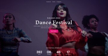
Did you know you can create Blocks in the Free version of Smart Slider 3? If you like this template take a look at its Free alternative.
The Block type is a special slider type of Smart Slider 3. It’s a kind of slider that can only display a single slide. You can use it to create animated sections of your site. In other words, you can take advantage of the power of Smart Slider without having to create an actual slider.
Layers
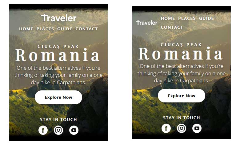
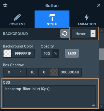
There are no special layers in the Traveler block. In fact, this block uses the most basic elements: heading, text, image and button layers. All layers have white colored text, that has high contrast with the dark background. There’s a large CTA button, which has a special hover effect. It has a dark background color, and also uses the backdrop-filter to blur the background behind. This CSS code is added to the CSS field of the button’s background.
There are social icons at the bottom of the slider. They’re image layers, but you can easily replace them with the Icon layer. At the top-left corner there’s another image layer, which displays the site’s logo. But these aren’t the only image layers this template has.
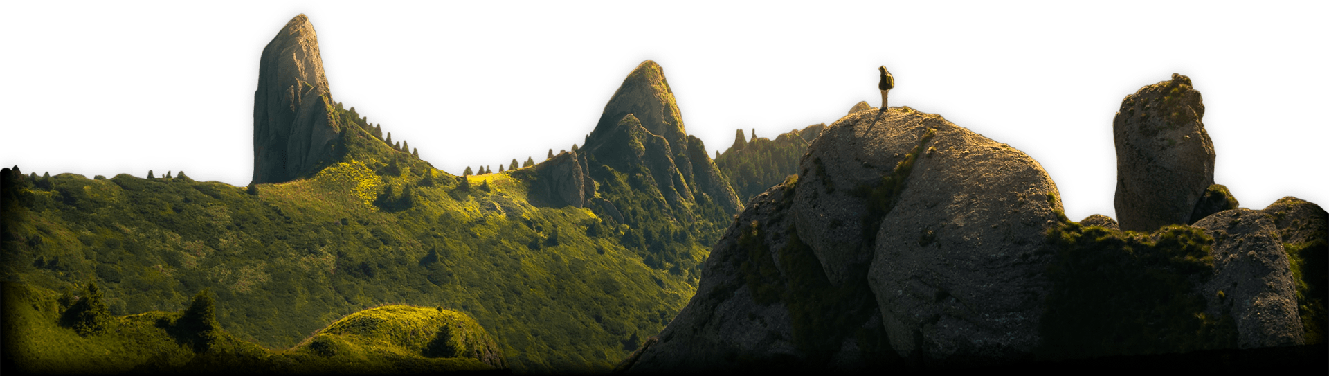
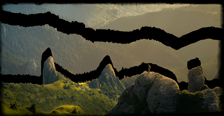
If you open up the Layer list, you can find four other image layers in Absolute position. These images serve as the background of the slide.
Animations
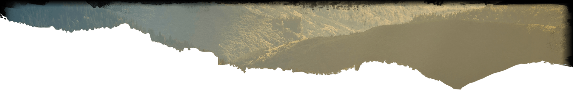
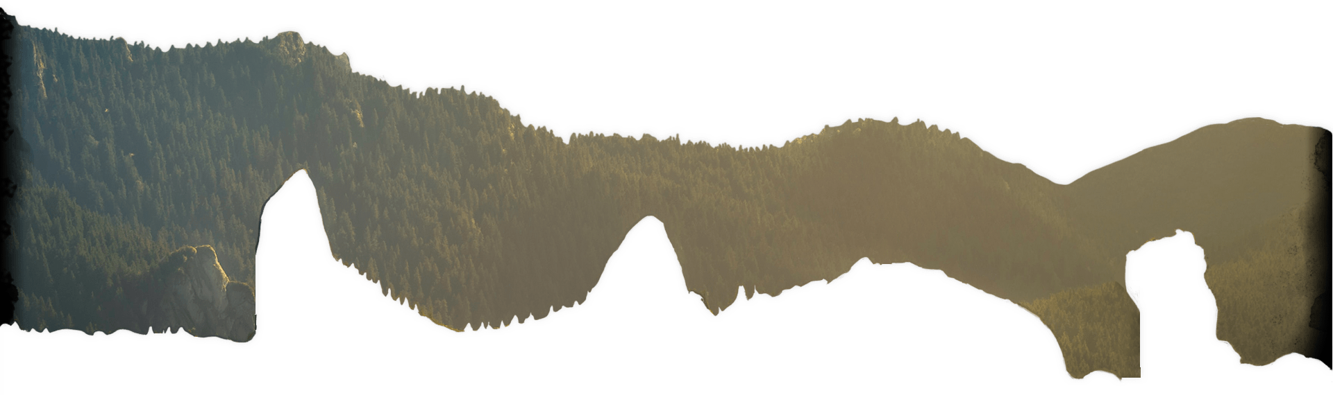
There’s a layer parallax effect on the Absolute positioned image layers, which creates that cool looking effect on scroll. To create such an effect, we split the image in three. Then we added each image as an Absolute layer. Finally, we moved the layers on top of each other, and selected the parallax depth.
Layout
The Traveler block’s layout is special. There are two rows creating the main layout. The first one, on the top, is a full width one. The bottom row, on the other hand, has a maximum width set, and it’s also stretched.
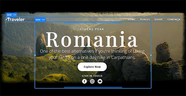
What makes Traveler block truly stand out is that it serves both as a hero section and a page header. In the top row there’s space for your site’s logo and navigation.
Responsive
Parallax effect doesn’t always work and look good on tablet and mobile devices. For this reason the three images which create the desktop background are hidden on mobile and tablet. On smaller screens there’s another Absolute positioned image that servers as the background.
Another interesting aspect of the mobile layout is that the menu displays below the logo. This happens because the logo is in the left column of the top row, and the menu is in the right column. Every row has a Wrap after option, which decides how many columns can fit next to each other on small screens. By default on mobile the Wrap after is 1. As a result, every column takes up a new line, which minimizes the time you need to spend with the mobile layout.