💡 Best features in this slider
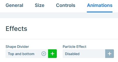
- Shape Divider
- Row with link action to switch slides
- Custom button using a row
Slider Settings
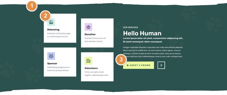
The Animal Shelter template is a simple type slider, the one that you can most commonly see on websites. It displays a single slide, so other content doesn’t distract the visitor when they view the page. It’s also a full width slider, meaning it fills the screen horizontally. Full width sliders are trendy in modern websites, because they look great on any screen size.
The template has a Shape Divider at its top and bottom. Adding a shape divider is an excellent way to enrich your slider. They’re pretty subtle, sitting under the layers but above the slide background. Oh, don’t bother looking for the Shape Divider on the first slide, because both that and the slide background are white. So you won’t see it there, but it will shine on the green and gray slides.
Layers
The template uses basic layers: headings, texts, buttons and images. Yet, it creates a beautiful section for your site. A heading layer lets you create actual, HTML headings for your slider. You can choose from h1 to h6 tag there, or if you don’t feel like needing either, you can just put the text inside a simple div. So, the heading layer is helpful to create short, headline sections. However, the text layer is a great way to enrich your slider with longer texts. And, of course, the image layer is a great way to add beautiful imagery to the slides.
Animations
The Animal Shelter template is very generous with animations. First, it has layer animations that you can spot when the slides load. The layer animations help introduce the layers to your slide with a nice effect. So it’s worth considering them when you build a slider.
The other effect you can quickly spot is the layer Parallax effect. There are many kinds of parallax effects on the web. The most common one is when the image stays still as the page scrolls over it. However, the parallax effect we added to this slider is connected to the mouse movement. When you move the cursor above the slider the layers move away from it with a slight animation.
The most interesting animation you can spot is the Background animation. It’s the Slices – Single effect, which is similar to the Reveal layer animation. It moves a single colored shape, which covers the current slide and as it moves out, it reveals the next slide. The animation uses the same green color that the second slide has. So it makes it seem like the paw prints are animated by it.
Layout
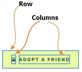
You can find many interesting layout solutions in the Animal Shelter template. The most interesting one is the button, as we used rows to build it. In fact, we built the light green button using a two column row as well. The left column contains the pawprint icon, and the right column has the text. We turned off the full width option at both of these rows, so they only take up as much space as their content needs. As a result, they create excellent custom buttons.
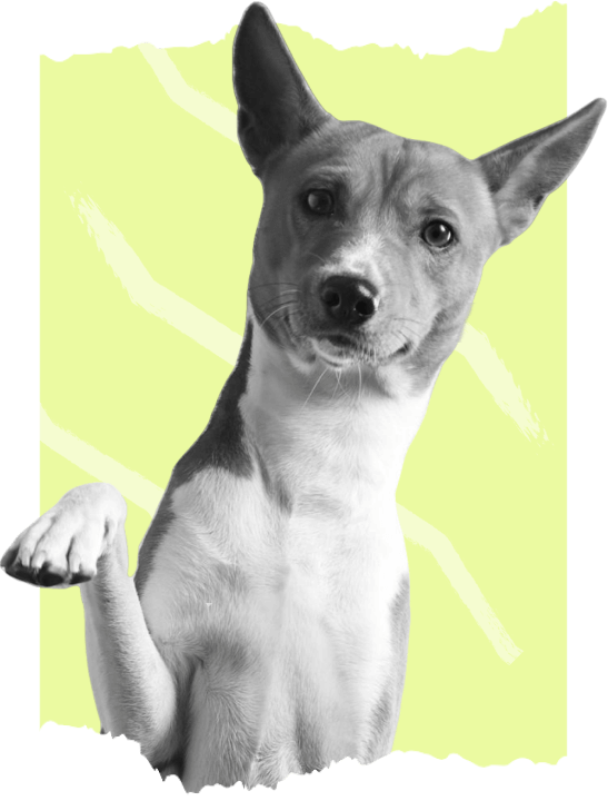
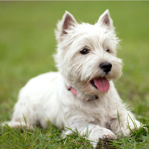
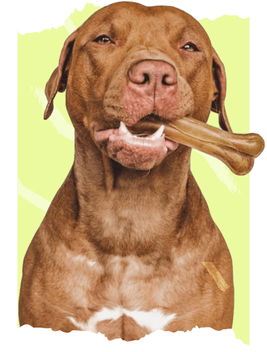
Another interesting layout solution is the usage of the Absolute positioned layers. Absolute positioned layers are great for adding decorative elements to the slide. For example, the two green shapes on the first slide are Absolute positioned layers. That is why they can overlap the dog picture.
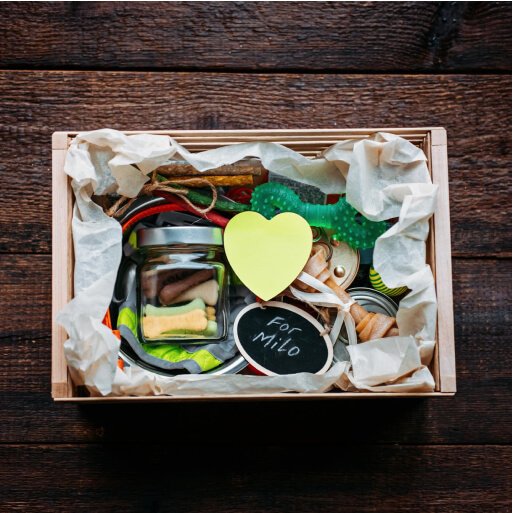
The boxes on the second slide look interesting because they have a slight offset. This offset is actually a padding on their container column. Adding paddings to different columns causes their content to lose their alignment. As a result, they create an interesting layout.
Responsive
Smart Slider is a great tool to create beautiful and responsive sliders for your website. It offers many tools to optimize your slider for small screens. For example, you can reduce the font size of text on tablet and mobile using the Font Resizer. This helps to make the texts fit better into small screens.
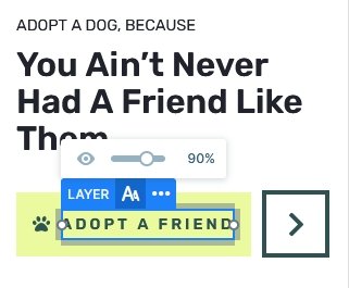
A rather busy slider can look great on large screens, but many layers often cause troubles on mobile. For this reason, you can hide any layer you don’t want to see on small screens. Additionally, if you’re working with rows, you can change the color order on mobile. By default when you add a row that breaks on small screens the columns keep their order. In other words, the column that was in the left will be at the top, and the column that was in the right will be at the bottom. However, you can change this order to create a better looking layout for small screens.
Related Tutorial: Rows and Columns
Related Post: Add Beautiful Section for your Website with Shape Dividers
