


💡 Best features in this slider
- Content on the Static Overlay
- Content on the regular slides
- Absolute positioned layers
- Shape Divider
- Bullets
Slider Settings
The Car Rental template is a simple type slider, which is the most common type of slider you can see on the web. Additionally, it uses the full width layout and that’s another very common usage of sliders. People love elements that fill the whole browser width horizontally, and content, especially images look great in full width on large monitors.
As the Car Rental template is a slider, it has many navigation options to allow visitors to see the other slides. The most obvious way of navigation is the orange CTA button that prompts the visitors to see the next car.
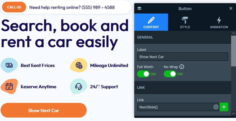
The other type of navigation is the bullets on the bottom of the slider. In fact, the bullets server two purposes on sliders. First, they are great way to navigate to a specific slide. Second, they show how many slides there are for visitors to see. That’s because there’s a bullet created for every slide, so if you have 3 slides in the slider, there will be 3 bullets. Apart from these navigation options, the slider also supports touch screens. As a result, touch screen users can swipe on the slider to switch slides.
Layers
The Car Rental template uses the most common layers to display its content. There are heading, text image and button layers on each slide.
Animations
There are a few interesting animations on the Car Rental template. First, there’s the Shape Divider at the bottom of the slider. We choose an interesting shape called “Curve 3”.
Apart from the Shape Divider, there are layer animations on the slides. The layer animations move in both the colorful shapes behind the main content, and also the content block on the right side.
Layout
The Car Rental template’s layout is quite interesting. Viewing the template it’s hard not to notice that the left side of the content stays still, while the right side moves. We achieved this behavior by placing the left side content on a Static Overlay. The Static Overlay is a special kind of slide that is above all other slides in the slider, and doesn’t move away. So, it’s perfect to create “fixed” content above your slides.
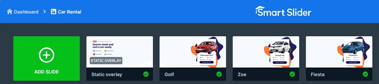
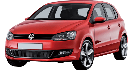
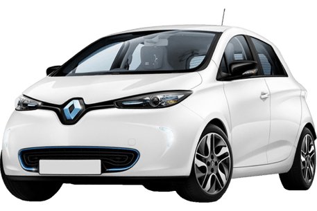
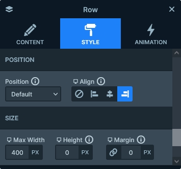
The right side contents are regular slides. Their content has a maximum width and it’s also aligned to the right, to ensure that they stay out of the way of the Static Overlay’s content.
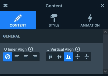
The Static Overlay’s content is based on a two column row. The actual content layers are in the left column, which means they always take up maximum 50% of the slider’s width.
Responsive
Smart Slider is a responsive slider and offers you all the flexibility you need to create awesome sliders for mobile. At the Car Rental template we made some special measures to ensure the slider’s good look on small screens.
On the Static Overlay, we set a large padding to the second, empty column. This ensures that the the content slides have enough space to display without the Static Overlay covering them. Since the Static Overlay’s padding enlarges the whole slider, all that was left to do in the other slides is to change the Vertical Align to bottom. As a result, their content displays at the bottom of the slide, below, but not under the Static Overlay’s content.
Related Documentation: What is the Static Overlay?
Related Post: 11 Beautiful Full Width Slider Examples