💡 Best features in this slider
Settings
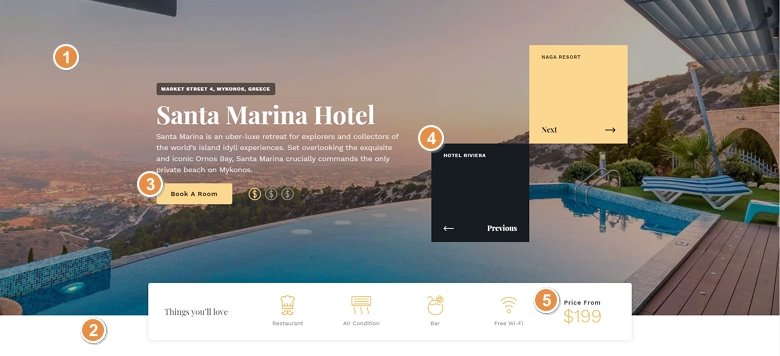
Full page sliders are popular in web design, they fill the whole screen and catch the visitors’ attention. With Smart Slider 3 Pro you can easily create a full page slider and you can import this sample from the Template Library. After that you can customize it, change the background and the texts, insert another layer or delete a layer so actually you can change everything that you want.
At the bottom of the slider you can see a rectangle shape divider which makes the illusion that the white row at the bottom is outside of the slider. But it isn’t, the shape divider makes you feel that way which can be a useful option.

You can navigate to other slides with a mouse drag or with the actions on the previous and next layers. Besides that, there is the slider autoplay turned on which can be seen because of the autoplay indicator at the top right corner, so without doing anything, the slides will automatically switch, too.
Layers
This slider is a good example of how useful the default positioning and using a structure can be. You can see a lot of different layer types on this slider: heading layer, text layer, button layer – with a nice hover effect, image layer and a counter layer which shows the price with a nice counter animation.
Animations
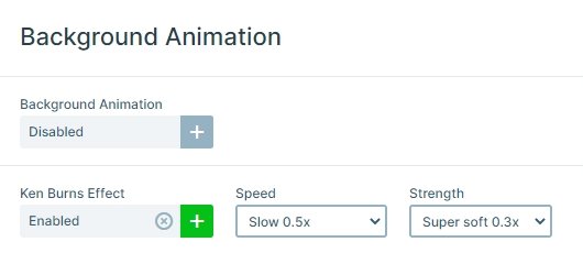
As you can see the background is moving a bit, this zooming effect is the Ken Burns effect. This effect is simple, elegant and works on any kind of images, but you can customize its speed, strength and the animation as well.
The speciality of this slider is the hover effect with the evens. If you hover over the Next or the Previous layer, another image will appear.
Layout
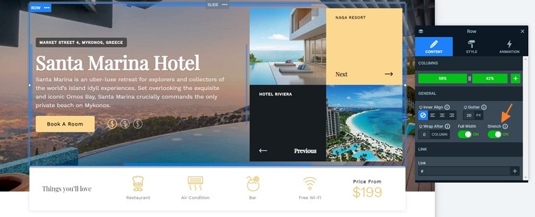
This slider is a full page slider, so fills the available horizontal and vertical space of your browser. The slider has special structure: there are more rows and columns used, which are bundled. In Smart Slider you can put a row into a column, which you can create cool layouts like this. There are 2 main rows under each other.
The top row contains the textual elements and the 4 boxes, and the bottom row is an informative row with a white background and a nice shadow. The top row is stretched, so it fills the available space on the top, and because of that the bottom row will be on the bottom of the slider with the background of a shape divider.
Responsive
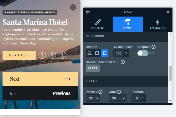
The full page hotel slider is fully responsive and looks good on any device. If you check your slider on mobile, you can notice that the texts are smaller, and the bottom white row is hidden. With hiding a layer we can make the slider smaller on mobile.
Related Post: Use the Popular Ken Burns Effect on your Slider
Related Post: What is a Full Page Slider and How to Use it?
Related Post: Configure Slider Autoplay and Create Automatically Rotating Slider
